


Africa continents powerpoint maps




Try Before you Buy Download Free Sample Product
 Impress Your
 Audience
 100%
100% Editable
 Save Hours
 of Time


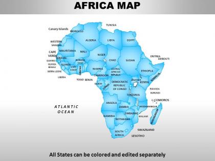
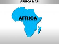
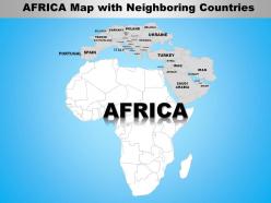
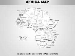
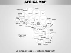
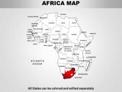
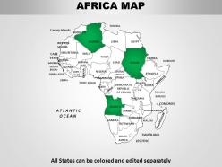
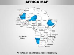
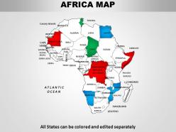
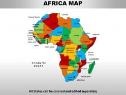
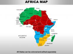
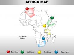
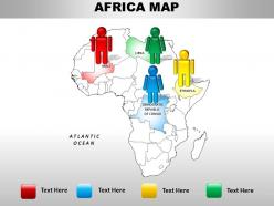
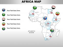
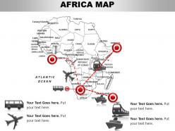
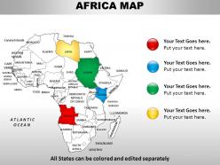
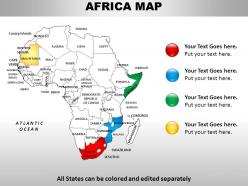
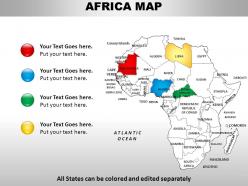
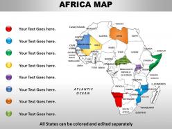
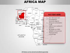
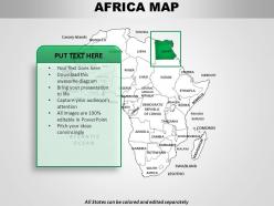
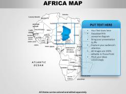
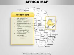
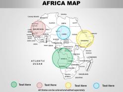
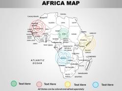
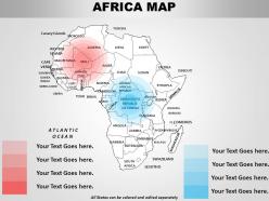
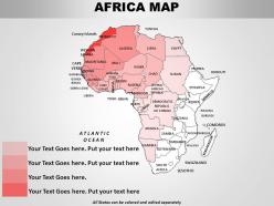
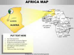
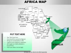
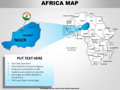
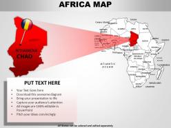
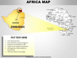
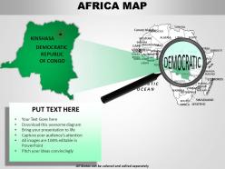
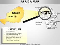
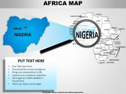
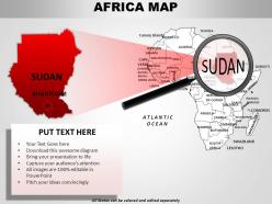
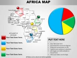
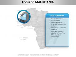
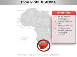
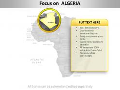
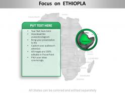
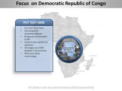
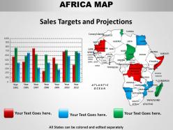
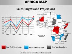
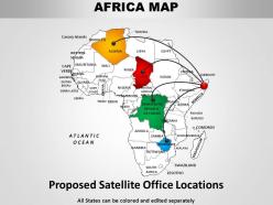
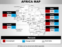
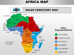
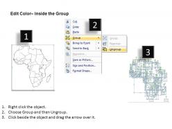
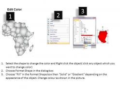
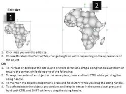
Download the Africa PowerPoint maps PPT slideshow. This PowerPoint slideshow consists of a map of the African continent and has 61 slides. This PPT presentation is recommended when you want to give a detailed description about the geographical, economical, or the various other features of the given country. This is very popular in use when you wish to show the weather reports, make a comparison between the birth rates, death rates, literacy rate, employment rate etc. Download this editable African continent map business template to illustrate the various features of the various countries existent in the given continent. This map PPT is very useful as it is very elegant and very classy, it will help you establish a good relationship with your viewers. The most important feature of a PowerPoint slideshow is that it connects you to your viewers and it is assured that this Africa map presentation will help you grab all the attention. Over the years we've all given shoddy business presentations. Make those a thing of the past with world class Africa Continents PowerPoint maps designs ready in seconds.
People who downloaded this PowerPoint presentation also viewed the following :
Africa continents powerpoint maps with all 61 slides:
Secure the basics with our Africa Continents PowerPoint maps. Your logic will win the day.


FAQs for Africa
So political maps are all about the human stuff - countries, capitals, cities, borders between Africa's 54 nations. Physical maps show the actual land features like the Sahara, mountain ranges, rivers, that whole Great Rift Valley thing. Basically political = "who runs what territory" and physical = "what does this place actually look like." Political ones use different colors for each country (can get pretty chaotic honestly), while physical maps do that elevation coloring thing. Use political when you need borders and government stuff, physical for terrain and geography. Hope that helps!
Those colonial borders from the 1880s? They're still what we use today on basically every map of Africa. Europeans just drew random lines and somehow they stuck - totally ignoring ethnic groups, languages, even natural boundaries that actually made sense. It's pretty crazy when you think about it. Modern mapping tools inherited this whole mess, so you're working with borders that don't reflect how people really live or organize themselves. My geography professor always said to question whether those boundaries actually help with whatever you're trying to map. Worth keeping in mind.
Dude, topographic maps are actually insane for tracking biodiversity patterns in Africa. Mountain ranges and river valleys literally show you where different species evolved - you can trace it right on the map. The Ethiopian Highlands? Perfect example of how isolation creates endemic species. Same thing happens in the Great Rift Valley with all those separate pockets. I always thought desert edges were boring, but they're where you find the most specialized communities. Honestly, if you're doing any field research, just overlay your species data on topo maps. You'll spot connections you'd totally miss otherwise.
Honestly, thematic maps are a game-changer for African socio-economic data. Color gradients show patterns in GDP, literacy, healthcare access - way better than staring at endless spreadsheets. Choropleth maps highlight regional disparities really well. You can also use proportional symbols for urban centers or resource stuff. The cool part? Layer different variables to spot correlations, like infrastructure vs economic growth. QGIS is solid for this (and free). Grab data from World Bank or UN sources - they've got tons. Just played around with some poverty data last week and the visuals actually made sense of everything.
Dude, satellite maps are a game-changer for tracking environmental stuff in Africa. You get real-time data on deforestation, droughts, floods - basically anything you can't easily reach on the ground. Perfect for monitoring desertification in the Sahel or tracking those crazy locust swarms. The resolution's gotten insanely good lately, like you can zoom in on individual farms now. They're also clutch for disaster response when roads are washed out or it's too dangerous to send teams in. NASA and Google Earth Engine have solid free databases if you need current imagery - way better than I expected when I first started using them.
Dude, the difference is wild. You used to be stuck with these crappy paper maps that were wrong half the time. Now you just pull up your phone and boom - super detailed, real-time maps of anywhere in Africa. GPS and satellite tech made everything crazy accurate. Plus locals can actually add stuff themselves through OpenStreetMap, which is pretty cool honestly. The best part? You can layer different info on top - like population data or climate zones. I got distracted looking at economic patterns in Kenya for like an hour yesterday. Check out Google Earth or OpenStreetMap for whatever you're working on.
Honestly, colonial maps really screwed things up in Africa. They just drew random lines that ignored how people actually lived - sometimes splitting communities apart, other times forcing enemies together. We're talking 3,000+ ethnic groups crammed into 54 countries, which... yeah, not great for peace. Those old boundaries still cause tons of political drama and resource fights today. The cool thing is modern mapmakers are finally asking local communities how they see their own territories instead of just using Western ideas about borders. Definitely worth checking what locals say versus official maps if you're doing anything Africa-related.
Oh this is actually super cool stuff! Maps help document where endangered African languages are spoken and track cultural boundaries before they vanish. You can map out which dialects are most at risk, plan preservation work, and show traditional territories or sacred sites. The visual aspect makes it way easier for researchers and communities to understand the data - honestly, way better than just having spreadsheets of info. Cultural mapping also captures migration patterns, which is pretty neat. If you're doing any preservation work, definitely throw some mapping into the mix. It's one of those things that just works.
Oh man, the "Mountains of Kong" thing is wild - European mapmakers basically invented this huge mountain range across West Africa and kept drawing it for like 100+ years based on sketchy explorer reports. Totally screwed up trade routes and geography understanding. The Nile source confusion was another mess that sent explorers on pointless missions. But honestly? The worst part was how colonial maps straight-up lied about borders to benefit European powers instead of showing real ethnic boundaries. These weren't just oops moments - they actually influenced military plans and policies. Always check multiple map sources from different eras if you're digging into this stuff.
Honestly, interactive maps are game-changers for understanding migration in Africa. You can watch movement patterns happen in real-time instead of staring at boring static maps. The cool thing is layering different data - climate stuff, economic conditions, conflict zones - so you actually see what's pushing people to move. Zoom out for regional trends, zoom in for local displacement. Time filters let you track how everything's changed over years, which is pretty fascinating once you get into it. UNHCR's migration dashboard is probably your best starting point, though the interface takes some getting used to.
Honestly, GIS is a game-changer for mapping African cities. The real-time updates alone are worth it when everything's changing so fast. Instead of shuffling through a million different maps, you can stack all your data - population, infrastructure, whatever - in one place. Satellite imagery catches those informal settlements that ground surveys totally miss. Remote collaboration is clutch too, especially if your team's spread out. QGIS is free and actually pretty solid if you're not swimming in budget (I spent way too much time learning it last year, but whatever). The detail you can pull is honestly impressive.
Honestly, maps are total game-changers in the classroom. Kids get way more engaged when they can actually *see* where stuff happened - like tracing slave trade routes or showing how colonial borders totally messed up ethnic boundaries. I've watched students who hate reading suddenly perk up over a good map! Geography becomes real when you connect it to historical events. Different map types help too - political vs physical vs historical. Same region, completely different story each time. It's wild how much geography actually shaped conflicts and trade. Visual learners especially eat this stuff up.
Dude, map literacy is huge for Africa's development. Poor spatial understanding leads to terrible infrastructure decisions and urban planning disasters - I've seen cities flood because planners didn't grasp basic topography. Citizens who can read maps access services better and understand their environment. Resource management improves dramatically too. Agriculture gets smarter. Even disaster response becomes way more effective when people actually know where things are located. The fix? Better geographic education everywhere, not just memorizing capitals. It sounds boring but honestly pays off in governance and development outcomes.
So those old African maps? They're basically proof of how Europeans just carved up the continent without caring about who actually lived where. Wild stuff - they literally used rulers to draw straight lines through people's homelands from conference rooms in Europe. Different ethnic groups got forced into the same countries while others were split apart completely. That's why you see all those perfectly straight borders cutting through territories. Honestly explains so much about conflicts there today. Most of those borders are still the same as what some random colonial officials decided back in the 1800s.
Maps are honestly a game-changer for sustainable development in Africa. Satellite data lets you track deforestation, find clean water sources, and scout the best locations for solar or wind projects. Plus governments can use them to plan roads and monitor how cities are growing. Without decent mapping, you're basically flying blind when it comes to resource allocation - I mean, how do you even know where to build stuff? OpenStreetMap is a solid starting point since their African coverage keeps getting better. The spatial data also helps NGOs measure if their programs are actually working over time.
-
Nice
-
Much better than the original! Thanks for the quick turnaround.
-
Excellent work done on template design and graphics.
-
good
-
good