

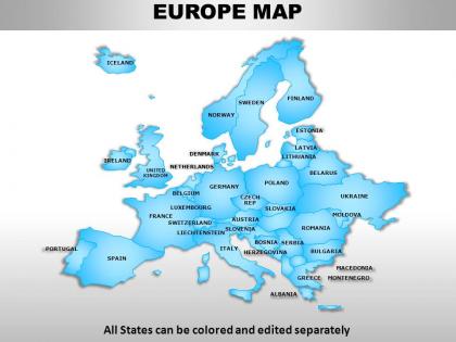
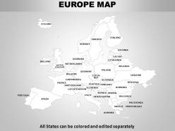
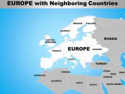
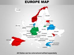
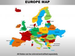
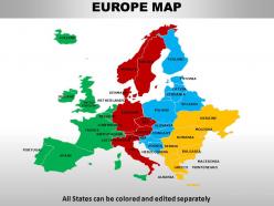
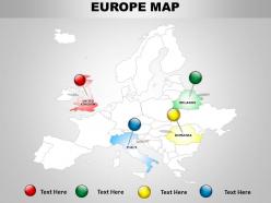
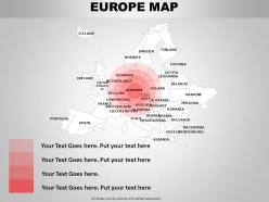
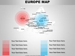
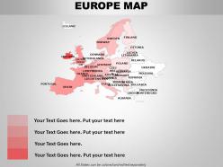
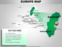
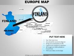
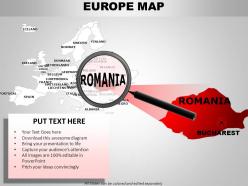
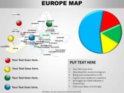
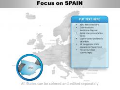
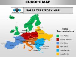
Europe continents powerpoint maps




Try Before you Buy Download Free Sample Product
 Impress Your
 Audience
 100%
100% Editable
 Save Hours
 of Time


Do you need a finish a presentation in a hurry? With our Europe Continents PowerPoint maps we can have you finished fast and looking great.
People who downloaded this PowerPoint presentation also viewed the following :
Europe continents powerpoint maps with all 63 slides:
Moral character is your proud possession. Spread the virue with our Europe Continents PowerPoint maps.
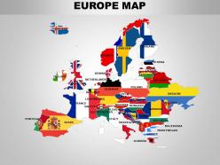
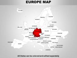
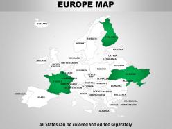
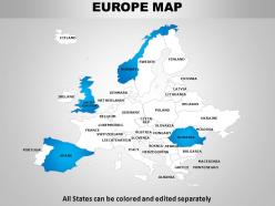
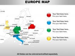
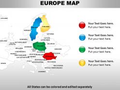
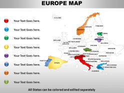

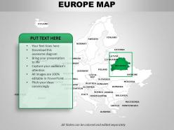
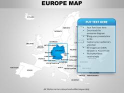
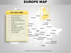
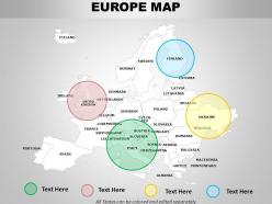
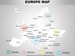
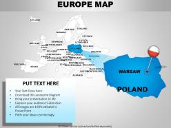
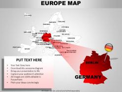
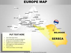
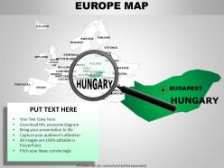

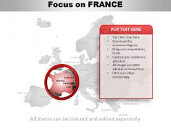

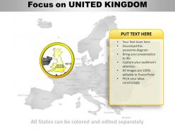
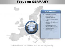
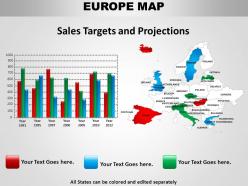
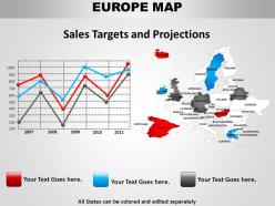
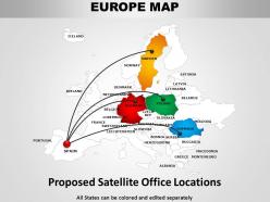
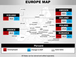

FAQs for Europe
So there's political maps with all the country borders and capitals - super useful for travel stuff. Physical ones show mountains, rivers, that kind of terrain detail if you're planning hikes. Road maps are obvious. Then you've got thematic maps covering population, climate, whatever data you want (I actually love getting lost looking at those). Historical maps are cool too - shows how crazy different Europe's borders used to be. What's your project about? I'd probably start with a basic political map and then add whatever specific info you need on top.
Looking at old European maps is wild - countries like Prussia and Austria-Hungary just vanished completely. Germany and Italy weren't even unified until the 1800s, which blew my mind when I first learned that. The Holy Roman Empire used to cover huge chunks of central Europe too. Borders shifted constantly back then, way more than you'd expect. Yugoslavia's another one that doesn't exist anymore. Always double-check what year your map is from because honestly, Europe got redrawn like every few decades. Makes you realize how recent some of these "permanent" countries actually are.
Start with Lambert Conformal Conic or Albers - they're your best bet for Europe since they handle the continent's wide east-west stretch without too much distortion. ETRS89 is the way to go for coordinates, keeps you aligned with EU standards. Scale's huge here, especially with all those tiny countries crammed together (seriously, the Benelux region is a nightmare). You'll want to simplify coastlines and borders based on your target scale - generalization is key. Oh, and double-check your datum transformations when mixing data sources, that stuff can bite you later. Honestly just pick your projection first and everything else falls into place from there.
Dude, European borders have been absolutely nuts over the past century. WWI destroyed Austria-Hungary and the Ottoman Empire - suddenly you've got all these new countries carved out. Then WWII happened with Nazi expansion, followed by Soviet control creating that whole Iron Curtain thing. The 1990s were crazy though - Yugoslavia fell apart and the USSR collapsed, which created like 15+ new nations overnight. I always forget how recent some of these countries actually are. If you're dealing with historical data, definitely check what borders existed when, because they've changed so much it'll mess up your research otherwise.
Dude, you really need maps for European geography. The Alps slice right through the south, and rivers like the Danube wind everywhere - it's wild how mountain ranges literally shaped where countries ended up. Like, Switzerland's whole neutrality thing makes way more sense when you see those massive peaks surrounding it. Just memorizing country names is pointless without seeing the actual landscape that influenced their history. Topographical maps show you elevation changes and how regions connect or get cut off from each other. Honestly, whenever I'm reading about European politics or trade, I always check a map first.
Honestly, interactive maps are a game changer for learning European geography. You can zoom from Prague's tiny streets all the way out to see the whole continent in like 2 seconds. Last week I literally spent hours just clicking around the Balkans - totally lost track of time lol. The cool part is layering different stuff like population or climate data over the same area. Way better than just memorizing capitals, you know? You actually start seeing how geography connects to culture and economics. I'd say pick a country you already know and just start exploring from there.
Honestly, start by figuring out what story you're trying to tell - that'll guide everything else. Mercator keeps shapes familiar but makes countries look weird sizes, while equal-area projections are more accurate proportionally. I'd go with whatever serves your point better. Keep your colors accessible (no red-green combos!) and don't cram too much stuff on there. Less is usually better anyway. Make sure people in the back can actually read your text. Oh, and definitely test it on a projector first if you can - things always look different than on your laptop screen. Your legend needs to be super clear too.
Oh yeah, map projections mess with Europe big time! Mercator makes Greenland and those Nordic countries look absolutely massive when they're really not. It's crazy distorted up north. Equal-area ones like Albers show the real sizes but everything looks kinda wonky shape-wise. Honestly depends what you need it for though. Comparing country sizes? Go equal-area for sure. Navigation stuff? Mercator's your friend since it keeps directions accurate. I always forget how much smaller some countries actually are until I see them on different maps.
Check the legend first - seriously, that's your lifesaver since colors mean different things depending on the publisher. Blue usually shows water, population, or economic stuff. Green? Forests and agriculture mostly. Red and orange pop up for temperature maps or political boundaries, but red's honestly all over the place - could be anything! Circle sizes typically show population centers, while line thickness indicates transportation networks. Oh, and those hatching patterns you'll see mark special areas like national parks. Different map types throw you curveballs though, so don't assume.
Maps are honestly a lifesaver for urban planners in Europe. You can see population density, transport routes, zoning laws - everything layered together. Historical maps are pretty cool too, especially those crazy medieval layouts. GIS software lets you test different scenarios before actually building anything. The demographic data combined with satellite images? That's where the magic happens for figuring out development priorities. I always think the best planners are basically data detectives. Plus you'll spot infrastructure gaps and green space needs way easier when it's all visual.
Yeah, cultural stuff totally changes how Europe gets mapped! Like, language and religion matter way more than actual borders sometimes. The Basque region crosses into both France and Spain, and don't even get me started on how differently Hungarians vs Romanians map Transylvania - it's wild. Historical baggage plays into it too. Administrative maps show one thing, but cultural region maps? Completely different story. Way more interesting honestly, just messier to work with. So when you're looking at European data, definitely check what angle the mapmaker was coming from first.
Honestly, layered maps are a game changer for European history. Start with Rome, then show how borders kept shifting through medieval times and all those wars. Kids actually *get* it when they see the changes visually instead of just cramming dates. Interactive digital maps work great - let them toggle between eras or make their own showing trade routes. Geography tells the human story, you know? Like how the Alps screwed over Napoleon or why coastal cities got rich. Oh, and try having them guess what'll happen based on terrain before you reveal the actual outcome. Works every time.
Honestly, satellite mapping for Europe is pretty solid - you get crazy accurate data and can watch changes happen over time. Cloud cover though? Total nightmare with Europe's weather. I learned that the hard way on a project last year. Ground-truthing helps fill gaps, especially in messy urban areas where buildings create weird shadows. The downside is cost - high-res imagery gets pricey quick if you're covering big regions. My advice? Mix satellite data with some field verification. Works way better than relying on just one source.
So basically topographic maps show Europe's elevation with contour lines and colors. When lines are bunched super tight together, that means steep terrain - think Alps or Pyrenees. Colors go from green for low areas up to brown and white for peaks. Pretty straightforward once you get it. You can literally scan a map and instantly spot where the mountains are versus flat areas just from the color coding. The lines give exact elevation numbers if you need specifics. Honestly saved me so much time planning that trip to Switzerland last year. Pull one up next time you're curious about why certain European regions look so different!
Oh man, the constant construction is brutal - Berlin and Amsterdam are changing so fast your maps are basically useless within months. Underground utilities are a total mess too, plus you've got transit lines and historic areas where half your surveying gear won't even work properly. EU privacy laws don't help either since they limit aerial shots over residential zones. Honestly the paperwork alone is exhausting sometimes. Your best move is hooking up automated feeds from planning departments and getting real-time satellite data to catch changes as they happen.
-
Professional and unique presentations.
-
Amazing product with appealing content and design.