

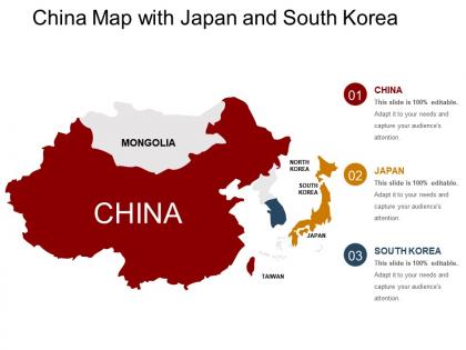
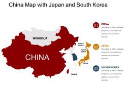
China map with japan and south korea




Try Before you Buy Download Free Sample Product
 Impress Your
 Audience
 100%
100% Editable
 Save Hours
 of Time


Our China Map With Japan And South Korea are convenient and user friendly. Just select the relevant ones and personalise them with your text.
People who downloaded this PowerPoint presentation also viewed the following :
China map with japan and south korea with all 5 slides:
Bring back the feel good factor with our China Map With Japan And South Korea. Everyone feels bright and cheery again.


FAQs for China map with japan
So you'll typically see China, Japan, North/South Korea, Mongolia, and Taiwan as the main countries. Russia's eastern part usually gets included too. Some maps throw in bits of Southeast Asia like Vietnam or the Philippines - honestly depends on who made the map and how they define the region lol. Just heads up though, some of these boundaries are super politically sensitive, especially anything involving Taiwan or those random island disputes. Worth double-checking that whatever map you're using matches your company's official position on stuff.
So basically the mountains and oceans create these crazy weather differences across East Asia. The Himalayas block southern air masses, while Pacific monsoons bring those wet summers and bone-dry winters. Northern China and Korea get absolutely hammered by freezing Siberian air in winter - it's honestly miserable. Japan's lucky though, all that ocean keeps things way more mild. Oh and if you're traveling there, definitely check monsoon timing first. Countries literally get their entire year's worth of rain during monsoon season, so you don't want to get caught in that mess.
So the main ones you'll see are Tokyo, Shanghai, Beijing, Seoul, and Hong Kong. Tokyo's huge for tech and manufacturing stuff. Shanghai basically runs China's trade and finance game. Beijing's the political center but also where all the big tech companies are - makes sense I guess. Seoul's your electronics hub, you know, Samsung and LG territory. Hong Kong's still a major financial player even with everything that's been going on lately. Those five are where most business happens, so I'd start there if you're doing research. They're basically the economic heavy hitters of the region.
So maps usually mark cultural stuff with little temple icons, pagoda symbols, castle shapes - that kind of thing. Great Wall, Kyoto temples, Korean palaces all get these markers. Honestly, some areas are just packed with them! Digital maps are clutch because you can filter by time period or category. Makes trip planning way easier. Physical maps tend to highlight UNESCO sites with special symbols. Oh and pro tip - skip general maps if you're really into historical sites. Tourist maps or cultural-focused ones are so much better for this stuff.
So East Asia's geography is wild - rivers like the Yangtze and Yellow basically decided where everyone would live. All the big cities? They're along these river systems because that's where the good farmland is. Then you've got massive mountain ranges (the Himalayas are insane) that kept different regions separated for centuries. That's why you get such distinct cultures even within countries. I always tell people to look at a map and trace the rivers - you'll find the population centers every time. Mountains divide, rivers unite. Makes total sense when you think about it.
Looking at East Asia maps, you'll notice how China's huge size basically dominates everything around it. Japan being an island nation totally changes how it deals with everyone else diplomatically. Korea's stuck right between major powers - kinda rough position honestly. Those South China Sea areas get messy with overlapping territorial claims from multiple countries. Maritime shipping routes connect all these economies together. The physical geography tells you so much about why certain nations get along or butt heads. Trade corridors matter just as much as borders when you're figuring out regional tensions.
So maps of East Asia can show you tons of demographic stuff! Population density jumps out first - those crazy urban clusters around Tokyo, Seoul, Beijing are wild when you see them mapped out. Age distribution patterns show up a lot too, plus migration flows and ethnic groups by region. The coastal vs inland split is honestly pretty dramatic visually. Some include economic data like income levels or job sectors, which is cool. Oh and rural-to-urban migration patterns are fascinating if you're into that. I'd look for maps combining multiple variables - they're way better for spotting regional trends you'd totally miss otherwise.
So urbanization totally changes how East Asia looks on maps - cities become these huge, detailed blobs that dominate everything. Compare maps from like the 90s to now and it's crazy how different they look. Tokyo-Osaka and Beijing-Tianjin are these massive connected urban strips that weren't really a thing before. Rural areas kind of fade into the background while metropolitan regions just sprawl everywhere. The population density stuff is honestly mind-blowing when you see it side by side. China, Japan, South Korea - they're all basically unrecognizable from their older maps because of how fast cities grew.
So most East Asian maps color-code each country differently - China's usually yellow/orange, Japan gets pink or light blue, South Korea's green, and North Korea is red or dark green. Mongolia's typically brown since it's mostly desert anyway. Stars mark capitals, dots show major cities, little mountain symbols for ranges like the Himalayas. Pretty standard stuff. Different publishers use different color schemes though, which honestly gets confusing when you're cross-referencing maps. Each country still gets its own distinct color to make borders obvious. Just always check the legend first - saves you from guessing what each shade means!
Honestly, it all comes down to resources when you look at East Asian politics. China's desperate for energy, so they're being super aggressive about those South China Sea claims. Japan and South Korea don't have much domestically, which keeps them stuck relying on the US for protection. North Korea's sitting on coal and rare earth deposits - gives them way more bargaining power than you'd expect, even with all the sanctions. Taiwan's chip industry makes them crazy valuable too, not just because of the whole China situation. Whenever there's drama in that region, I swear there's always some resource battle underneath it all.
Dude, those East Asia maps are getting crazy detailed with environmental stuff now. Color-coded pollution levels everywhere, plus they mark all the national parks and UNESCO sites. Real-time air quality data too - super useful if you're planning trips. The deforestation tracking is honestly kind of depressing but important to see. Industrial zones and renewable energy spots are mapped out, which gives you a good sense of what's actually happening environmentally. I'd definitely look for the ones with live data layers if you need current readings for whatever you're working on.
Dude, those maritime boundaries are a huge deal over there. China's basically claiming most of the South China Sea with their "nine-dash line" thing, but Vietnam and the Philippines are like "uh, no thanks." Then you've got China and Japan butting heads in the East China Sea too. Here's the kicker - we're talking about $3+ trillion in trade going through these waters every year. Plus there's probably tons of oil and gas underneath. Honestly, it's kind of wild how much global commerce depends on these disputed areas. Any time tensions flare up, supply chains get messy real quick.
So on those East Asia maps, railways show up as thick solid lines, highways are usually colored bands, and shipping routes are the dotted lines between ports. Pretty much all the action happens along coasts and rivers - makes sense since that's where trade's always been easiest. Shanghai, Tokyo, Busan... those cities have crazy dense networks around them. Honestly, just look for spots where different transport types meet up - those intersections are your goldmine for finding the real economic hotspots and major trade routes.
So basically, when you look at East Asia maps, the borders usually match up with where cultures change. China's huge and mostly Han, but you've got Tibetans and other groups around the edges. Japan being islands meant they could pick and choose what they borrowed from China - like they took Buddhism but kept their samurai thing going. Korea's stuck between China and Japan so they developed their own vibe. Mongolia's totally different though, still nomadic while everyone else farms. Honestly, the geography tells you most of what you need to know about why these cultures are so distinct.
Oh this is actually fascinating! So basically, early European maps from the 1500s were kind of a mess - they had Korea as an island and Japan's shape was completely wrong. Trade routes helped a lot though. By the 1700s you started getting way more accurate coastlines because they were finally listening to local knowledge instead of just guessing. Modern surveying was the real game-changer - it showed China's actual massive scale and fixed tons of geographical mistakes. You should definitely compare maps from different centuries side by side, it's wild to see the difference.
-
Nice and innovative design.
-
The Designed Graphic are very professional and classic.