


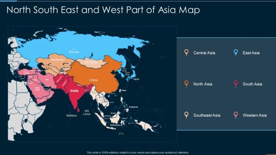
North South East And West Part Of Asia Map




Try Before you Buy Download Free Sample Product
 Impress Your
 Audience
 100%
100% Editable
 Save Hours
 of Time


Our North South East And West Part Of Asia Map are topically designed to provide an attractive backdrop to any subject. Use them to look like a presentation pro.
People who downloaded this PowerPoint presentation also viewed the following :
North South East And West Part Of Asia Map with all 6 slides:
Use our North South East And West Part Of Asia Map to effectively help you save your valuable time. They are readymade to fit into any presentation structure.





FAQs for North South East And West Part
Key features include accurate geographical boundaries, clear country labels, major cities and capitals, significant rivers and mountain ranges, and appropriate color coding for different regions. These elements enhance learning by providing visual context, supporting geographical literacy, and enabling students to understand regional relationships, ultimately delivering more engaging educational experiences with many educators finding that well-designed maps improve comprehension and retention.
Interactive elements enhance geographical understanding of Asia maps by enabling zoom functionality, layered data visualization, clickable regions for detailed information, and real-time updates on demographics or economics. These features transform static learning into dynamic exploration, with educational institutions and businesses finding that interactive maps improve spatial comprehension, facilitate cross-cultural business planning, and ultimately deliver more engaging geographical education experiences.
Depicting borders on Asia maps presents both sensitive political considerations and cultural representation challenges, including disputed territories, colonial legacy boundaries, historical claims, and ethnic divisions. These cartographic decisions significantly impact diplomatic relations, educational narratives, and cultural identity, with many institutions finding that thoughtful border representation enhances cross-cultural understanding while respecting diverse perspectives.
**INPUT**: Which presentation templates work best for showcasing demographic information across Asian countries? **OUTPUT**: Demographic presentation templates include interactive map layouts, comparative chart designs, infographic-style formats, regional breakdown slides, and data visualization dashboards. These templates enhance audience engagement by combining visual mapping with statistical overlays, color-coded regional comparisons, and dynamic data flows, with organizations in market research, international business, and government sectors finding that geographic-demographic integration delivers clearer insights and more compelling strategic presentations. [Word count: 60 words]
Strategic use of color in Asia maps significantly enhances audience engagement by improving visual hierarchy, enabling quick regional differentiation, highlighting key data points, and creating emotional connections with content. Through purposeful color schemes, presenters can guide attention to specific countries or regions, simplify complex geographical relationships, and maintain audience focus, with many finding that well-designed color palettes increase comprehension and retention rates.
Professional mapping tools include GIS software like ArcGIS and QGIS, presentation platforms such as PowerPoint and Google Earth, specialized cartography applications, and template libraries from SlideTeam. These technologies streamline map creation by offering customizable templates, real-time data integration, and professional styling options, with many organizations finding that strategic visual mapping enhances audience engagement and delivers clearer geographical insights.
Common mistakes include using outdated maps, incorrect country boundaries, oversimplifying complex regions, neglecting cultural sensitivities, and poor color contrast for visibility. These errors undermine credibility by confusing audiences, misrepresenting political realities, and reducing comprehension, with many organizations finding that investing in accurate, culturally-aware geographic presentations ultimately delivers stronger stakeholder trust and more effective communication outcomes.
Asia maps require careful scale selection based on coverage area, with regional maps using 1:10,000,000 to 1:25,000,000 scales and country-specific maps employing 1:2,000,000 to 1:5,000,000 ratios. The Mercator projection works well for navigation, while Lambert Conformal Conic delivers superior accuracy for landmass representation, ultimately ensuring geographic precision and visual clarity for diverse business applications.
Physical features significantly shape Asia's political and economic narratives by influencing trade routes, resource distribution, border conflicts, and strategic alliances across the continent. These geographical elements enable presenters to illustrate how mountains like the Himalayas create natural barriers affecting diplomatic relations, while major rivers and coastlines drive economic development patterns, ultimately delivering clearer insights into regional power dynamics and commercial opportunities.
Historical maps of Asia can be integrated into modern presentation templates through digital overlay techniques, interactive zoom features, comparative timeline slides, and strategic color coding that highlights geographical changes over time. These approaches enable presenters to demonstrate regional evolution, trade route development, and cultural expansion across sectors like education, tourism, and international business, ultimately delivering engaging visual narratives that enhance audience understanding.
Best practices for annotating an Asia map include using clear, legible fonts, consistent color coding, strategic placement of labels, balanced information density, and culturally appropriate symbols. These techniques enhance comprehension by minimizing visual clutter, establishing clear hierarchies, and providing contextual information, with many presenters finding that well-annotated maps significantly improve audience engagement and retention rates.
Trade routes and economic zones can be effectively illustrated through color-coded pathways, distinct shading for different zones, interactive overlays, and strategic icons marking key ports and hubs. These visual techniques enhance audience comprehension by highlighting connectivity patterns, trade volumes, and economic relationships across Asian markets, ultimately delivering clearer strategic insights for business expansion and partnership decisions.
Maps of Asia can be adapted through simplified color coding and basic country labels for children, detailed topographical features and economic data for students, and specialized overlays showing trade routes, population density, or geopolitical boundaries for professionals. Educational institutions and businesses increasingly find that layered mapping approaches enhance comprehension and decision-making, with interactive digital formats delivering scalable solutions across diverse learning and professional environments.
Storytelling techniques for Asia map presentations include journey narratives, regional comparisons, historical progressions, data-driven insights, and cultural connections. These approaches captivate audiences by transforming static geographical information into compelling narratives, with many presenters finding that combining visual storytelling with strategic market analysis, expansion routes, and cultural context ultimately delivers more engaging presentations and stronger stakeholder connection.
Data visualization tools complement Asia maps by incorporating interactive charts, real-time analytics, demographic overlays, sales performance metrics, and market trend indicators directly onto geographical regions. These integrated approaches enable businesses to showcase market penetration across countries like Japan and India, identify growth opportunities, and present complex regional data in compelling visual narratives, ultimately delivering clearer strategic insights and enhanced stakeholder engagement.
-
Awesomely designed templates, Easy to understand.
-
Such amazing slides with easy editable options. A perfect time-saver.