

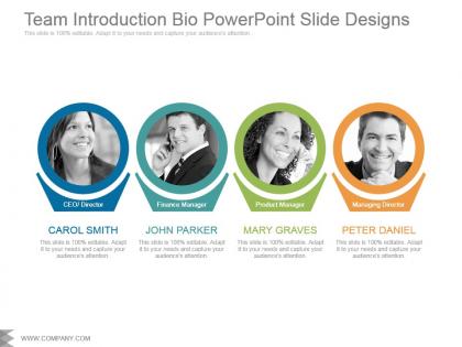
Team introduction bio powerpoint slide designs




Try Before you Buy Download Free Sample Product
 Impress Your
 Audience
 100%
100% Editable
 Save Hours
 of Time


Disseminate the facts contained in the document with our Team Introduction Bio Powerpoint Slide Designs. Be able to divulge the contents.
People who downloaded this PowerPoint presentation also viewed the following :
Team introduction bio powerpoint slide designs with all 5 slides:
Our Team Introduction Bio Powerpoint Slide Designs generate happiness beyond expectations. You will get a feeling of euphoria.
FAQs for Team introduction bio
For the basics, you'll need a professional headshot, their name and job title. Add a short 2-3 sentence bio highlighting their experience - nothing crazy long. Email or LinkedIn works for contact info if that makes sense for your audience. Design-wise, keep everything consistent across the team. Honestly, mismatched fonts look pretty terrible. A fun fact or personal detail helps people connect, but don't get weird with it. Templates are your friend here - just swap out the content for each person. Balance is key - professional but not robotic.
Honestly, good visuals are what make team bios stick in people's minds instead of just being another boring slide deck. Get decent headshots - and I mean actually professional ones, not someone's Facebook pic they cropped weird. Throw in some icons that match each person's role, keep your branding consistent throughout. Charts work really well if you want to show off achievements or expertise. Just don't go crazy with animations and flashy stuff that distracts from the actual people. Clean design beats overly fancy every time. You want them remembering your team, not your PowerPoint skills.
Honestly, just go with navy and white - you can't mess that up. Soft grays work great too, maybe throw in one accent like teal or coral. I've made the mistake of using bright backgrounds before and everyone's faces looked super washed out lol. If you already have brand colors, stick with those in a monochromatic way. Keep it simple though - two or three colors tops. The main thing is making sure there's enough contrast so people can actually read the text. Oh, and whatever you pick, use it consistently across all the slides or it'll look messy.
So honestly, I'd make a template that everyone has to use - same fonts, colors, that whole thing. But then let people go wild with their personal stuff, you know? Skip the boring corporate headshots and get real photos that actually show their personality. Some of the best team pages I've seen throw in random hobbies or weird skills right next to work stuff. Like "Sarah manages our finances and once ate 47 chicken nuggets in one sitting." Design consistency is clutch, but the content should feel human. Give them guardrails but don't micromanage every detail.
Honestly? Less is more with bio slides. Use maybe 2-3 font weights tops and don't cram everything together - white space is your friend. I always go with clean fonts like Montserrat for names/titles. Make names big (24-28pt) so people can actually read them. Job titles around 16-18pt work fine. The bio text part though - this is where people mess up. Keep it to 2-3 lines max or you'll lose everyone. I learned this the hard way after bombing a presentation once. Oh, and definitely check how it looks from the back of the room before you present. Trust me on that one.
Honestly? It's totally situational. For client pitches or conferences where people actually want to connect afterward, LinkedIn links are clutch. Internal meetings though - I'd probably skip it. Board presentations definitely skip it, feels too casual. Match what your audience expects, you know? If networking is part of why you're there, go for it. But stick to LinkedIn only in professional settings. Nobody wants to accidentally click on someone's Instagram story about their lunch when they're trying to review quarterly numbers lol. Context is everything here.
Honestly, icons are a lifesaver for team bios - they turn boring text blocks into something people actually want to look at. Use them for skills, locations, maybe even quirky stuff like "dog person" (people eat that up). A little globe for Tokyo, coffee cup for your caffeine addict teammate, you know? They guide people's eyes to what matters most about each person. Just... don't go crazy with them or you'll create some weird hieroglyphic situation. I'd stick to maybe 2-3 per person tops. Graphics help break things up too, especially if you've got text-heavy slides.
Make your text at least 24pt with high contrast colors - trust me, squinting at tiny text sucks for everyone. Alt text on headshots is clutch, and don't rely just on color coding (like green = available). Toss in an icon too. Keep descriptions short since people's brains work differently. Your headings need proper formatting for screen readers, not just random bold text. Honestly, I learned this the hard way after bombing a presentation once. Pro tip: check everything in grayscale first to spot contrast problems.
Go with a grid layout - it gives everyone equal space and looks way cleaner. Use the same card format for everyone: photo, name, title, quick bio. I've definitely seen those awkward slides where the CEO gets this massive headshot and everyone else looks like postage stamps... super weird vibe. You can mix it up with alternating layouts or mosaic styles to keep it interesting. Just keep your photo styles consistent - same lighting, similar backgrounds, that sort of thing. Otherwise people focus on the wonky design instead of actually seeing how diverse and talented your team is.
Turn each bio into a mini-story instead of just listing credentials. Start with where they came from, then hit a pivotal moment that changed everything for them. Maybe they had an "aha" moment or hit a wall that redirected their whole path. Show how that journey brought them to your team. Skip the boring job title stuff - people forget that instantly anyway. Focus on the "why" behind their moves. "After realizing..." or "When they discovered..." helps connect the dots between career jumps. I tried this with our designer's bio and honestly? Night and day difference. Way more memorable than the old resume-style version we had before.
Honestly, less is more with these bios. People's attention spans are garbage - keep it to 2-3 key points per person max. Make sure all the headshots match in size and lighting so it doesn't look like you grabbed random LinkedIn photos. I've seen way too many teams use those awful stock photo backgrounds that scream 2015. Skip the tiny fonts too - nobody's squinting to read about your CFO from the back of the room. Professional photos are worth the investment, and readable fonts aren't negotiable. Your audience should instantly get who does what without working for it.
Okay so basically you gotta match your stuff to whoever you're pitching to. Tech companies? Show off those certifications and keep it sleek and modern. But if it's healthcare or finance, play it way more conservative - formal headshots, highlight your credentials. Creative places are totally different though - they actually want to see your personality! Bold colors, weird hobbies, that random side project you did last summer. I swear it makes a difference in those industries. The whole thing is about reading the room first. A scrappy startup wants completely different energy than some stuffy corporate presentation. Quick tip: check out their website and social media to see what vibe they're going for, then match that.
Honestly, you really should include roles on those team slides. People need to know who does what - otherwise they're just staring at random faces wondering if you guys actually know what you're doing. When investors see clear roles, they get that your team has structure and everyone's accountable for their piece. It's basically a cheat sheet for who to bug about specific stuff later. Without it, you might have the best team ever but nobody can tell. Keep the descriptions short but specific enough to matter. Trust me, that organized look makes a huge difference when you're trying to prove you can deliver.
Okay so basically you want everything to look the same across all your bio slides. Same fonts, colors, spacing - the whole thing. Otherwise people get distracted by weird design choices instead of actually reading about your team. Plus it just looks way more professional when everything matches. Like, mismatched slides scream "we threw this together last minute" (which honestly might be true but they don't need to know that lol). Pick one template and use it for everyone - just change out the photos and info. Trust me, it'll make such a difference in how put-together you look.
Honestly, just use Canva. Their team bio templates are solid and you don't need to be a design genius to make something that looks good. Figma's another option if you want more control over everything - plus it's free which is nice. PowerPoint has stepped up their template game recently (shocking, I know), and you probably already have it anyway. Adobe's obviously the fancy choice but seems like way too much for basic team bios? I'd stick with Canva's templates and tweak them. You'll probably be done in 20 minutes and it'll look professional enough.
-
Easily Editable.
-
Best way of representation of the topic.