


Tender Presentation Powerpoint Ppt Template Bundles





Try Before you Buy Download Free Sample Product
 Impress Your
 Audience
 100%
100% Editable
 Save Hours
 of Time


Our Tender Presentation Powerpoint Ppt Template Bundles are topically designed to provide an attractive backdrop to any subject. Use them to look like a presentation pro.
People who downloaded this PowerPoint presentation also viewed the following :
Tender Presentation Powerpoint Ppt Template Bundles with all 22 slides:
Use our Tender Presentation Powerpoint Ppt Template Bundles to effectively help you save your valuable time. They are readymade to fit into any presentation structure.
-

Tender Presentation
-
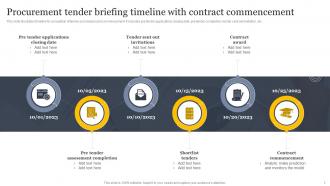
Procurement tender briefing timeline with contract commencement
-
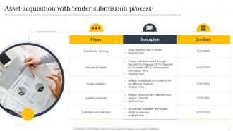
Asset acquisition with tender submission process
-
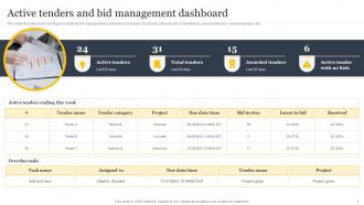
Active tenders and bid management dashboard
-
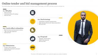
Online tender and bid management process
-
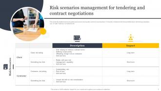
Risk scenarios management for tendering and contract negotiations
-
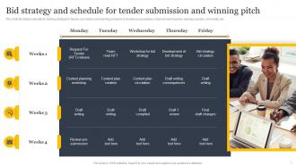
Bid strategy and schedule for tender submission and winning pitch
-
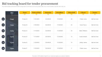
Bid tracking board for tender procurement
-

Tendering process impact on global strategies
-
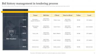
Bid history management in tendering process
-
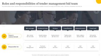
Roles and responsibilities of tender management bid team
-
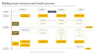
Bidding team resources and tender process
-
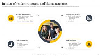
Impacts of tendering process and bid management
-
Tender submission and bid management icon
-
Legal tender and auction bid icon
-
Outbid tender and winning pitch icon
-

Tender
-

-

-

-

-

FAQs for Tender Presentation Powerpoint
So for your tender template, you'll want an exec summary up front, company overview, and how you understand their project. Add your methodology, timeline, team bios, and pricing breakdown. References are huge - honestly, past work examples can make or break you. Include a problem statement so they know you actually get what they need. Risk management stuff too. Make it super scannable with headers and bullet points because nobody reads walls of text anymore. Oh, and throw a one-page summary at the very beginning since executives barely have time to breathe. Build the template once, then just tweak it for each bid.
Good design seriously makes a difference in tenders. Most of them look like someone just dumped text on a page, so you'll stand out immediately. Clean layouts help evaluators actually find what they're looking for. Charts work way better than paragraph after paragraph of boring details. Your brand colors should be consistent throughout - sounds obvious but you'd be surprised how many people mess this up. Bold text and callout boxes make key points jump out. White space is your friend here. The whole point is making their job easier so they remember you instead of forgetting about proposal
-
The presentations are very helpful. I am always able to get appropriate templates for the different topics related to my profession.
-
The designs are super attractive. Me and my team love using SlideTeam’s presentations.