


Thank you ppt example professional





Try Before you Buy Download Free Sample Product
 Impress Your
 Audience
 100%
100% Editable
 Save Hours
 of Time


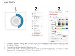
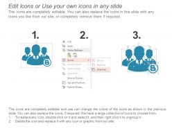
Cast a positive impression on your potential customers by incorporating this Thank You PPT slide at the end of your presentation. Show your appreciation and gratitude towards your audience with the assistance of this invigorating PPT template. You can easily display your contact information, address, and email details in our acknowledgment PPT theme. Employ our content-ready professionally created PPT layout to highlight your infographics. This innovative PPT design also allows you to edit or add any text or image according to your preference and requirements. Include our thank you PPT graphic to showcase your willingness to collaborate with your prospective clients. Conclude your content with this appropriate and suitable PPT theme. This well-color-coded and vibrant PPT visual is the best option for your business purposes. Leave a lasting impression on your potential clients with the assistance of this PPT slide. Download this PPT presentation to impress your audience with your creativeness.
People who downloaded this PowerPoint presentation also viewed the following :
Thank you ppt example professional with all 5 slides:
Create equal facilities for all with our Thank You Ppt Example Professional. It will discourage any disparity.


FAQs for Thank you
Don't just slap "Thanks!" on your last slide and call it a day - that's so lazy lol. Make sure you actually say thank you, but also include your contact info so people can reach you later. Add your email, LinkedIn, whatever works. Then throw in something to keep them engaged like "Questions?" or "Let's talk next steps." Oh and if you want, you can recap your main point real quick as a visual reminder. The whole thing is about making it super easy for people to hit you up afterward. You'll be surprised how many people actually will if you give them a clear way to do it.
Honestly, visuals are a game-changer for thank you slides. People's brains are fried by the end of your presentation, so a good image snaps them back to attention. I'd go with something that ties to your main message - maybe a photo, some clean icons, or just a design that fits your brand vibe. It creates this little emotional moment that sticks with them way better than boring text. Oh, and don't go overboard with multiple graphics. One strong visual beats a cluttered mess every time. That's what separates the memorable presentations from the forgettable ones.
Honestly, just stick with boring professional colors that match your deck. Deep blues or charcoal gray are safe bets. White background with dark text is my go-to - can't mess that up. Skip the neon stuff unless your workplace is super laid back (which, let's be real, most aren't). You want good contrast so people can actually read it. Brand colors work if they're not hideous. Otherwise just copy whatever colors you used in the rest of your slides so it doesn't look weird.
Oh totally! You'd be shocked how much this matters. Red's super lucky in China but screams "danger" here in the West. White means purity to us but represents mourning in parts of Asia - learned that one the hard way at a conference once. Japanese and Arab audiences want subtle, relationship-focused language while Germans and Americans prefer you just get to the point. My advice? Find someone local to review your slides first, or at least do a quick Google search on cultural norms. Trust me, it's way easier than dealing with awkward silence after your presentation!
Throw in specific details about your audience - that's what makes it stick. Reference something from your actual presentation or mention their company by name. I've seen people drop in photos from the event or reference local stuff that gets everyone nodding. Inside jokes work great too if you can pull it off naturally. Short sentences hit different. Then mix in your contact info that's actually relevant to what they're dealing with. The whole point is making it feel custom-made for them, not like slide
-
Very unique, user-friendly presentation interface.
-
Great product with effective design. Helped a lot in our corporate presentations. Easy to edit and stunning visuals.