

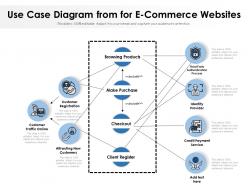
Use case diagram from for e commerce websites





Try Before you Buy Download Free Sample Product
 Impress Your
 Audience
 100%
100% Editable
 Save Hours
 of Time


Our Use Case Diagram From For E Commerce Websites are explicit and effective. They combine clarity and concise expression.
People who downloaded this PowerPoint presentation also viewed the following :
Use case diagram from for e commerce websites with all 2 slides:
Give your audience a fulfilling experience. They will find our Use Case Diagram From For E Commerce Websites elevating.
FAQs for Use case diagram from for
For an e-commerce system, you'll want **Customer** (covers both guest and registered users), **Admin**, and **Payment Gateway** as your external system. Depending on how complex you're going, maybe throw in **Inventory System** and **Shipping Provider** too. I've seen people split customers into separate guest/registered actors, but honestly? Just use one Customer actor - way cleaner that way. Admin does all the backend management stuff. Oh, and you might need **Customer Service Rep** later if your system gets fancy with support features. Start with those core ones first. You can always add more specific actors as things get more complicated.
Just draw lines connecting your actors to the use cases they can do. Customer gets connected to "Browse Products," "Add to Cart," whatever. Pretty straightforward. The hard part? Don't go crazy with detail - I learned that the hard way on my first diagram. Focus on actual business goals, not every button click. Map your main user types first, then draw lines to their key actions. Keep use cases meaningful rather than getting into the weeds. You'll thank yourself later when it's actually readable.
Your main use cases should be the obvious shopping stuff - Browse Products, Search, View Details, Add to Cart, Checkout. Then throw in Create Account and Manage Profile. Track Orders and Leave Reviews are pretty much expected these days, so definitely include those. Oh and Returns/Exchanges - seriously, that one gets forgotten all the time but customers will riot if it's not there lol. When you're drawing it out, group the shopping flow together since it all connects naturally. Also show how Guest and Registered Customer might inherit from a basic Customer actor. Makes the whole thing cleaner.
User roles totally change how you set up your use case diagram. Admin gets access to everything - inventory, refunds, analytics, review moderation. Guest users? They're basically stuck browsing and maybe adding stuff to cart until they hit the registration prompt (which is honestly pretty annoying). Regular customers sit in the middle with buying, order tracking, and account stuff. You'll want to map out each role's specific permissions first, then design your use cases around those limits. Makes it way clearer for developers to know what features to lock down or open up.
You definitely need to add some mobile-specific stuff to that diagram! QR code scanning is huge now - people constantly use it for quick product lookups. Location services too, so users can find stores nearby or check if something's in stock locally. Push notifications are a must for deals and shipping updates. Apple Pay and Google Pay should be in there since honestly, mobile payments are way easier than typing card info on a tiny screen. Social sharing is another big one - people love posting products they're eyeing. I always forget how different mobile shopping really is from desktop, but these behaviors are super common and you'd be missing key interactions without them.
Use case diagrams are honestly great for figuring out what your e-commerce site needs to do upfront. Map out all the main stuff - customers browsing, adding to cart, checkout flow, admins dealing with inventory. Plus returns (ugh, always fun). Stakeholders actually get excited about visual stuff instead of drowning in docs. Each diagram becomes a requirement you can track later. Start with your key players - customers, admins, payment systems - then work out what they're trying to accomplish. You'll have a solid foundation that makes way more sense than random feature lists.
Payment processing is super important to map out - it's where customers actually complete their purchases and honestly, it's where things get messy fast. You'll see all the key players involved (customer, payment gateway, banks) and what happens when stuff breaks. Most e-commerce headaches I've seen start here tbh. Breaking it into smaller pieces like "validate payment" and "process refund" makes way more sense than trying to tackle the whole thing at once. Plus you'll catch security issues and figure out your third-party integrations early, which saves you tons of pain later.
Put those third-party shipping services outside your system boundary as external actors, not use cases. Connect them to whatever use cases they actually touch - like "Process Shipment" or "Track Package." Basically, treat them as separate entities your system communicates with. Don't get caught up in the API stuff or technical details - that's not what use case diagrams are for. Keep it business-focused. Figure out which of your use cases actually need these services first. Then draw those connections. Way easier than trying to model the whole integration mess.
Oof, scope creep will be your worst enemy here. E-commerce systems are basically a web of features that'll turn your diagram into spaghetti real quick. Finding the right detail level is tricky - like, you could break "place order" into 20 tiny steps but then what's the point? Also stakeholders love throwing in "oh just add this one thing" halfway through (so annoying). The actor mess gets wild too when customers, admins, vendors and payment systems are all doing their thing. Honestly? Map out your core user flows first. Build from there piece by piece instead of trying to capture everything upfront.
So use case diagrams basically let you see every spot where customers interact with your site. Super helpful for catching those annoying friction points that kill conversions. Map out the whole journey - browsing, checkout, support stuff - and you'll spot exactly where people bail out. Honestly, I wish more teams did this before launching features. Start with your main user flows first, then tackle the weird edge cases later. It's like getting that overhead view of what's actually broken vs what you think might be broken. Way better than just guessing at optimization priorities.
Honestly, Lucidchart and Draw.io are your best bets - super intuitive and they've got templates to get you rolling. If you're already using Microsoft stuff, Visio's solid too. Visual Paradigm has crazy good UML features but might be way more than you need (depends on how complex this thing gets). Pro tip: tons of teams just sketch these on whiteboards first before making them all fancy digitally. I'd start with whatever tool you're already using for docs, then switch later if you need something beefier. Don't overthink it at first.
Honestly, I'd start with the obvious stuff - customer flow from browsing to buying to after they get their order. Then pile on all the admin headaches like inventory tracking and user management. Map out everything working perfectly first, then think about what breaks. Talk to people in different departments because they'll spot things you totally missed. I know it sounds basic, but checking out competitor sites actually helps you catch random scenarios. Your first attempt will suck - that's normal. Keep adding edge cases as you find them. Oh, and if you have user stories lying around, cross-check those too.
So use case diagrams are pretty solid for agile e-commerce stuff - they basically turn your user stories into something visual that actually makes sense. You can break down the whole customer journey into pieces like "Browse Products" or "Process Payment" that your team can sprint on. What's nice is you're dealing with different user types (customers, admins, vendors) and it gets messy fast without some kind of map. The visual thing really helps when you're showing stakeholders too, way less confusing than just talking through features. Oh and definitely update them after sprint retros - your product backlog's gonna change and you don't want your diagrams getting stale.
User feedback is basically your reality check for use case diagrams - it shows you what actually happens vs what you think happens. Real customers will catch missing use cases like "save items for comparison" that you totally overlooked. They'll also point out when your "simple checkout" is actually super complicated. Honestly, I've seen too many diagrams that seemed perfect but missed obvious stuff users deal with daily. Don't forget about actors you missed either - gift recipients, customer service people, etc. Just run quick interviews asking about their typical shopping flow, then fix your diagrams based on what they say.
First thing - double-check your actors are actually external people/systems, not internal stuff. Customers, payment processors, shipping companies, yeah. Internal processes, nah. Walk through each use case like you're the actual user. I swear this catches the weirdest gaps every time! Make sure they're goal-focused too - "complete purchase" not "validate credit card." That's more of a behind-the-scenes thing. Definitely get stakeholders to look it over. They always spot business requirements I totally missed. Oh, and don't forget the main paths: browsing, ordering, payment, customer service scenarios. Those are your bread and butter.
No Reviews