


Waste management tracking dashboard municipal solid waste management ppt formats




Try Before you Buy Download Free Sample Product
 Impress Your
 Audience
 100%
100% Editable
 Save Hours
 of Time


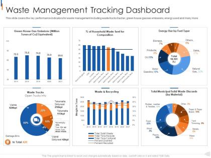
This slide covers the key performance indicators for waste management including waste trucks tracker, green house gasses emissions, energy used and many more.
People who downloaded this PowerPoint presentation also viewed the following :
Waste management tracking dashboard municipal solid waste management ppt formats with all 2 slides:
Use our Waste Management Tracking Dashboard Municipal Solid Waste Management Ppt Formats to effectively help you save your valuable time. They are readymade to fit into any presentation structure.

FAQs for Waste management tracking dashboard municipal solid waste
Start with waste generation rates and diversion percentages - basically how much you're recycling vs dumping. Cost per ton matters too, obviously. Track your missed pickups religiously because nothing pisses off customers faster than that. Contamination rates in recycling are crucial since dirty streams cost you more to process. Real-time truck data helps catch route problems before they get expensive. Compliance stuff if you're dealing with regulations (ugh). Honestly, don't overcomplicate it at first - get your team used to these basics, then add the fancy metrics later.
Honestly, data visualization is a total game-changer for waste management. You're not stuck squinting at boring spreadsheets anymore – instead you get actual maps and charts that show you what's going wrong. Like, you can instantly see which routes suck, where bins are overflowing, or if your recycling numbers are tanking. We should've started doing this years ago, would've saved us so much hassle. Seasonal spikes? Equipment breaking down? You'll catch it right away and fix things before they get expensive. Start with mapping your collection routes first – that's where you'll see the biggest impact immediately.
Focus on data quality first - set up automated validation so you don't end up with ridiculous readings like negative waste levels (learned that one the hard way). Update every 15-30 minutes instead of real-time since waste doesn't change that fast anyway. Your system will thank you. Make sure users can tell when data's stale or sensors are down with clear visual cues. Honestly, the biggest mistake is trying to do everything at once. Pick one data source, get that working smoothly, then add more. Way less headache that way.
So basically, the dashboard breaks down everything you're tossing - by type, volume, how you're getting rid of it. Pretty eye-opening stuff. You might find out you're dumping cardboard that recyclers would actually pay for (happened to my last company, we felt pretty dumb). It tracks your recycling rates over time too, plus shows cost comparisons between just throwing stuff away versus recycling it. Honestly, start with whatever you're throwing away the most of - that's where the money is. Those smaller waste streams can wait.
Dude, UI design will make or break this whole thing. Your team won't touch it if they can't find what they need fast - collection schedules, route stuff, capacity alerts should be right there upfront. I swear, half these dashboards look like NASA control rooms and get abandoned after a week. Color coding works great for priorities, plus drag-and-drop for route changes. Mobile-friendly is huge since field crews are never at desks. Oh, and definitely map out how your team actually works first, then build around that workflow. Sounds obvious but you'd be surprised how many people skip that step.
So predictive analytics is basically like having a crystal ball for your waste management stuff. Your system learns from past data to forecast when bins will overflow, predict truck breakdowns, and figure out the best collection routes. Instead of scrambling when things go wrong, you're already three steps ahead. It's honestly pretty cool - kind of like how Netflix knows what you want to watch, but for garbage trucks. You can optimize schedules way better and cut down on fuel costs. Start small though. Pick your most obvious waste patterns first and build up from there.
Start with whatever data you can grab easily - waste collection systems, recycling facilities, landfill reports, that kind of stuff. Your finance team's cost data is honestly where you'll find the biggest headaches though! Hauler reports are solid too. If you've got any IoT sensors on bins or trucks, definitely pull that in. Oh, and compliance reports from environmental agencies - boring but necessary. Weather data might seem weird but it actually affects collection schedules more than you'd think. My friend's company saw huge patterns there. Just build it out piece by piece.
Dude, you're gonna love this - it basically handles all that boring compliance crap you're doing by hand right now. Tracks waste volumes and disposal methods automatically, then spits out whatever reports the EPA wants. No more last-minute panic before deadlines! It flags you when you're getting close to permit limits too, which honestly saved my ass more than once. Inspectors show up? Just pull the historical data instantly instead of digging through filing cabinets. Set it to auto-generate monthly reports and you're golden. Real game-changer for staying on top of violations.
Honestly, the hardest part is usually your data being a total mess. It's probably spread across different systems, maybe some old spreadsheets (we've all been there), and you'll spend forever cleaning it up. Connecting everything - hauler data, facility systems, compliance stuff - that's where things get annoying. But here's what nobody talks about: you can build the most beautiful dashboard ever and people still won't use it if they don't get it. Training matters way more than you'd think. I'd start by figuring out where your data lives now and what's causing you the biggest headaches.
Honestly, dashboards are perfect for this! Real-time collection schedules and recycling rates by neighborhood make everything so much clearer than those awful quarterly reports. People actually want to see this stuff when it's interactive. Set up public displays around town, maybe add maps showing problem areas - residents can even report issues directly through it. The visual charts help everyone understand their actual impact, which is pretty cool. Oh, and definitely figure out what metrics your community cares about first. That'll save you time building features nobody uses.
Honestly, the shared workspace thing is a game changer for getting departments to actually work together. Set up role-based access so operations sees their stuff, finance sees theirs - nobody gets buried in irrelevant data. Comment threads beat email chains by miles, trust me on that one. Real-time notifications are clutch when routes change or budgets get shifted around. Oh, and the shared calendar for maintenance scheduling? Super helpful. I'd start with department-specific views first though - let everyone get comfortable with their own dashboard before you throw all the collaboration features at them.
Honestly, mobile access is a game changer for waste management dashboards. Your drivers can update collection statuses right from their phones instead of waiting to get back to base. Real-time data means supervisors actually know what's happening out there and can jump on problems fast. No more of that annoying delay where something goes wrong but nobody finds out until hours later. Field teams can report issues on the spot too. Just make sure the thing actually works well on phone screens – I've seen too many dashboards that look great on desktop but are basically unusable on mobile. That'll just tick everyone off.
Honestly, a few cities are crushing it with waste dashboards. San Francisco's tracks diversion rates live and got them to 80% - pretty impressive. Amsterdam went full tech nerd with IoT sensors in their bins, which cut collection routes by 30%. Singapore does this cool thing where they mix citizen reports with predictive stuff to stop overflows. Oh, and Barcelona made theirs open-source if you're into that. My advice? Don't overthink it at first. Start with basic metrics, then add the fancy sensors later when you've got more cash to throw around.
So ML can predict when your bins will actually be full instead of just guessing - saves you from those annoying overflow situations. Route optimization is where I'd start though, you'll see the money savings right away. The algorithms get weirdly good at spotting patterns in weather data and local events that mess with waste generation. You can even catch contamination in recycling automatically, which is honestly kind of satisfying to watch. Oh, and it flags weird data anomalies without you having to dig through spreadsheets all day. Definitely go for route optimization first - that's your quick win.
Honestly, sustainability should drive every decision when you're building that dashboard. Focus on metrics that actually matter - carbon footprint, recycling rates, contamination levels. The pretty charts are nice but they're useless if people can't quickly spot where they can cut waste. Make it super obvious when teams hit their targets too, people love seeing those wins. I mean, good environmental choices usually save money anyway so it's a win-win. Just don't get caught up in tracking everything - pick the stuff that'll actually inspire people to take action.
-
Great quality product.
-
Nice and innovative design.
-
Best way of representation of the topic.
-
Awesome presentation, really professional and easy to edit.