


0514 concept map format powerpoint presentation




Try Before you Buy Download Free Sample Product
 Impress Your
 Audience
 100%
100% Editable
 Save Hours
 of Time


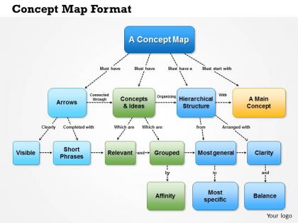
Looking for a unique PPT design to organize and comprehend information, helps to depict relationships and set objectives? Then there’s good news for you, our team of very professional experts have designed the best in industry concept map format PowerPoint presentation which helps to set meaningful connections which is easy to be comprehended by the students or business professionals and thus easily transform set of information into knowledge. It is important to have brainstorming activities in educational institutions where students use PPT design to a challenged task and set connecting between various concepts or by putting to use a presentation slide show to solve a problem, look into cause and effect relationship and set information into sequence so that it is easy to comprehend and understand the topic. Even the business sector can put to use this presentation visual for organizing the thoughts and ideas and in solving the issues or to illustrate in depth ideas plus set up a hierarchical structure for understanding the information. Radiate confidence with our 0514 Concept Map Format Powerpoint Presentation. Your self belief will emanate from your views.
People who downloaded this PowerPoint presentation also viewed the following :
0514 concept map format powerpoint presentation with all 5 slides:
Give your brand a leg up. Highlight your USP on our 0514 Concept Map Format Powerpoint Presentation.
FAQs for 0514 concept map
A concept map is a visual diagram that illustrates relationships between ideas through interconnected nodes and linking words, differing from traditional linear outlines by showing hierarchical and cross-connections simultaneously. While traditional outlines present information sequentially through bullet points and numbered lists, concept maps enable presenters to demonstrate complex relationships, cause-and-effect patterns, and interdependencies, ultimately delivering more comprehensive understanding and enhanced audience engagement.
Concept maps enhance audience understanding by visually organizing complex relationships, simplifying information hierarchies, and enabling viewers to follow logical connections between ideas more intuitively. These visual frameworks streamline knowledge transfer through clear pathways, interactive elements, and structured layouts, with many educators and business professionals finding that audiences retain information significantly better, ultimately delivering improved comprehension and engagement outcomes.
Key elements include a central concept or theme, hierarchical branching structure, connecting lines with relationship labels, color-coded categories, and clear visual hierarchy with consistent fonts and spacing. These design components work together by organizing complex information into digestible visual pathways, enabling presenters to demonstrate connections between ideas effectively, while audiences can follow logical progressions more intuitively, ultimately delivering clearer communication and enhanced comprehension.
Color coding in concept maps enhances information retention by creating visual associations, establishing clear hierarchical relationships, and enabling faster pattern recognition across complex information networks. This strategic approach helps viewers process and remember interconnected concepts more effectively, with many educational institutions and corporate training programs finding that color-differentiated mapping significantly improves comprehension and recall rates.
PowerPoint offers several built-in tools for creating effective concept maps, including SmartArt graphics, shapes and connectors, text boxes, and drawing tools. These features enable users to design hierarchical structures, customize layouts with various formatting options, and create professional visual representations of complex relationships, with many educators and business professionals finding that PowerPoint's accessibility and integration capabilities streamline concept map development across organizations.
Concept maps facilitate collaborative presentations by enabling visual brainstorming, shared knowledge mapping, real-time idea organization, and collective problem-solving among team members. Through interactive mapping tools, teams streamline complex project discussions, enhance cross-departmental communication, and ensure all stakeholders understand interconnected concepts, with many organizations finding that visual collaboration ultimately delivers faster consensus-building and more comprehensive strategic outcomes.
Common mistakes include overcrowding slides with excessive information, using inconsistent formatting across connecting elements, creating unclear hierarchical relationships, choosing poor color schemes that reduce readability, and neglecting proper spacing between concepts. These design flaws undermine comprehension and visual flow, with many educators and business professionals finding that strategic simplification, consistent visual standards, and clear concept groupings ultimately deliver more effective knowledge transfer and audience engagement.
Balancing aesthetics and clarity in concept map presentations involves using consistent color schemes, readable fonts, strategic white space, and logical visual hierarchy to guide audience attention. Through thoughtful design choices like limiting color palettes, maintaining uniform node sizes, and ensuring clear connection lines, presenters create visually appealing maps that enhance comprehension, ultimately delivering more engaging and effective communication experiences.
Hierarchy establishes clear information structure within concept maps by positioning broader, more general concepts at the top and progressively narrower, specific details below them. This top-down organization enables viewers to quickly grasp main themes before diving into supporting details, ultimately enhancing comprehension and retention in business presentations, educational materials, and strategic planning sessions.
Concept maps can be tailored by incorporating visual elements like colors and icons for visual learners, adding detailed text explanations for reading-focused audiences, and including interactive components for kinesthetic learners. These design adaptations enable presenters to engage diverse audiences simultaneously, with many educators and corporate trainers finding that multi-modal concept maps significantly improve comprehension and retention across different learning preferences.
Creative multimedia integration includes interactive videos, clickable audio explanations, animated transitions between concepts, embedded infographics, and dynamic visual elements like hover effects or progressive reveals. These elements enhance audience engagement by transforming static concept maps into immersive learning experiences, with many educators and business presenters finding that multimedia-rich presentations improve comprehension rates and retention while delivering more compelling, memorable content.
Concept maps enhance presentations by visually organizing information through interconnected nodes, making complex relationships clear for audiences across educational lectures, business strategy meetings, and creative brainstorming sessions. Educational presenters use them to show curriculum connections, business professionals leverage them for process mapping and strategic planning, while creative teams employ them for project workflows, ultimately delivering improved comprehension and engagement.
**INPUT**: What strategies can be employed to effectively present a concept map to an audience? **OUTPUT**: Effective concept map presentation strategies include using hierarchical visual flow, progressive disclosure techniques, interactive navigation elements, clear color coding systems, and audience engagement methods. These approaches streamline complex information delivery by guiding viewer attention systematically, enabling step-by-step concept exploration, and facilitating better knowledge retention, with many educators and business presenters finding that strategic visual organization ultimately enhances comprehension and drives meaningful discussions. [Word count: 60 words]
Effective concept maps maintain engagement through strategic design choices including clear hierarchical organization, consistent visual elements, limited color palettes, readable fonts, and balanced white space distribution. By focusing on essential connections, using progressive disclosure techniques, and incorporating interactive elements where possible, presenters can guide audience attention systematically while preventing cognitive overload, ultimately delivering clearer understanding and stronger retention.
Concept map templates offer pre-designed layouts, professional formatting, consistent visual hierarchy, and time-saving structures that eliminate design guesswork. These templates streamline presentation development by providing tested frameworks, enhancing visual clarity, and ensuring professional aesthetics, with many organizations finding that standardized formats improve team collaboration and audience comprehension significantly.
-
Great quality slides in rapid time.
-
Design layout is very impressive.