


0514 product tree diagram powerpoint presentation




Try Before you Buy Download Free Sample Product
 Impress Your
 Audience
 100%
100% Editable
 Save Hours
 of Time


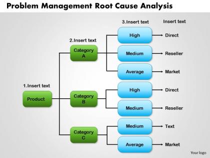
Here’s a product tree diagram for depiction of product structure modeling or the bill of materials in our elegantly streamlined PowerPoint presentation so that your enterprise can be effectively responsive to the individualistic tastes of consumers without having to tackle unmanageable critical product information record which includes the list of raw material, sub-parts, assembly components etc. and the quantity of each of the aforementioned items required to make a final product. This PPT slide can showcase the product breakdown through constituent components and the relationship with the main product. When you are looking at a root cause analysis for determination of the true source of a disruption in service, this PowerPoint presentation slide can be equally helpful as it can depict fault tree analysis or chronological analysis before the results can be delivered to somebody in the senior management for chalking out the problem management and elimination guidelines within a fixed timeline with centers of responsibility clearly defined. Our 0514 Product Tree Diagram Powerpoint Presentation are like ingredients in your recipe of sucess. Stir them together and get people licking their lips.
People who downloaded this PowerPoint presentation also viewed the following :
0514 product tree diagram powerpoint presentation with all 5 slides:
Get an exceptional group with our 0514 Product Tree Diagram Powerpoint Presentation. They will all combine excellently.

FAQs for 0514 product tree
So basically you're creating a visual breakdown of your entire product - like a family tree but for features instead of people. Start with your main product at the top, then work down through all the components and sub-features. It shows how everything connects and depends on each other. Honestly, it's a lifesaver for spotting gaps you'd otherwise miss during development. Super helpful when you're planning releases or need to explain the whole structure to stakeholders who don't get the technical side. You'll probably discover stuff about your own product that surprises you.
So basically you map out your features like branches on a tree, with the main user needs as the trunk. Makes it way easier to see what's actually useful vs random stuff you thought sounded cool. I started doing this after our last sprint disaster - honestly wish I'd known about it sooner. You can spot where you're missing features users need, plus where you've gone overboard building things nobody asked for. Stakeholders get it instantly since it's visual. Definitely try sketching one before your next feature review.
So for your Product Tree Diagram, put the main product goal at the top - that's your trunk. Major feature themes become the big branches, then specific features and user stories are the smaller ones. Here's what trips people up though: they forget to add actual metrics to each branch. Don't be that person! Color-code or size things to show priorities, and make the relationships between features super obvious. Keep it visual since you'll be staring at this thing in every planning meeting. Oh, and use it constantly - otherwise what's the point of making it pretty?
Honestly, these diagrams are perfect when you're drowning in features that don't seem connected. I use them all the time during roadmap planning - especially when people keep asking how different parts relate. New team members love them too since they can see the whole picture fast. The real magic happens during prioritization though. You'll spot which features actually support your main goals versus the random stuff that just sounds cool. Dependencies become super obvious too, which - trust me - saves you from those "oh crap" moments later. Worth sketching one before sprint planning.
So basically you put your most important features near the "trunk" - that's your core product. Then branch out with less critical stuff. Map your main user flows as the thick branches first, then add other features as smaller ones based on impact and business value. Honestly, this approach is way better than spreadsheets because you can actually *see* when one area is getting too bloated. Get your team to physically move things around until it feels right. Oh, and try color-coding by effort level - makes it super obvious where the quick wins are hiding.
Miro and Mural are probably your best choices here - both have solid templates and are built for teams to work together. Lucidchart's good too if you want something more structured. FigJam works great for most people though, and it's pretty straightforward. The main thing is making sure everyone on your team can actually access and edit it together. That's where these diagrams really shine. Honestly? I'd just go with whatever tool you're already using as a team. Why add another password to remember when you don't have to, right? Start there and see how it goes.
Okay so basically a Product Tree Diagram just maps out how all your features connect to your main goals visually. Super helpful when your stakeholders keep talking past each other (which, let's be honest, happens constantly). When someone throws out a random feature idea, you can literally point at the tree and be like "okay but where does this actually fit?" The visual makes it way easier to have those priority conversations that usually get pushed off until it's too late. I'd definitely try walking through one in your next planning meeting - honestly surprised how fast people get aligned when they can see everything laid out like that.
Honestly, the worst thing you can do is go crazy with detail upfront. You'll just overwhelm yourself and miss the forest for the trees. Also don't mix random stuff at the same level - like throwing UI buttons next to major feature categories. That's just messy. Start with maybe 3-5 big branches, then dig deeper later. And here's what kills me - teams will spend forever perfecting these trees internally, then show users who are completely lost because they think about the product totally differently. Test it with real people! Keep things simple at first, complexity comes naturally as you build it out.
So Product Tree Diagrams are perfect for sprint planning - they show how your stories actually tie back to the big picture stuff. Map your epics as main branches, then break those down into features and smaller stories. Your team will finally see why they're building what they're building instead of just cranking through random tickets. I usually make one during PI planning or quarterly sessions, then we pull it up every week during sprint planning. Trust me, it stops your backlog from turning into complete chaos. The dependency spotting alone makes it worth doing - plus stakeholders love seeing everything connected visually.
So Product Trees are basically like family trees but for features - they show how everything connects to your main goals and user needs. Traditional roadmaps? Those are all about timelines and shipping dates. Trees help you figure out WHY something matters, not just WHEN it'll be done. You can see dependencies way clearer this way. Honestly, I think Trees are way better for prioritizing based on actual strategic value instead of just delivery pressure. Use them when you need to explain feature decisions to stakeholders or double-check that your product strategy actually makes sense. Roadmaps still have their place, but Trees give you the bigger picture.
So grab feedback from surveys, support tickets, whatever you've got. Then match each piece to the right branch on your Product Tree. I do this color-coding thing - green for good stuff, red for complaints, yellow for requests. Works pretty well actually. Patterns jump out super fast this way, plus you can see which parts are getting hammered with issues. Keep updating it when new feedback rolls in. Honestly, using this during sprint planning is a game-changer - you'll focus on what users actually need instead of those shiny features everyone gets excited about internally.
So for Product Tree Diagrams, color coding is your best friend - use different colors for each feature category. Make sure your font sizes are actually readable (I've seen way too many tiny unreadable ones). Icons next to features help people scan faster, which is clutch when you're presenting to stakeholders. Spacing between hierarchy levels needs to be clear, and don't go crazy with connecting lines. Priority indicators work great - stars, traffic light colors, whatever. Oh, and leave white space! Nobody wants to stare at a cluttered mess. These tweaks will turn your diagram from confusing to actually useful.
Yeah totally! Product Tree Diagrams work for both physical and digital stuff. Physical products break down into components, materials, manufacturing steps - that kind of thing. Digital ones are more about features, user flows, technical modules. I use them all the time for mobile apps actually - super helpful for mapping screens and functionality. Though honestly, the trick is just adapting your categories to whatever makes sense for your specific product. Start with your main product as the trunk, then break it into chunks your team will get. Don't overthink it.
Walk them through the tree structure visually first - show how features connect to themes and your main product vision. Don't just throw up slides though, people tune out immediately. Make it interactive! Use real user stories they'll actually recognize so the branches feel concrete, not abstract. I'd color-code everything by priority or team ownership - makes it way easier to scan what matters most. Save plenty of time for questions because you'll need to dive into specific branches. Your real goal here is getting everyone aligned on how their work fits the bigger picture, not just dumping information on them.
Quarterly reviews are usually perfect timing, or right after big feature drops. Don't be like those teams obsessing over weekly updates - total waste of time. Every 2-3 months hits the sweet spot, unless you're shifting strategy or making major priority calls. The whole point is keeping it current with what users actually need and where the business is heading. Not some dusty document nobody looks at. Oh, and definitely set a recurring reminder with your team - otherwise you'll forget about it for six months and then scramble to update everything at once.
-
Professional and unique presentations.
-
Great experience, I would definitely use your services further.