


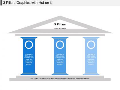
3 pillars graphics with hut on it




Try Before you Buy Download Free Sample Product
 Impress Your
 Audience
 100%
100% Editable
 Save Hours
 of Time


A fine finish is guaranteed with our 3 Pillars Graphics With Hut On It. They are designed to make it happen.
People who downloaded this PowerPoint presentation also viewed the following :
3 pillars graphics with hut on it with all 5 slides:
Have a bash with our 3 Pillars Graphics With Hut On It. Get the gang dancing to your tune.
FAQs for 3 pillars graphics with
Okay so three main things - structure, emotion, and relevance. Structure's pretty obvious, right? Beginning-middle-end so people can actually follow you. The emotional piece is huge though - most people just vomit spreadsheets at their audience instead of making them *feel* something. Third is relevance to whoever you're talking to. Like, what do they actually care about? I've seen gorgeous presentations totally bomb because they missed this part. Even if you nail the first two, wrong audience focus = dead presentation. Quick test for your next one: can you check all three boxes?
Honestly, design pillars are what make or break whether people actually stick around. When you get consistency and visual hierarchy right, users can follow along without getting lost or annoyed. I've watched too many teams bomb because they rushed past this stuff. Good pillars create that seamless "this just works" feeling. Plus everything becomes way more memorable since it all reinforces the same vibe. Oh, and here's the thing - you don't need like 10 principles. Just pick 3-4 solid ones for your project and let those guide every choice you make. Trust me on this one.
So basically there are four key things that make data viz actually work - clarity, accuracy, efficiency, and aesthetics. You want people to immediately understand what you're showing them (clarity), trust that your numbers are right (accuracy), and find insights without drowning in visual chaos. I swear some dashboards look like a rainbow exploded on them. Aesthetics isn't just about being pretty - it keeps people looking long enough to actually absorb what you're trying to tell them. Get all four right and you'll turn boring spreadsheets into something that actually makes people want to take action.
Figure out who you're presenting to first - do they care more about how it looks or what it actually tells them? Clean layouts are your friend here. Don't go overboard with fancy graphics that distract from your point. I've sat through way too many beautiful presentations that were basically empty inside, ugh. White space is clutch for readability. Pick fonts people can actually see from the back row. Every visual should have a reason for being there. You want the design to make your content pop, not fight against it. Keep it consistent throughout and you'll look way more professional.
Honestly, it comes down to three things: structure, story, and support. Make sure there's a clear flow - beginning, middle, end. People's brains just work better that way. Wrap your points in some kind of story because facts alone are boring (learned this the hard way lol). Back it up with real stuff - data, examples, whatever proves your point. Hook them at the start, build your case in the middle, then push for action at the end. There's that old rule about telling them what you'll say, saying it, then recap. Sounds repetitive but it actually works. Focus on those three pillars and you'll nail it.
Oh man, this is so true from experience! Different cultures totally change how people receive your main points. Like, Americans love straight facts and data, but when I presented in Japan once, they needed way more background story first. Some cultures want everything ranked by importance, others hate that rigid approach. Honestly, the hierarchy thing can make or break you. My advice? Do your homework on communication styles beforehand. If you know someone local, definitely pick their brain about it. Trust me, it's worth the extra effort to avoid that awkward silence when your opener bombs.
Focus on three things: storytelling, interaction, and visuals that don't suck. Our brains just process stories way better than random facts - it's weird but true. Every 5-7 minutes, throw in a poll or ask questions so people stay awake. And seriously, clean up those slides. I still see terrible PowerPoint everywhere and it's painful. Once people start scrolling their phones, you've lost them. Oh, and don't try to nail all three at once - pick whichever feels easiest first, then add the others. You've got this!
Dude, tech can totally transform your presentations if you use it right. Interactive stuff like polls keeps people awake instead of scrolling their phones. Animations and charts make complex ideas way clearer than boring bullet points. I'm obsessed with real-time feedback tools - you can actually see what's working. But honestly? The most important thing is having a backup plan when everything crashes. Which it will, trust me lol. Just start with one interactive thing next time. You'll be shocked how much it changes the vibe in the room.
Honestly, it comes down to three things: confidence, empathy, and clarity. Confidence means actually believing what you're saying - people pick up on that energy immediately. Reading the room is huge too (empathy, basically) - like, adjusting your vibe based on whether they're into it or completely zoned out. That one's tricky but game-changing. Then there's clarity - just organizing your thoughts so you don't lose people in random tangents or industry speak. I swear these work together to build real trust. Next presentation, maybe just focus on nailing one of these? You'll notice the difference right away.
Honestly, feedback is like getting a health check for your presentation skills. I know it's awkward to ask - I still get a little weird about it too - but focus on three main areas: how clear your content was, your delivery, and whether you kept people engaged. The real magic happens when you start seeing patterns. Like if three different people say you talked too fast during the important parts, boom - there's your answer. Fix whatever got hit the hardest next time around, then specifically ask if that part felt better. It's pretty much the only way I've gotten better at this stuff.
Honestly, remote presentations are way trickier than in-person ones. People zone out so easily at home - I've definitely been guilty of scrolling Instagram during meetings. Audio quality is huge, way more important than having perfect video, so get a decent mic if you can. Make everything super readable on small screens and throw in polls or breakout rooms to keep people awake. I always map out each section clearly so nobody gets lost. Oh, and have a backup plan ready because tech will definitely fail you at the worst possible moment. Check in with your audience frequently too - silence is deadly in virtual rooms.
Okay so basically when you actually use those collaboration pillars, your presentation won't suck because everyone's doing what they're good at instead of just randomly splitting up slides. Set up clear communication and roles from the start - otherwise you'll end up with three people talking about the same thing and nobody doing the conclusion (been there, it's painful). The whole feedback thing really works too. People can call out weak ideas and build on good ones, which honestly makes everything way more polished. Just talk about this stuff upfront in your next group project. You'll thank me when you're not scrambling at 2am the night before.
Look, your voice is just mixing your experiences, values, and hot takes in a way only you can. Figure out what you actually care about and the stories that shaped you - boom, there's your content. So many speakers try copying others and it sounds fake as hell. Embrace what makes you weird: your background, your screwups, even those random opinions about your industry. Stop filtering out the "unprofessional" bits of yourself - that's where the good stuff lives. Tell your stories out loud until they feel natural, then sprinkle them throughout your talks. Oh, and practice way more than you think you need to.
Honestly, just focus on three big things: being transparent, staying accurate, and protecting privacy. Don't hide your data sources or pretend your tiny sample size represents everyone. I know it's tempting to only show the stats that make your point look good, but resist that urge! Get consent before using people's personal info. Also think about whether your findings could screw over certain groups unfairly. Here's my test: would you be totally fine if someone made your entire process public? If that makes you nervous, you probably need to fix something first.
Honestly, clear and concise presentations are a game-changer because people actually listen instead of mentally checking out. Nobody wants to decode your corporate buzzwords or sit through endless slides - I've been there, it's painful. When you're direct, your points hit immediately. Being concise? That keeps you from rambling about stuff that doesn't matter. I swear, some presentations could be emails. These two things together mean your message actually sticks with people rather than drowning them in fluff. Before you present anything, just ask: "Would I want to sit through this myself?"
-
Colors used are bright and distinctive.
-
Professional and unique presentations.