

Scope template infographic powerpoint slide designs download





Try Before you Buy Download Free Sample Product
 Impress Your
 Audience
 100%
100% Editable
 Save Hours
 of Time


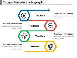
Scope template infographic PowerPoint slide designs download is a generic diagram created for professional business presentations. The simply designed colorful illustration of the scope of business PPT model can be used to present any type of data presentation with cool and minimal visual effect. Business professionals and consultants download this business success strategy PPT presentation graphic to display PowerPoint presentations of business development and business plan. Users can easily classify the elements of a business strategy with the help of this business diagram. Business success is the result of business strategy which is formulated on the basis of business scope. The scope of business strategy and resources can also be used by teachers and educators. Often professionals make use of this PPT to display step by step progress of business development in their company. So now it’s time to impress all the types of professional audiences by making use of this scope of business strategy PowerPoint infographic. Focus on different careers with our Scope Template Infographic Powerpoint Slide Designs Download. Give them a good idea of all the exciting choices available.
People who downloaded this PowerPoint presentation also viewed the following :
Scope template infographic powerpoint slide designs download with all 5 slides:
Initiate action to counter any ill effects with our Scope Template Infographic Powerpoint Slide Designs Download. It helps identify disruptive influences.


FAQs for Scope template infographic powerpoint
You want stuff that's easy to scan quickly - clear sections, consistent icons, maybe some color coding for different phases. White space is clutch so people aren't squinting at a wall of text. Honestly, the templates with timeline elements work great if your project has phases. Don't forget space for assumptions and exclusions because scope creep will bite you. Oh, and test how it looks projected first! I learned that one the hard way when my beautiful laptop template turned into an unreadable mess on the conference room screen. Pick something that fits your brand colors too.
Honestly, infographics are a game-changer for project scope stuff. Nobody wants to read through dense bullet points - your brain just shuts off. Visual elements like flowcharts and timelines actually make people pay attention. You can show how different parts connect instead of just listing everything out. It's way easier for stakeholders to see what's included and what's not when it's mapped out visually. Kind of like the difference between getting directions as a paragraph versus having an actual map, you know? Timeline infographics work great for phases, and process flows are perfect for showing deliverable relationships.
Your charts should actually connect to what you're presenting - like specific milestones or project phases. Stick with colors that match your template. Honestly, cramming tons of complex charts on one slide looks messy. Pick 2-3 metrics that stakeholders actually care about instead. Make axis labels readable (seems obvious but you'd be surprised). Skip the 3D effects - they're just distracting. Oh, and line up your charts with text blocks so it doesn't look like you randomly dropped everything on the slide. Less really is more with this stuff.
Dude, colors can totally make or break your infographics. High contrast is key - nobody wants to squint at neon green text on bright blue (learned that the hard way). I'd stick with 3-4 colors tops, use your brand palette if you have one. Also worth checking how it looks for colorblind folks - red-green combos are rough for them. Quick tip: test everything on different screens first. Your laptop might look amazing, but projectors are brutal and will expose every readability issue you missed.
Honestly, the biggest mistake is cramming way too much text on each slide. Nobody wants to read paragraph dumps - just use clean bullet points that people can actually scan. Also don't go crazy with colors (I learned this the hard way) - stick to 2-3 max or you'll end up with something that looks like a kid's art project. Make your fonts big enough so the person in the back can read it. Those fancy animations? Skip them, they're just annoying. One clear message per slide works best, and keep your spacing consistent so it doesn't look messy.
Keep your animations super simple - fade-ins for bullet points, smooth slide transitions. I can't tell you how many times I've watched people get distracted by spinning text and completely lose track of what's being presented. It's painful. Use entrance animations to show project phases one by one so people can actually follow along. Stick with 0.5-1 second delays and no sound effects. "Appear" or "Fade" work great for text. "Push" transitions between slides look clean without being boring. You're trying to guide their attention, not put on a show.
So basically you just swap out the boring generic stuff for what actually matters in your field. Healthcare teams throw in patient journey icons and clinical phases. Construction? They're all about project milestones with building visuals. Tech people are obsessed with their agile sprints - honestly you can't escape those anywhere these days! Finance folks adapt theirs for budget cycles and compliance stuff. Just grab a basic template and replace 3-4 main elements with your industry's actual language and colors that don't make people's eyes glaze over. Way easier than starting from scratch.
Honestly, PowerPoint's built-in stuff will probably handle most of what you need. You can tweak colors, fonts, layouts - the usual design things. Canva's pretty solid too if you want fancier templates that still work with PowerPoint. I've messed around with Adobe Illustrator for custom graphics, but that's overkill unless you're going all-out on visuals. Even basic editors work for quick tweaks. Oh, and don't sleep on PowerPoint's native tools first - I was shocked how much I could do without downloading anything else. Start there and see how far it gets you.
Honestly, visuals are everything when it comes to getting people to actually pay attention to your project scope. Charts and icons beat walls of text every single time - I've seen too many meetings where everyone's phones come out the second someone starts reading bullet points. Break your scope into chunks that make sense visually. Timelines work great, or those flowchart things with boxes and arrows. Pick templates that don't look like they're from 2003 though! Different stakeholders care about different parts anyway, so make it easy for them to find their piece. Start with your main deliverables and boundaries, then figure out how to show those relationships without making people's eyes glaze over.
Scope templates are great when you're dealing with stuff that has clear boundaries - like project phases, org charts, or workflow steps. Perfect for showing what's in vs what's out. I use them all the time for timelines and feature comparisons. Really anything hierarchical works well. Just don't go too granular with your data points or people get overwhelmed. Keep it high-level so viewers can actually see the forest for the trees, you know? They're also solid for departmental responsibilities. Honestly, if you need to draw clear lines around what's included in something, scope visuals are your friend.
Honestly, white space is your best friend here - don't cram everything together. Pick a color scheme and actually stick to it (I used to go crazy with like 8 different colors and it looked terrible). Your text needs to be short and punchy. Use visual hierarchy so people know where to look first, second, etc. Charts and icons are cool but only if they actually help explain your data, not just for decoration. Oh, and here's what I always do - step back and see if you can get the main point in 10 seconds or less. If you're squinting or confused, your audience will be too.
Honestly, typography can make or break your whole infographic. I'd stick with sans-serif fonts like Arial - serif gets weird when you shrink it down for data points. Pick maybe 2-3 fonts max, otherwise it looks like a hot mess. You want people's eyes to flow naturally from your big headlines down to the details. One trick that works well: choose a bold header font, then pair it with something clean for body text. That combo handles most situations. Oh, and don't let your text fight with your visuals - they should work together, not compete for attention.
Dude, less text = better presentation. Go for bullet points instead of paragraphs, and make your fonts huge so people in the back can actually see. Let your visuals do most of the work - charts and diagrams beat text walls every time. I swear, some scope presentations look like someone copy-pasted a manual onto slides! Try the 6x6 rule: 6 bullets max, 6 words each. Use good contrast and white space so it doesn't look cramped. Oh, and put your most important scope stuff first, then add details after.
Dark mode with bright accent colors is everywhere right now - looks so crisp. Also seeing tons of interactive timeline stuff and clean minimalist layouts. Honestly, the minimalist thing is way better than those cluttered infographics from a few years back. Modular templates are huge too. You can swap sections around without everything falling apart, which is amazing. Bold typography with lots of whitespace seems to be the move. Oh, and definitely grab templates with animation guides built in. Stakeholders eat up those smooth transitions between project phases - makes presentations way more engaging.
Honestly, I just do quick before/after surveys with actual comprehension questions - way more useful than asking "did you like it?" Watch how engaged people look too. Are they taking notes or staring into space? A/B testing different groups works surprisingly well if you have the setup for it. Present with infographics to one team, without to another, then quiz them a week later. The real proof though? Whether someone can actually explain your main points back to you days later without looking confused. Oh, and track simple stuff like how many questions you get - that usually tells you if people are following along. Start with whatever's easiest to measure consistently.
-
Easily Editable.
-
Graphics are very appealing to eyes.