


Vision and mission ppt slide design





Try Before you Buy Download Free Sample Product
 Impress Your
 Audience
 100%
100% Editable
 Save Hours
 of Time


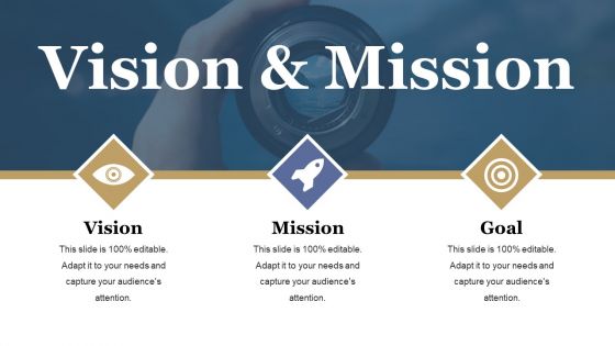
A vision statement describes how the future will look if the organization achieves its mission. So you can incorporate our vision and mission PowerPoint template into your presentation and attract the attention of your audience. Explain the concept of future vision and mission with this vision and mission PPT diagram. The slide contains the graphic of a person with icons which can be used for business and marketing-related presentations. An organization's vision or preferred future must contain information that is realistic, credible, and attractive for the organization in the future. A strong and current vision connects with your passions and greatest potentials. Having a vision is most important in the path of your success in life. Hence, use our slide to fulfill your goals. Get in first with our Vision And Mission Ppt Slide Design. Your thoughts will acquire an early advantage.
People who downloaded this PowerPoint presentation also viewed the following :
Vision and mission ppt slide design with all 5 slides:
Be instrumental in creating awareness with our Vision And Mission Ppt Slide Design. It helps disseminate information.

FAQs for Vision and mission
Honestly, keep it super simple - one punchy sentence people can actually remember. Don't cram it with corporate speak that'll put everyone to sleep (I've sat through way too many of those). Pick visuals that actually connect emotionally instead of boring stock photos. Make your font huge so the person in the back can read it. The whole thing should inspire people, not overwhelm them. Quick test: show it to someone for like 5 seconds - if they don't immediately get your vision, you've got too much stuff on there. Less is definitely more with these slides.
Oh totally, colors hit people before they even process the words. Blue's your safe bet for trust - hospitals and banks love it for good reason. Green screams growth and eco-friendly vibes. Red gets hearts pumping but can come off pushy if you go overboard. Yellow and orange feel super upbeat, though yellow's honestly a nightmare to read sometimes. Purple has this fancy, creative energy that works well for premium brands. I'd say pick what matches the vibe you're going for, then test a few versions. You'll know which one clicks with your brand's personality pretty quickly.
So here's what I'd do - use lighter colors and maybe some upward arrows for your vision since it's more dreamy and aspirational. For the mission, go with bold fonts and solid shapes because that's your actual plan of action. Don't cram them together on the same slide though, that always looks messy. Put vision at the top and mission below it. The visual hierarchy will make the difference super clear. I think of vision as "where we're going" and mission as "how we get there" - honestly helps me remember which design approach to use for each one.
Okay so typography is huge for vision/mission slides - people actually have to read this stuff! Use clean fonts like Helvetica or Arial, nothing fancy or script-looking (save that for wedding invites lol). Make it at least 24pt, bigger if you can swing it. Don't go crazy with different font weights - one or two max. And honestly? Test it from the back of the room first because I've seen too many presentations where you're squinting trying to read some tiny text. Strong contrast between your text and background is key. Bad typography basically turns your inspiring message into an eye exam nobody asked for.
Think of imagery as your vision's translator - it turns those abstract company goals into something people can actually picture. You'll want visuals that show what success looks like, not just generic stock photos. Healthcare transformation? Skip the boring doctor headshots and show real innovation happening. Good imagery makes people *feel* your vision instead of just skimming past more corporate speak. Honestly, the emotional connection is what sticks with people later. Test it by asking yourself: does this image make our future feel more real? Pick visuals that paint the world you're trying to build.
Honestly, icons are a game-changer for mission slides. People's eyes glaze over with text blocks, but throw in a lightbulb for innovation or linked circles for teamwork? Suddenly they get it. Executives especially - their attention spans are terrible. You want symbols that connect to your message without being super obvious or corny. Oh, and definitely stick with one icon style throughout. I've seen slides mixing cutesy cartoons with clean minimal designs and it just looks sloppy. Visual shorthand works because people process images way faster than reading.
Honestly, visual timelines with milestone markers work really well. The mountain/journey thing is solid too - shows your path to the peak goal. I love doing this "telescope" approach where you're literally looking into the future with expanding circles of impact. Before/after split screens are super clean, or that seed-to-tree growth thing if you're scaling something up. Icon progressions hit different though - puzzle pieces fitting together, building blocks stacking. Way better than boring arrows pointing up, you know? Just pick something that actually connects to your vision. Oh, and test it on someone who doesn't know your context first - they'll catch stuff you miss.
Try the "challenge-transformation-future" thing - it actually works. So you start with whatever problem you're solving, show how your mission tackles it, then end with your vision as the big dream outcome. Real examples beat abstract stuff every time, honestly. Nobody wants to hear more corporate buzzwords (seriously, we've all suffered through enough of those). Maybe throw in a customer story or that moment when your founder had their lightbulb idea. The whole point is making people feel something instead of just... reading words on a slide, you know?
Make your text huge and simple - people in the back row need to read it too. White space is your friend. One message per slide, that's it. I'd go with bold fonts over anything fancy (learned that one the hard way lol). Break up long statements with bullets or just use more slides. Your colors should match your brand but make sure there's good contrast. Stock photos are usually pointless unless they actually add something. Oh, and definitely practice saying everything out loud first - you'll catch weird phrasing that sounds fine on paper but trips you up when presenting.
Grab your brand stuff first - colors, fonts, logo rules, all that. Find a template that either matches perfectly or you can easily customize without screwing up the design. Honestly, I've watched so many people pick these crazy flashy templates that looked terrible with their branding. Super awkward. Clean layouts work best since they won't fight your content for attention. The color scheme needs to actually be readable too. Oh, and test your logo on it! When you're not sure, go simpler - way easier to keep everything looking consistent that way.
Honestly, less is more with these slides. Your audience doesn't want to squint at tiny text or sit through a wall of words. Make your vision/mission big and readable - I'm talking fonts you can see from Mars. Clean design beats flashy every time. White space is your friend here. Those cheesy stock photos of business people high-fiving? Hard pass. They scream "template presentation." Keep it simple so people can actually absorb your message in like 10 seconds max. Pro tip: stand at the back of your room and see if you can read everything clearly. If you can't, neither can they.
Honestly, cluttered slides just overwhelm people - their brains can't handle processing too much at once. Clean layouts with lots of white space work way better. Don't dump paragraphs of text on there (seriously, who reads that?). Stick to key phrases instead. Make your vision statement the obvious focal point, then let everything else support it visually. One main idea per slide is golden. Oh, and use fonts people can actually read! Try squinting at your slide - if you can't spot the main message, neither will your audience. It's kind of a weird test but it actually works.
Keep your core mission the same but tweak how you talk about it. With employees, show them how their work connects to the big picture - use the language they already know. Customers want to hear about benefits they'll actually get. Investors? They're mostly looking for ROI and growth potential, let's be real. The trick is translating your "why" into what each group cares about. Don't try cramming everyone into one presentation. Make separate versions of your deck - way more effective than some generic one-size-fits-all approach.
Honestly just use PowerPoint or Google Slides - they're easy and won't distract from what you're actually trying to say. Canva's also solid if you want it to look more professional without doing much work. Their business templates are pretty clean. If your team's already in Figma for other stuff, that works too, but feels like overkill for this. Keep it simple though - vision and mission slides need to be clear and stick in people's heads, not win design awards. I'd pick whatever you already know how to use and spend your time writing good copy instead of messing with fancy transitions.
Honestly, team quotes make those slides feel so much more real. Like, people can tell the difference between something leadership cooked up versus what your actual employees believe. I'd throw in a "voices from our team" section - just short quotes about what the mission means to different people. It's way more convincing than corporate speak. Plus your team will actually connect with it when they see their coworkers represented. Kind of like how a candid photo always beats a stock image, you know? Makes the whole thing feel genuine instead of just... polished boardroom stuff.
-
Help for informational and innovational design
-
Nice and innovative design.
-
Good research work and creative work done on every template.