


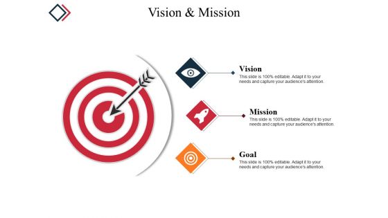
Vision and mission powerpoint slide clipart




Try Before you Buy Download Free Sample Product
 Impress Your
 Audience
 100%
100% Editable
 Save Hours
 of Time


Expose attempts at intrigue with our Vision And Mission Powerpoint Slide Clipart. Foil efforts at generating disorder.
People who downloaded this PowerPoint presentation also viewed the following :
Vision and mission powerpoint slide clipart with all 5 slides:
Get candid with our Vision And Mission Powerpoint Slide Clipart. Express your views honestly and truly.
FAQs for Vision and mission
Dude, visuals make such a difference with mission statements! People forget boring text instantly, but images? They stick. Your brain just processes pictures faster than words - it's wild how much better people remember stuff when you throw in some graphics or icons. Makes the whole thing way more shareable too, whether you're talking to employees or customers. Honestly, most mission statements are forgettable garbage anyway. But pair them with the right visuals and suddenly everyone can actually picture what you're trying to accomplish. Next time you're presenting, add some simple graphics and watch how much more engaged people get.
Honestly, clipart is a lifesaver for making your vision and mission stuff actually stick with people. Nobody wants to read paragraph after paragraph of corporate speak - their eyes just glaze over. Icons work great: lightbulbs for innovation, arrows showing growth, little people graphics for community stuff. Each key point gets paired with something visual that makes sense. Your audience will remember the message way better afterward too. I mean, we're all visual learners whether we admit it or not. Just don't go overboard with the graphics - keep them simple and relevant to what you're saying.
Go with super simple icons that everyone gets immediately - handshakes for teamwork, lightbulbs for innovation, shields for trust. Keep it clean and professional so it matches your brand vibe. I'd avoid anything too fancy or trendy since it'll look weird in a year (trust me on this one). Make sure they're scalable too because you'll probably end up using them everywhere. Oh, and definitely run them by a few people first. If someone squints and goes "what's that supposed to be?" then it's back to the drawing board.
Yeah, colors totally affect how people see your company's vision and mission stuff. Blue's your safe bet for trust and professionalism. Green screams growth and sustainability - you know, all that eco-friendly messaging. Red gets people fired up but can come across as aggressive if you go overboard with it. Orange and yellow feel way more approachable and innovative, though yellow's honestly a pain to read on screens. Here's the thing - don't just pick what looks nice. Your colors should actually match what your company stands for and what your audience expects. Otherwise you're just confusing people about who you really are.
Ugh, so many people mess this up! Don't use blurry, pixelated images - they look awful on big screens. Also, that random free clipart you found? Make sure it actually matches your brand vibe instead of looking totally out of place. I've seen presentations with like 12 different graphic styles and it's just chaos. Oh, and please avoid those ancient PowerPoint templates that look straight out of 2005. Keep your colors consistent throughout. Actually preview it on the screen you'll use too - stuff looks different projected than on your laptop. The graphics should support your message, not fight with it for attention.
Honestly, simple clipart just works better. Your brain processes it in like 2 seconds flat - no thinking required. Complex graphics? They're pretty but people get distracted by all the design stuff instead of actually listening to what you're saying. I learned this the hard way when I spent hours on this elaborate infographic that totally flopped. Basic icons are also way easier to resize for different platforms without looking weird. When you're picking visuals, just ask yourself if they're helping your message or competing with it. Simple usually wins.
Honestly, less is more with clipart - just put it above your text or off to one side. Never let it cover your words because then nobody can actually read your mission statement, which defeats the whole point. Stick with 2-3 colors that match your brand and leave lots of white space around everything. Make your text big enough so people in the back row aren't squinting. Oh, and pick clipart that actually relates to what you're saying, not just random pretty graphics. Quick test: if you can read it clearly on your phone, you're good to go.
First thing - make a style guide with your colors, fonts, and overall vibe. Then stick to it when picking clipart. Your brand personality matters here too. Like if you're a tech startup, don't grab those cutesy cartoon graphics that look like they belong on a kindergarten bulletin board. Go for clean, modern stuff instead. Make sure the colors work with your palette (or that you can change them easily). I always do this weird thing where I squint at the final design - sounds dumb but it helps you see if everything actually looks cohesive. Does it scream "our company" or just random clipart thrown together?
Honestly, customization just hits different when it comes to making your brand feel real. Generic clipart is so obvious and boring - like those weird handshake photos that don't mean anything. But when you actually swap in stuff that reflects your industry or team, people instantly get it. They see themselves in the visuals instead of rolling their eyes at another stock image. Your message actually connects because the graphics feel intentional, not slapped together. It's like visual storytelling that matches your company culture. Even small tweaks work - just replace the generic elements with things your audience would recognize from their actual work.
Clipart makes vision goals so much more engaging than boring text blocks. Use arrows for growth targets, lightbulbs for innovation stuff, people icons for team goals - whatever matches your message. People actually pay attention when there's visuals involved (shocking, I know). Create an infographic layout where each goal gets its own icon, or build a visual roadmap showing how everything connects. Make your most important objectives stand out with the boldest, most eye-catching images. Honestly, the difference is night and day compared to just lists of text.
Honestly, dynamic clipart is a game-changer for making your mission statement actually stick. Instead of another boring paragraph, you're showing people a story they can follow. Growth arrows, connected gears, that kind of stuff - it beats reading about "synergistic solutions" any day. The movement creates this emotional hook that static text just can't match. What really works is sequencing your visuals to show before-and-after or breaking down your process step by step. People need to see your impact, not just hear about it. Makes everything way more memorable than typical corporate fluff.
Shutterstock and Getty Images have the best stuff for this - tons of lightbulbs, compass, and target icons. Adobe Stock's decent too. If you're going free, try Freepik or Unsplash, though honestly the selection can be pretty random. Here's a tip: search for "corporate vision" or "strategic planning" instead of just "vision and mission." You'll find way better options. Canva's got some built-in clipart if you're designing there anyway - saves time jumping between sites. Just double-check the licensing before you use anything. Last thing you want is attribution requirements popping up in a client deck.
Dude, multimedia clipart works because people learn differently - some need visuals, others respond to movement. Honestly, static slides are brutal. They'll zone out every time. When you throw in animations or short videos for your vision/mission stuff, you're giving their brains multiple ways to actually absorb it. Abstract words like "innovation" suddenly feel real instead of just corporate fluff. Motion helps too. I'd stick to maybe 2-3 animated pieces that actually support what you're saying, not random decorative crap that distracts from your point.
Oh definitely! I learned this the hard way once - used a thumbs up in a presentation and got some weird looks. Turns out certain colors and symbols can be super offensive in different cultures, even when they seem totally innocent to us. Animals, hand gestures, religious stuff... it's all fair game for misinterpretation. Honestly, it's kind of crazy how much meaning we pack into simple clipart. Before you present internationally, maybe run your visuals by someone local? Trust me, it beats dealing with that awkward "sorry I accidentally insulted your culture" conversation afterward.
Honestly, just track whether people actually remember your stuff. Check if they can explain your mission to someone else weeks later - that's the real test. Survey feedback helps too, but I've seen so many presentations where flashy graphics just made things worse. Time spent on slides is decent data, but retention matters more. Do employees get what you're trying to say? Can they repeat your vision statement without looking it up? The whole point is clearer communication across teams. If your clipart isn't helping people understand better, ditch it. Focus on whether the visuals actually translate into better alignment throughout the company.
-
Top Quality presentations that are easily editable.
-
Designs have enough space to add content.