


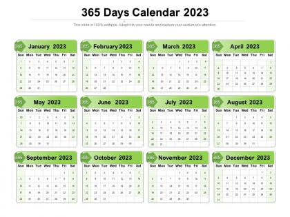
365 days calendar 2023




Try Before you Buy Download Free Sample Product
 Impress Your
 Audience
 100%
100% Editable
 Save Hours
 of Time


Our 365 Days Calendar 2023 are topically designed to provide an attractive backdrop to any subject. Use them to look like a presentation pro.
People who downloaded this PowerPoint presentation also viewed the following :
365 days calendar 2023 with all 2 slides:
Use our 365 Days Calendar 2023 to effectively help you save your valuable time. They are readymade to fit into any presentation structure.
FAQs for 365
Pick a template with clean layouts - you don't want it competing with your actual content. Make sure the dates are big enough to see from the back of the room. Editable text boxes are a must so you can add deadlines and project phases right on there. Color-coding is amazing, though I always go overboard with like 8 different colors lol. Check it's sized for standard presentations (16:9 or 4:3). The good ones let you highlight date ranges and throw in icons. Oh, and definitely test it in presentation mode first - I've learned that one the hard way when something looked great editing but awful projected.
Honestly, custom design makes a huge difference for calendar presentations. Your audience will actually remember the info better when it matches your brand colors and fonts. Stock calendars? They scream "I didn't try" at this point. A custom one shows you care about details and professionalism. The real win though is controlling what stands out - you can make deadlines pop visually however you want. Worth the extra work if it's for clients or the board. Trust me on this one.
Look, digital calendars are clutch for keeping everyone on the same page. Real-time updates mean when you change something, boom - everyone sees it instantly on their phone or laptop. Plus you can sync with project tools and set reminders so people actually show up. Printable ones? They're solid for meetings where you need to physically mark stuff (there's just something about pen on paper, you know?). But if you really want stakeholders staying connected and not missing updates, digital's your best bet. Way easier to track who's actually checking things too.
Honestly, using a 2023 calendar template for your project is genius because everyone gets it instantly. No confusing Gantt charts or messy spreadsheets. Just highlight your key phases and mark important deadlines - boom, done. Your stakeholders will actually thank you since they can see the whole timeline month by month instead of drowning in boring project docs. I always forget how much easier it is to spot scheduling conflicts this way too. Just grab any template online, customize it with your stuff, and watch your team finally understand what's happening when.
Make the month layouts clean and readable - give people actual space to write stuff down. Mark the big holidays obviously. I'd throw in some seasonal colors or simple graphics, but don't go overboard since it's gotta be functional first. Week numbers are clutch if your target audience does any business planning. Moon phases or little inspirational quotes can add personality without being cheesy. Honestly, the best test? Print a draft and actually try writing appointments on it yourself. You'll spot the design problems real quick that way.
Honestly, think about what you want people to feel when they look at it. Blues and greens are super calming for work stuff - way better than stressing people out every time they check their schedule. But then throw in some bright orange or red for deadlines so they actually notice them. For personal calendars? Go warmer - nobody wants some depressing gray thing staring at them from the kitchen wall, you know? I'd probably switch it up seasonally too. Deeper colors feel right for fall/winter, then lighter energetic stuff for spring. Oh, and definitely test a few options with real people first before committing!
Pick 2-3 colors that'll work all year and stick with them - trust me on this one. High-res photos are a must, and they should actually match your style. Are you going for clean and minimal or more of a cozy family vibe? Don't go crazy with fonts (I learned this the hard way). One main font plus maybe something fun for headers. Oh, and think about how you actually use calendars first. Need bigger boxes for writing? More goal space? Definitely print out just one month as a test run. You'd be surprised how different things look on paper vs your screen.
Honestly, adding holidays and key dates is what separates useful calendars from total duds. Nobody keeps those boring empty grids around. Pack yours with major holidays, cultural celebrations, and stuff that actually matters to your audience - like industry events or quirky observances they'd care about. Your people will bookmark it, share it around the office, and actually remember you helped them out. I always think the niche dates work better than obvious ones sometimes. It's that daily utility that gets them coming back. Way more engagement than pretty design alone.
Honestly? Just go with Canva - it's free and has tons of templates you can customize super easily. Takes like 20 minutes max. Adobe InDesign is great if you want something really polished, but that's probably overkill unless you're doing this professionally. PowerPoint works too if you already have it (surprised how decent calendar layouts you can make). Excel's solid for the more structured approach. I made one in Google Sheets last year and it turned out pretty clean actually. But yeah, I'd definitely start with Canva since there's basically zero learning curve and the templates don't look awful.
Honestly, having a 2023 calendar spread out makes everything click way better than staring at endless spreadsheets. You can actually see where your product launches might crash into budget deadlines or whatever. Stakeholders get it faster when they can visualize the timeline too – there's something about seeing it all mapped out that just works. I always grab a huge printout for planning meetings and we just go crazy with markers. It sounds old school but you'll catch timing conflicts early, plus you can actually plan around holidays and busy seasons instead of pretending they don't exist.
Honestly, the interactive timeline thing works great - just have people physically walk to different months around the room. Gets everyone moving! You could also do calendar bingo cards with dates that matter for your topic. I've tried the giant wall calendar approach where everyone slaps sticky notes everywhere with their goals... total chaos but people love it. Breaking into teams works too - give each group a quarter of the year to present with key industry stuff. Oh, and there's always the digital route where everyone edits a shared calendar live during your session. Pick whatever matches your crowd's vibe though.
Honestly, just grab a 2023 calendar template and start mapping everything out visually. Block out your research time, when drafts are due, review periods - all of it. I'm terrible at remembering how long reviews actually take (why does feedback always take forever?). Work backwards from your presentation date so you can spot realistic checkpoints. You'll catch stuff like holidays or crazy busy weeks that might mess up your timeline. Way better than trying to juggle all those dates in your head. Trust me on this one.
Don't go crazy small with the fonts - seriously, half your audience will need reading glasses just to see what month it is. Also, resist cramming every little detail into those date squares. Looks terrible when it's all cluttered up. Double-check your holidays too (trust me on this one). Nobody wants a calendar that says Thanksgiving is on a Wednesday. Leave some actual white space so people can scribble their doctor appointments and stuff. Clean and readable beats fancy every time. Your clients need to actually use the thing, not frame it.
Shared calendars honestly save so much headache. Your team can see everyone's availability without those annoying "when works?" email threads. People can comment right on events, get auto notifications when stuff changes, and you can color-code by project or department - which looks way cleaner than you'd think. No more surprise conflicts because everyone's looking at the same schedule. Set up a master 2023 calendar and have everyone dump their key dates in there. You'll catch scheduling disasters before they happen, trust me.
Honestly, minimalist is still king right now - lots of white space, nothing cluttered. Bold sans-serif fonts look great, and I'm personally loving those muted colors like sage green over the typical bright stuff. Dark mode isn't optional anymore btw, people expect it. Oh and definitely design mobile-first since everyone's always on their phone checking dates anyway. Keep typography super readable and maybe go with warm terracottas if green isn't your thing? Just test it on small screens before you show anyone - learned that the hard way lol.
-
Designs have enough space to add content.
-
Excellent work done on template design and graphics.