


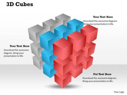
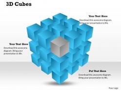
3d cubes powerpoint template slide




Try Before you Buy Download Free Sample Product
 Impress Your
 Audience
 100%
100% Editable
 Save Hours
 of Time


You are the best but you know it can be bettered. Our 3D Cubes Powerpoint Template Slide will give that extra zeal.
People who downloaded this PowerPoint presentation also viewed the following :
3d cubes powerpoint template slide with all 8 slides:
Keep them glued with our 3D Cubes Powerpoint Template Slide. They may even forget to blink.
FAQs for 3d cubes
Dude, 3D cube templates are actually pretty sick for presentations. Each face lets you show different data points or categories, so you're not stuck with those boring flat charts everyone uses. They catch people's attention way better too - there's something about the depth that just works. Perfect for quarterly reviews or when you need to break down complex stuff into chunks people can actually follow. I mean, they look modern and help your audience track your logic since each cube can be like a step in your process. Way cooler than bullet points, honestly.
Okay so 3D cubes are honestly perfect for this - they break complex stuff into bite-sized visual pieces. Each face can show different parts of your concept, or stack them to show how things progress. Way better than bullet points, which are just... boring. The depth pulls people's eyes exactly where you want them to go. You can animate them rotating or building up piece by piece, which actually keeps people watching instead of zoning out. Oh, and use different colors for each cube to organize your themes - makes everything way cleaner.
Those 3D cube templates are perfect when you're breaking down complex stuff - like business strategies, project phases, or how different parts of an organization connect. Tech presentations love them. They make everything feel more digestible, honestly. Just don't go overboard because they can look cheesy if you use them everywhere (learned that the hard way). The visual hierarchy thing really does help your audience follow along better. But make sure your content actually fits that whole "building blocks" vibe first. Otherwise you'll just confuse people more than you're helping them.
Honestly, 3D cubes work great for keeping people engaged. Your audience will actually pay attention because there's something about that depth that just looks more interesting than flat graphics. I mean, everyone's seen a million boring bullet points, right? But when you swap those for 3D arrangements showing your data or processes, people literally lean forward. Don't go overboard though – use them strategically to highlight the important stuff. The trick is making your presentation feel polished without looking like you're trying too hard. Trust me, it makes a difference.
Yeah, 3D cubes can be really solid for data viz! Each face lets you show different metrics, or you can stack multiple cubes for hierarchical stuff - like org charts or comparing products. They definitely grab attention better than boring bar charts. Just don't go crazy with it though. I'd stick to maybe 3-6 data points per cube so people can actually read the thing. Use different colors or sizes to highlight what matters most. Oh, and they work great for presentations since they look way more interesting than flat graphics.
Honestly, just keep those 3D cubes pretty simple. Same colors throughout - don't get crazy with a bunch of effects that'll distract people from what you're actually trying to say. I've sat through way too many presentations where I'm staring at the fancy cubes instead of listening! Make sure your text pops against the cube surfaces so it's readable. Give them some breathing room too - cramped 3D stuff looks awful. Oh, and test it on different screens first since the effects can look totally different depending on resolution.
Oh man, don't cram a wall of text on each face - nobody can read that from the back. I learned this the hard way lol. High contrast colors are your friend too, otherwise text just vanishes. You'll be tempted to make everything spin and flip constantly because it looks sick, but honestly? Your audience will want to throw up after 5 minutes of nonstop motion. Stick to 2-3 bullet points max per cube. Save the crazy animations for when you're actually switching between big topics, not every single slide.
Yeah, 3D cubes are way better at catching people's eyes than boring flat designs. They make your slides feel less static, you know? Plus they're perfect for showing how different ideas connect - way more interesting than another bulleted list. I'm a sucker for a smooth cube rotation animation, honestly. They work great when you've got complicated stuff that needs that spatial element to make sense. Just don't turn your presentation into some weird geometric fever dream. Your audience will thank you for breaking up all those rectangular text boxes with something that actually has some dimension to it.
Hey! So basically anything before PowerPoint 2013 is gonna mess up your 3D stuff - learned that one the hard way lol. Your animations might glitch out or just look flat and weird. PowerPoint Online is hit or miss too since it doesn't handle 3D that well. Mobile apps? Forget about it. Honestly, I'd test everything on whatever setup you're actually presenting on first. Maybe make a backup with simpler graphics just in case everything goes sideways. Trust me, you don't want to be scrambling during your actual presentation when half your slides look broken.
Oh totally! PowerPoint's actually pretty decent with 3D cubes. Right-click and hit "Format Shape" - that's your best friend. Colors, gradients, lighting effects, whatever you need. You can resize them too, obviously. The rotation thing is kinda annoying though - you drag that little handle but sometimes it doesn't cooperate with exact angles. Whatever, close enough usually works. Pro tip: duplicate cubes to make patterns, then group the related ones together. Makes moving stuff around way less of a headache when you're tweaking your layout later.
3D cubes are perfect for breaking down complicated stuff into bite-sized pieces - way better than those mind-numbing bullet points everyone uses. Each face can show different project phases or timeline steps. They're awesome for displaying product features too, where every cube highlights a key benefit. I've seen people use them for team org charts, showing how departments connect. You can stack them for growth metrics or arrange in grids for comparisons. Oh, and make sure your colors match your brand - nobody wants clashing cubes. Just don't make the text too tiny to read!
Dude, colors make a huge difference for those 3D cubes! Dark colors make them look solid and heavy. Light ones? They'll seem like they're floating around. You want contrast between the faces - maybe dark blue front, lighter blue top, medium on the side. Even single-color schemes work if you vary the shades enough. Just don't pick colors that are too close in brightness or everything looks flat. Oh, and test it on a projector first - I learned that the hard way when my "perfect" green looked like garbage during the actual presentation.
Dude, animations totally make or break 3D cube presentations. Without them you're just showing a boring static object. Rotation is your best friend - spin that thing to reveal different faces and data points. Zoom and fade effects work great for directing attention too. I always start simple with basic rotations before getting fancy with complex sequences. The timing matters a lot though - you want each spin or transition to line up with what you're explaining. It's like choreographing a dance, except with data cubes lol. Trust me, once you nail the timing your presentations will look way more professional.
Oh yeah, 3D cubes work really well for presentations! Each face can show different concepts or steps - way better than boring bullet points honestly. Kids actually pay attention when there's something interactive to look at. The rotating thing is perfect for revealing info bit by bit, which keeps them guessing what's coming next. Great for comparing subjects, timelines, vocab stuff. Though don't get too crazy with the animations or it becomes distracting - I learned that the hard way. Keep the rotations smooth and they'll love it.
So basically, tons of industries are using 3D cubes now. Tech companies throw them into presentations for product features and system stuff - they can't get enough of anything that looks fancy and dimensional, honestly. Finance people break down quarterly numbers or portfolios with them. Healthcare folks display patient data and research results this way too. Oh, and manufacturing uses cubes for process flows. The whole point is turning boring spreadsheet numbers into something people can actually understand right away. Just match your industry's usual colors and you're set. Way better than another pie chart, trust me.
-
Much better than the original! Thanks for the quick turnaround.
-
Very well designed and informative templates.