


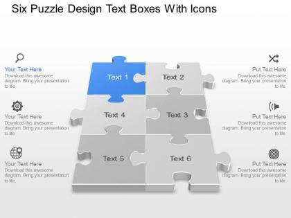
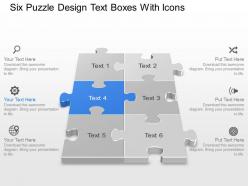
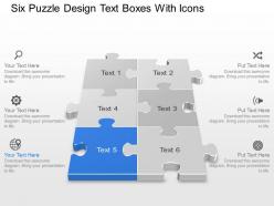
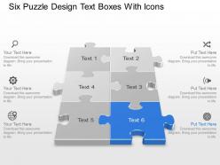
Bf six puzzle design text boxes with icons powerpoint template




Try Before you Buy Download Free Sample Product
 Impress Your
 Audience
 100%
100% Editable
 Save Hours
 of Time


Ski along safely on our Bf Six Puzzle Design Text Boxes With Icons Powerpoint Template. Conquer the steepest inclines with ease.
People who downloaded this PowerPoint presentation also viewed the following :
Bf six puzzle design text boxes with icons powerpoint template with all 9 slides:
Keep eminent company with our Bf Six Puzzle Design Text Boxes With Icons Powerpoint Template. You will be welcome at any gathering.
FAQs for Bf six puzzle design text boxes with
Number your steps clearly - people get lost super fast without good visual hierarchy. Interactive stuff is key too, like clickable pieces or drag-and-drop if you can swing it. Color coding saves lives here, trust me. I've watched so many people zone out when everything looks the same. Keep text short on each piece and throw in icons where they make sense. Oh, and definitely do a "big picture" view showing how it all connects. Test it on someone first though - what makes sense to you might be total gibberish to them!
Oh man, colors are huge for puzzle presentations! Blues and greens work awesome for the complex stuff - they feel trustworthy and clear. Then when you hit the problem-solving parts, reds and oranges create that urgency vibe. I swear, presentations with just boring default colors put everyone to sleep. You'll want contrasting colors so different pieces actually stand out and guide people through your logic. Warm tones are perfect for highlighting solutions too. Honestly test it on someone first though - I've learned the hard way that what makes sense to me doesn't always click for others!
For school stuff, go with jigsaw puzzles and word games - they show how ideas connect really well. Corporate presentations? Flowcharts and missing piece visuals work better since they're all about problem-solving. I've sat through way too many cringe puzzle metaphors in boardrooms, but the good ones actually land. Match your puzzle to what you're saying - collaboration means pieces fitting together, finding solutions needs that "aha moment" reveal. Oh, and don't just throw them in for decoration. They should actually back up your point or you'll look silly.
Try using animations to reveal puzzle pieces one by one - it's like unwrapping a present! "Fly In" and "Fade" effects work really well for building that suspense. Click triggers are honestly my favorite part because there's something weirdly satisfying about making each piece appear. After pieces connect, you can animate text boxes with hints popping up. Just don't make people wait forever between reveals or they'll get bored. Oh, and set up your slide transitions so you can speed up or slow down based on how into it your audience seems.
Honestly, don't go crazy with the puzzle theme - I've seen presentations that look like a jigsaw piece exploded everywhere. Super distracting. Just use puzzle elements as accents or maybe between sections. Oh, and please don't do that dark, mysterious color thing. Sure it looks cool but nobody can read your text. I sat through one last month squinting at gray text on black backgrounds... painful. Clean fonts are your friend here. Those decorative puzzle fonts might seem fun but they're terrible for actual reading. Pick one solid puzzle concept and stick with it throughout. Way better than cramming every puzzle idea you found on Pinterest into one deck.
Oh totally! Just swap out the colors and icons to match whatever you're working on. Healthcare stuff? Go with blues and medical icons. Tech company? Modern fonts work great. Honestly, the puzzle thing is kinda genius because it works for literally anything - I've seen people use it for marketing plans, supply chains, you name it. Change how many pieces you need based on your key points. Then just replace all that generic placeholder text with your actual industry terms and you're set. Takes like 10 minutes max.
Typography can make or break your puzzle presentation, seriously. Go with clean fonts - Arial or Calibri are your friends here. Save the fancy stuff for wedding invitations! You'll want bigger text for main ideas, smaller for details, but nothing under 24pt or people in the back row will hate you. Keep it consistent across all your puzzle pieces so everything flows together nicely. I learned this the hard way after using like 5 different font sizes in one presentation - looked like a mess. Stick to 2-3 sizes max and you're golden.
Alright, so visual hierarchy is basically about making sure people know where to look first. Size matters - bigger pieces grab attention immediately. Bold colors against neutral backgrounds work great too. Put your most important stuff in the upper left or dead center since that's where eyes naturally land first. I made this nightmare puzzle once where everything was the same size... total disaster, nobody knew where to start! Whitespace around key elements helps them breathe and stand out. Maybe add some subtle shadows for depth? The goal is creating a clear path so people's eyes follow exactly where you want them to go.
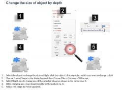
PowerPoint's got some decent built-in tools for this actually. The Freeform shape tool works great for those classic jigsaw curves and little tabs. I probably went overboard making puzzle pieces last week lol - but the Merge Shapes function is clutch for combining basic shapes into puzzle-like stuff. The Curve tool gives you smoother edges if you want that look. You can even turn images into puzzle formats using "Remove Background" which is pretty neat. For anything more complex, just grab some free SVG puzzle graphics from sites like Freepik and customize the colors to match your presentation.
Puzzle templates are honestly genius for getting people off their phones and actually talking. What I like to do is split up key info between different team members - so they literally can't solve it alone. Had one workshop where everyone got super competitive trying to crack this mystery I built into the slides. You could set it up so groups have to work together to unlock the next section. Or make teams compete to piece together your main point first. The trick is making collaboration necessary, not optional. People get way more invested when they're solving something together instead of just listening to you talk.
So here's what works - treat each puzzle like it's revealing part of a bigger mystery. Your audience becomes detectives following clues instead of just sitting there absorbing random facts. Create characters they can relate to, then have those people face the same challenges you're actually teaching about. Structure the whole thing like a story journey where puzzles are major plot twists. Honestly, people eat this stuff up way more than boring bullet points. The trick is making every puzzle feel crucial to what happens next - not just thrown in because puzzles are trendy right now.
Yeah, cultural differences totally matter for puzzle design. Western folks usually go for step-by-step logic puzzles, but Eastern cultures often dig more holistic pattern stuff. Oh, and color meanings are wild - red's lucky in China but screams danger here. Super obvious but I've definitely forgotten that mid-project before. Reading direction matters too since some cultures read right-to-left. For your PowerPoint thing, I'd make modular puzzle pieces you can swap around and recolor easily. Way less headache than rebuilding everything for different audiences.
Track how many people actually engage with your puzzle slides - raised hands, verbal responses, that kind of stuff. Time spent on each slide matters too. I always watch body language honestly, like are they leaning in or scrolling their phones? Dead giveaway right there. Check your Q&A sessions after puzzles since good ones usually get people asking more questions. Post-presentation feedback is clutch - see if anyone mentions the puzzles specifically. Oh, and here's a big one: follow up a week later with questions about the puzzle content. You'll know real quick if it actually stuck. Start simple though, just count responses during your next puzzle slide and build from there.
Oh totally keep notes after each presentation! I used to skip this and regretted it so much later. Just write down what bombed and what actually got people engaged - especially with your puzzle parts since those can be tricky. Watch for when audiences look confused or zone out. That's gold right there. If the same thing trips up multiple groups, you know that section needs work. I literally keep a messy doc on my phone and scribble thoughts right after presenting. Then I'll flip through it before designing the next one. Game changer honestly.
Dude, interactive puzzles are a game changer. Your audience actually pays attention instead of scrolling Instagram under the table. You'll get instant feedback on whether people are getting it or not, which is super helpful. Breaking complex stuff into puzzle pieces just makes it stick better in their heads. People feel smart when they solve things too - like they're part of it rather than being talked at. Oh and honestly? It makes presenting way less boring for you. Even just one interactive bit completely changes the room's energy. Trust me on this one.
-
Great designs, Easily Editable.
-
Excellent work done on template design and graphics.