

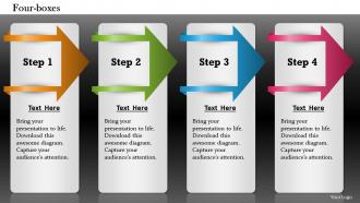
Four boxes powerpoint template slide





Try Before you Buy Download Free Sample Product
 Impress Your
 Audience
 100%
100% Editable
 Save Hours
 of Time


Do the analytics in an insightful way. Our Four Boxes Powerpoint Template Slide help sort the clutter.
People who downloaded this PowerPoint presentation also viewed the following :
Four boxes powerpoint template slide with all 5 slides:
Up the ante with our Four Boxes Powerpoint Template Slide. Take the game to the next level.
FAQs for Four boxes
Four boxes work really well because they create this balanced, clean look that doesn't overwhelm people. Your audience can scan the info quickly since each box gets equal visual weight. Perfect for comparing stuff - like pros/cons, quarterly results, or before/after scenarios. Honestly, I use this layout way more than I probably should, but it just makes complex topics so much easier to digest. Nothing gets buried or overlooked. Next time you're presenting multiple concepts that are equally important, try it out. It's basically foolproof for keeping things organized without looking cluttered.
Honestly, four boxes are a game changer for presentations. You're basically chunking info so people don't get overwhelmed by walls of text. Picture cleaning your room - instead of throwing everything in a pile, you sort stuff into different containers. Way less chaotic, right? Each box becomes its own little focus area. People can actually process one section before their brain moves on. I usually group things by theme or steps in a process. Sometimes priority order works too, depending on what you're presenting. Trust me, your audience will thank you.
Oh, four boxes are super handy! I throw them at everything - pros/cons lists, SWOT analysis, product comparisons, you name it. Perfect for workflows too. Honestly, they're kinda my go-to layout when I'm stuck, which probably happens more than I'd like to admit lol. The trick is making sure your content actually splits into four logical chunks that feel balanced. Don't cram too much text in each box or it'll look messy. Also works great for team stuff or quarterly planning - basically anything where you've got four natural categories.
Dude, four boxes are a game changer for comparisons and pros/cons stuff. Bullet points? Total snooze fest - people's eyes just glaze over that wall of text. With boxes, you can't ramble on forever, plus each point gets the same visual space so nothing gets buried. They're clutch for strategy decks or showing how different ideas connect. Honestly, I probably overuse them now but whatever works, right? Next time you've got more than 4 bullet points, just throw them in boxes instead. Your audience will actually pay attention.
Dude, definitely color code those boxes! Your audience's brains will process stuff so much faster when each section has its own color. Think of it like mental bookmarks - way easier to jump around and remember things. I sat through this one presentation where everything was the same boring blue and by slide four I was totally zoned out. Plus you can show priority levels or group similar ideas together. Maybe stick with the same colors throughout so people know what each one means. Trust me, anything that makes people's brains work less is a win.
Make your four boxes the same size and space them evenly - looks way cleaner that way. Same fonts and colors too, obviously. Don't stuff one box with tons of text while leaving others basically empty (I've seen people do this and it's awkward). Give everything room to breathe with good spacing. One main point per box works best. Skip the paragraphs - bullet points or short phrases hit better. Oh, and definitely check if you can actually read it from across the room before you present. Nothing worse than squinting at tiny text during a presentation.
Put one solid visual in each box - icons, charts, product pics, whatever works with your message. Don't go crazy though, I've seen people stuff way too much in there and it looks like a hot mess. Keep your visuals the same size and style across all four boxes so it doesn't look wonky. Colors should match your slide theme without fighting each other for attention. Oh, and cut your text down - let the visuals do most of the talking. Trust me, less is more here. Your audience will actually absorb the info better when there's room to breathe.
Oh man, the worst thing you can do is stuff way too much text in each box. Nobody wants to read paragraphs in a template! Use bullet points instead. Also make sure your four points actually connect to each other - I've seen so many where it's just random stuff thrown together lol. Keep the content length pretty even between boxes too, otherwise it looks messy. And honestly? Spend like two extra minutes making the fonts and colors consistent across everything. It makes such a difference in how professional it looks.
Okay so the four-box thing is actually genius for storytelling. Your brain naturally wants to follow a path, right? You can do it chronologically - like past, present, future, whatever comes next. Or go with problem/cause/solution/outcome if that fits better. Each box becomes its own little chapter. People love info in bite-sized pieces instead of one massive wall of text. Plus you get those natural breathing spots when you're presenting (honestly saved me so many times). Here's what I always do: map out your main story points first, then worry about making it look pretty. The visual breaks do half the work for you.
Oh totally doable! First thing - swap in your brand colors and fonts, then drop your logo in there. The icons are usually swappable too which is nice. You can mess with the box shapes or resize them however you want. Actually, you don't even have to stick with that 2x2 grid thing - I've seen people do single rows that look way cleaner sometimes. Just don't go crazy with colors that clash or make text hard to read. Start with whatever brand stuff you already have and build from there. Way easier than designing from scratch, trust me.
Make a master template first with your four boxes, colors, and fonts all set up. Then just copy the previous slide and swap out content - way easier than building each one from scratch. Keep your spacing consistent between boxes and use the same text hierarchy every time (headers for main points, bullets for details). Oh and stick to your color system! If red means "challenges" on one slide, don't randomly make it mean something else later. Honestly the biggest time-saver is reviewing all your slides together at the end to catch weird formatting stuff before you present.
The four boxes thing works great for brainstorming - I've done it a bunch of times. Each box gets its own category, like "What's working" vs "What sucks" vs "New opportunities" and "Potential problems." You could also do "Ideas," "Concerns," "What we need," and "Next steps." Give everyone sticky notes so they can fill out all the boxes at once. Way better than those chaotic sessions where the loudest person just talks over everyone else (we've all been there). The boxes keep things organized and honestly, people seem to think more clearly when there's structure. Just don't overthink the categories - keep them simple.
Oh man, typography can totally make or break those four-box slides. I always go with sans-serif fonts since they look way cleaner on screens - learned that the hard way in college lol. Make your headers bold and bigger than the body text, but don't go crazy with it. The biggest mistake I see? People cramming way too much text into each box. You'll want consistent sizing across all four so it looks balanced. Stick to maybe two font weights max, otherwise it gets messy fast. Also, check the contrast against your background colors and literally test it from across the room before you present.
So basically you'd put one product in each box, then use the same format for all of them. Like pricing at the top, features in the middle, pros/cons at the bottom - whatever works. It's honestly genius because you can scan across and instantly see the differences. People love that symmetry thing too, makes everything feel organized. Just don't mix up the structure or it gets messy fast. Think of it like having four report cards lined up - way easier to compare than reading four separate reviews. The key is staying consistent with your categories so it's actually a fair comparison.
Honestly, this template is everywhere once you start noticing it. SWOT analyses are probably the most obvious example, but I see it constantly in marketing comparisons and project planning too. HR folks use it for evaluating candidates, tech companies love it for feature breakdowns - even strategic planning sessions rely on it pretty heavily. The thing is, it just works really well when you've got information that naturally splits into four chunks or quadrants. Super simple concept but way more useful than you'd think. Next time you're stuck trying to organize something complex, try the four-box approach. Beats staring at a blank screen forever.
-
Top Quality presentations that are easily editable.
-
Nice and innovative design.