


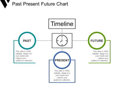
Past present future chart powerpoint slides




Try Before you Buy Download Free Sample Product
 Impress Your
 Audience
 100%
100% Editable
 Save Hours
 of Time


Encourage joyful interactions with our Past Present Future Chart Powerpoint Slides. Introduce folks to entertaining activities.
People who downloaded this PowerPoint presentation also viewed the following :
Past present future chart powerpoint slides with all 5 slides:
Improvise on our Past Present Future Chart Powerpoint Slides to highlight your individuality. It can be custom designed.
FAQs for Past present future
Start with your major dates - that's your backbone. Then throw in milestones that people actually care about, not just internal stuff. Make sure you've got who's doing what and when. Use colors or different text sizes so the critical things pop. Nobody wants to squint at a wall of tiny text. Brief descriptions work best, but detailed enough that it makes sense without you standing there explaining everything. Oh, and seriously - build in extra time for delays. I learned this the hard way on my last project when everything ran two weeks behind. Things always take longer than you think they will.
Honestly, good visual design is a game-changer for timelines. Use different colors for categories - makes scanning so much easier. Keep your timestamps lined up and don't be afraid of white space (cramped timelines are the worst). Bold text or bigger elements work great for highlighting key stuff. Oh, and if you're doing this digitally, progressive disclosure is clutch - let people click for more details. I'd start with just fixing the spacing between events first. Once that looks clean, you can tackle color coding and the rest. Trust me, even small changes make a huge difference.
Gantt charts are probably what you see most - those bar timeline things that show task dependencies super clearly. Milestone charts just hit the big deadlines without getting into the weedy details. Kanban boards move stuff through columns like "doing" and "done," which feels more natural to me honestly. Sprint timelines break everything into those 2-4 week chunks if you're doing agile stuff. But real talk - doesn't matter how pretty your chart looks if the dates are totally unrealistic from day one. Just pick whatever your team will actually look at and update regularly, otherwise it's completely pointless.
Honestly, it's all about how zoomed in you need to be. Historical timelines cover massive chunks of time - like "WWI happened 1914-1918" - while project ones get crazy specific with exact deadlines. You're looking at centuries vs. "finish the wireframes by Tuesday." Historical stuff is more about understanding how events connect and influence each other. Project timelines? They're pure logistics - who does what and when. I always think of it like Google Maps - sometimes you need the satellite view to see the whole country, other times you just want turn-by-turn directions to get there.
Oh nice! TimelineJS is definitely your best bet to start - it's free and you can literally just use a Google Sheet to build one. Takes like 30 minutes max. Tiki-Toki's got some really slick visual options if you want something prettier. I've honestly wasted entire afternoons just messing around with timeline tools lol. Knight Lab has solid stuff for media-heavy projects too. PowerPoint actually has decent timeline templates now if you need it for presentations. D3.js gives you total creative control but you'll need to code. Just go with TimelineJS first though - super straightforward and gets the job done.
Okay so academics want all the methodology stuff - data sources, peer review timelines, basically anything that shows rigor. Business people? Totally different. They need concrete dates, ROI milestones, and how delays hurt profits. I swear academic timelines are like reading hieroglyphics sometimes! Build yours backward from what success looks like to your audience. Ask them first what matters most. Then for suits, skip the methodology deep-dive and go straight to deliverables and budget impacts. Academics actually want those detailed notes though.
Think of colors and fonts as your secret weapons for making timelines actually readable. I like using different colors to separate event types - red for deadlines, blue for milestones, that kind of thing. Bold fonts should hit the most critical stuff only. Honestly, I've messed this up before by going overboard with colors (looked like a kids' birthday party). Stick to 3-4 colors tops, and don't get fancy with the fonts. The whole point is someone can glance at it and immediately know what's going on without squinting or getting confused.
Honestly, timelines just work because our brains are wired to love that visual "look how far we've come" feeling. Left-to-right reading makes it feel natural too. Colors and icons help break up the monotony - nobody wants to stare at a wall of text about quarterly reports or whatever. Short sentences work. But you can also build momentum with longer ones that actually flow together nicely. The trick is making each milestone feel like its own little victory story. I've definitely seen some that are way too cluttered though - total mess. Use different visual weights so people know what's actually important vs just filler dates.
Honestly, short labels are your best friend here - like 3-5 words tops. Pick one date format and don't switch it up halfway through (I've done this way too many times). Color-coding saved my life when I had to present last month - makes everything so much easier to follow. Your font sizes should be different for headers vs details, obviously. Write everything like you're explaining it to your mom or something. If people have to squint at your timeline, you've already lost them. Test it on someone first! They'll catch the confusing parts you totally missed.
Yeah, culture totally affects how people read timelines! Western ones usually go left-to-right with that whole cause-and-effect thing. Eastern cultures? They're more into cyclical patterns - honestly makes way more sense sometimes. Some focus on group achievements instead of individual stuff, which completely changes what feels important. Oh, and Indigenous cultures often include spiritual or seasonal markers that others might miss entirely. You should probably think about your audience's cultural background when making these. Maybe add extra context or shift what you're emphasizing? It's wild how different the same timeline can look to different people.
Ugh, don't cram everything onto one timeline - nobody wants to decode tiny text with a magnifying glass. Pick your key milestones only. Also those default fonts are awful, go bigger and clearer. Keep date formats consistent too, otherwise it looks sloppy. I made this mistake once with rainbow colors thinking it looked cool... it didn't. Stick to simple colors that won't give people headaches. Mix up your spacing so events don't look crammed together. Trust me, people will actually read it instead of scrolling past.
Timeline posts are honestly genius for showing your development process. Start with your best story - maybe how you tested 50 prototypes or incorporated user feedback that changed everything. Map out the key moments: research, testing phases, those "aha" moments, final tweaks. People eat up behind-the-scenes content, especially for tech stuff or beauty products where the process actually matters. Works great on Instagram stories or product pages. I'd probably go with whatever development journey has the most drama or interesting twists first - that'll hook people way better than just listing features.
Honestly, digital timelines are so much better than paper ones. You can update stuff instantly, add new deadlines, and share everything with your team right away. The best part? Everyone can jump in and edit or leave comments at the same time - no more printing things out and passing them around (seriously, who has time for that). Everything saves automatically too, so you won't lose your work. You can zoom around, filter by different things, even attach files. Oh, and Google Sheets works great for basic ones, but Airtable's pretty cool if you want something fancier.
Honestly, building a crisis timeline before you need it is clutch. Map out your response phases and who's doing what by when - saves you from that scrambling panic later. I've seen teams trip over each other's work way too often when there's no clear roadmap. Leadership will constantly bug you with "where are we?" and having that visual ready is such a relief. The dependencies part is huge though. Spot those early and you'll catch when one delayed decision tanks everything else downstream. Sounds boring but trust me, future-you will thank you for having a template ready.
Honestly, getting your timeline order right is everything. Without proper chronological flow, readers just get confused trying to follow what happened when. I learned this the hard way on a project last year - total mess. Your brain wants to process things sequentially anyway, so work with that. Put events left-to-right or top-to-bottom in time order. That way people can actually see the cause-and-effect connections and how everything evolved. Double-check those dates though! One mixed-up event and you'll have people scratching their heads wondering what's going on.
-
Easily Editable.
-
Thanks for all your great templates they have saved me lots of time and accelerate my presentations. Great product, keep them up!