

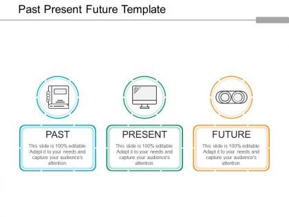
Past present future template ppt background graphics




Try Before you Buy Download Free Sample Product
 Impress Your
 Audience
 100%
100% Editable
 Save Hours
 of Time


Identify irrational fears with our Past Present Future Template Ppt Background Graphics. Elaborate on ill founded apprehensions.
People who downloaded this PowerPoint presentation also viewed the following :
Past present future template ppt background graphics with all 5 slides:
We all sometimes have the presentation nerves especially if we are not sure of what we have for our audience. However, when you use Past Present Future Template Ppt Background Graphics that are created by professionals, your confidence level is sure to increase.
FAQs for Past present future template
White space is your best friend - seriously, cramped slides are the worst. Pick fonts big enough for the back row and stick to colors that won't blind anyone. I swear, some people think presentations need every color in existence! Keep things consistent with spots for your titles, bullets, and images so it all flows together. Short sentences work better than long ones. Don't overthink the design either - simple usually wins. Test your template on a few slides first before you go all in. Trust me, you'll thank yourself later when you're not scrambling to fix formatting issues.
Honestly? Templates are a game-changer for corporate storytelling. You get these pre-built narrative frameworks instead of staring at a blank slide deck forever. Problem-solution layouts, customer journey maps - they're all there. Keeps your audience focused on the actual message rather than weird design choices too. The data viz spots make it super easy to drop in compelling evidence. I always pick the template that matches my story type first, then tweak it. Way less stressful when you're scrambling before a big presentation.
Make sure you can actually read the thing from the back of the room - big fonts (24pt minimum) and high contrast colors are your friend. White space is crucial too. Keep fonts consistent because students will notice if you're switching between Times New Roman and Comic Sans like a maniac. Clean, simple designs work best since you want them focusing on what you're saying, not your wild color choices. Bullet points and clear headings help everyone follow along. Oh, and definitely test it beforehand - classroom projectors are basically from 1995 and will make everything look awful.
Oh man, colors totally make or break presentations! Reds and oranges pump up the energy, blues and greens feel more chill and trustworthy. I made the mistake once of using a dark background in a super bright conference room - nobody could read anything. So embarrassing. Professional colors matter way more than you'd think too. Keep it simple with maybe 2-3 colors max. And definitely test your slides on the actual projector beforehand! Trust me on this one.
Ugh, don't pick those crazy busy templates - you'll spend forever trying to make your content fit. Also skip anything too trendy with weird animations. Trust me, that stuff looks dated super fast. Make sure there's actually enough slides for what you need (learned that one the hard way). Oh and check if people can read the text from far away - some templates have tiny fonts. Honestly? If you're fighting with the layout more than working on your actual presentation, just go simpler. Your message matters more than flashy design anyway.
Templates are flexible because you can switch out the visuals and language while keeping the same basic structure. A finance template might be heavy on charts and compliance stuff, but a creative agency one would probably go bold with images and portfolio pieces. Pretty smart, honestly. You're getting a solid foundation that fits what your audience expects. The trick is having design elements you can mix around - colors, icons, different slide layouts. Figure out what visual style your industry uses first. Then just swap in fonts, images, and content blocks that'll actually connect with whoever you're presenting to.
Honestly, infographics are a game-changer for presentations. Your brain processes visuals way faster than text - like, we're talking 60,000 times faster or something crazy like that. Most good templates already come with chart layouts and icon sets built in, which saves you tons of time. People just don't want to sit through slide after slide of bullet points anymore. Pick templates that have solid infographic frameworks already there. You'll turn boring data into actual stories people remember. Way more engaging than whatever I used to make in college with basic PowerPoint themes.
Start with dual purpose in mind - high contrast colors and readable fonts (12pt minimum) are your best friends. Skip complex animations since they're useless on paper anyway. Clean layouts with white space are crucial because cramped designs look absolutely awful when printed. Trust me, I've been there with slides that came out looking like ancient hieroglyphics! For digital stuff, stick to 16:9 and test on different screen sizes. The real trick? Create a master template with simple elements that scale well. Whether someone's squinting at their laptop or flipping through printed handouts, you want it to actually look decent.
Oh totally, your slide layout really affects how people absorb info. White space and clean designs help audiences focus way better - cluttered stuff just stresses everyone out. I bombed a presentation once with way too much crammed on each slide, never again lol. Grid layouts make you look organized and trustworthy. Asymmetrical can be cool for grabbing attention but goes chaotic fast if you overdo it. Font size and contrast matter more than you'd think too. Just match your template vibe to whatever message you're giving, and honestly? Always check if people in back can actually read your text.
So the trick is setting up your templates right from the beginning - high contrast colors, big fonts (24pt minimum), proper headings. I always throw in alt text placeholders for images because honestly, going back to add those later is such a pain. Your color combos need to hit WCAG standards, and don't make color the only way people get info. Oh, and consistent layouts help screen readers actually navigate your stuff. Way easier than trying to fix accessibility issues after the fact every damn time.
Honestly, animations are pretty clutch for keeping people engaged. They help you control the flow - like when you want to build up to a big reveal or walk through something complex step by step. I used to think they were just cheesy effects, but they actually make your content way easier to follow. The trick is not going crazy with it though. Skip the bouncing text madness. Fade-ins work great, smooth slide transitions too. Just make sure each animation actually helps tell your story instead of being random eye candy that pulls focus from your main points.
Honestly, industry templates are such a game changer compared to generic ones. They already have the right sections built in - like patient data fields for healthcare or roadmap layouts for tech startups. The visual stuff matches too, so finance templates use those boring conservative colors while creative agencies get the fun bold designs. Generic templates? You're basically starting over anyway. I made that mistake once and spent forever just getting the basic structure right. Way better to grab an industry one as your starting point, then tweak it however you want.
Honestly, presentation design is going through some big changes right now. Minimalist layouts are huge - tons of white space, clean fonts, that whole vibe. Dark mode is literally everywhere (my eyes are so much happier). Interactive stuff is becoming the norm too - embedded videos, clickable elements, real-time collab features. AI tools are starting to suggest layouts based on your content, which is pretty wild. Oh, and mobile-first design matters way more now since people view presentations on their phones constantly. You should definitely check out some newer template platforms - they'll help your stuff look fresh instead of like every other boring deck.
Templates are lifesavers for keeping everyone's slides looking professional. Your team gets locked into using the same fonts, colors, and logo spots so Bob from accounting can't randomly show up with some wild font choice. Smart move is setting up maybe 3-4 different layouts that cover most presentation needs. People save tons of time since they're not starting from zero every time. Plus your brand stays consistent across all departments without you having to police everyone's design choices. Honestly, it's one of those small fixes that makes a huge difference. Just share the templates once and you're done.
Oh definitely include call-to-action stuff! People will just sit there like "cool presentation" and then... nothing happens. Which is honestly the worst feeling as a presenter. Make your CTAs obvious - "Email me by Friday" or "Let's schedule that demo" or whatever fits. Your template needs actual spots for this, not just squeezed in at the end. I can't tell you how many solid presentations I've watched totally fizzle because nobody told the audience what to do next. Don't forget contact info too - you want to make following up as brain-dead simple as possible.
-
Presentation Design is very nice, good work with the content as well.
-
Great designs, Easily Editable.