


5 parts circle diagram 5




Try Before you Buy Download Free Sample Product
 Impress Your
 Audience
 100%
100% Editable
 Save Hours
 of Time


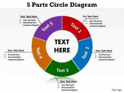
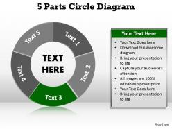
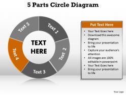
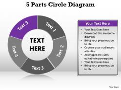
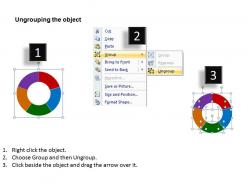
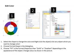
Reveal your plans step by step while using this 5 parts circle diagram 5 PPT icon. This presentation icon plays a perfect role to engage your audience on a higher level. In fact a cycle diagram PPT 26 works well to keep you at the top of your game. The chief advantage of a circular flow diagram is to check on some of the economy’s true complexity and make it difficult to use it for quantitative analysis. A circular diagram on the other hand can represent the resource markets; demonstrate the business, the households in exchange for the economic resources used as the chief factors of production. Almost every business sells services and goods to the households for generating profits and earning revenue. In fact this circle diagram presentation design also showcases the pay wages, profits and interest. Thus use this wonderful design for presenting your message vividly. Unravel your plans stage by stage. Our 5 parts circle diagram 5 will play the perfect part.
People who downloaded this PowerPoint presentation also viewed the following :
5 parts circle diagram 5 with all 9 slides:
Conscientious minds are behind our 5 parts circle diagram 5. They will live up to their promise to benefit you.
FAQs for 5 parts
Honestly, 5-part circles are great because they don't overwhelm people - each section gets equal space so nothing feels more important than anything else. Your audience can actually follow along instead of getting lost in the details. Way better than those awful bullet point slides everyone uses. They work really well for cyclical stuff too, like project phases or workflows where things loop back around. I'd use them when you've got 5 things that are equally crucial. Just don't cram too much text in each part or it'll be impossible to read from the back row.
Dude, those 5-part circle diagrams are actually clutch for explaining complicated stuff. Your brain can only handle so much at once, so breaking things into five chunks makes it way more digestible. Plus the circular thing shows how everything connects – like if you're explaining a process or framework where the pieces flow into each other. Way better than dumping a massive paragraph on someone. I use them all the time now, especially for work presentations. People actually pay attention instead of their eyes glazing over. Honestly should've started using these years ago!
Use a 5-part circle when you've got exactly five pieces that connect to each other - like workflow steps or stakeholder groups. It's so much cleaner than those messy flowcharts everyone loves to overcomplicate. Works great when people need to see both the individual parts and how they fit together as one system. Honestly, I've seen too many people force this format when they only have 3-4 elements. Don't do that. Also skip it if there's an obvious hierarchy - just use a pyramid instead. Quick tip: sketch it out first to make sure the circular layout actually makes sense for your content.
Hey! So for each segment, stick to one main idea with a clear label and maybe 2-3 bullet points underneath. People scan these things super quick - like 3-5 seconds per section - so don't cram too much in there. Keep your formatting the same across all five parts and throw in some icons or colors so they're easy to tell apart. Oh, and arrange them clockwise in whatever order makes the most sense. Here's what I always do: show it to someone for 10 seconds, then see what they actually remember. Works every time to figure out if you've got the right balance.
Oh definitely use different colors for each section! Your brain processes visuals way faster than just text, so it'll help people actually remember what you're saying. I always match the colors to whatever theme I'm presenting - like green for growth, red for problems, that kind of thing. Plus you can carry those same colors through your whole presentation on slides and bullet points. Makes everything feel connected, you know? Short version: distinct colors = people won't get confused jumping between sections. Trust me, it's such a simple thing but makes a huge difference.
Don't make uneven sections when they're supposed to be equal parts - it looks sloppy and confuses people. Also, circle diagrams aren't meant for paragraphs of text. Keep labels short and sweet. Here's something I learned the hard way: similar colors are your enemy. Nobody can tell your sections apart if they're all slightly different shades of blue. But don't go crazy with neon either. Oh, and please don't rotate text at bizarre angles just because it follows the circle. Consistent fonts across all sections. Grab a template if you're starting from scratch - saves tons of headaches.
Definitely animate those segments one at a time instead of dumping everything on screen at once. Your audience won't know where to look otherwise. I'd start with the main concept, then reveal each piece as you talk through it. Stick with simple fade-ins or maybe slight rotations - nothing too crazy that pulls attention from what you're saying. Oh, and animate those connecting lines between parts too so people can follow the relationships. Just make sure you time it with how fast you actually speak because waiting around for slow animations is painfully awkward.
You'll want five categories that actually add up to 100% - like survey ratings or budget splits across departments. Market share between five competitors works too. The categories can't overlap though, or it gets messy real quick. Honestly, most data doesn't naturally fall into exactly five buckets (kind of annoying but true). If you're cramming stuff together just to make it work, a bar chart might save you the headache. Oh, and they have to be mutually exclusive - no double-counting allowed.
Honestly, size matters way more than you'd think with these circle diagrams. People just zone out if the text is too small or everything's crammed together. Give each section enough room so you can actually read the labels without squinting. Put your most important piece at the top and maybe use a brighter color for it. Related stuff should sit next to each other - just makes sense that way. Oh, and definitely check how it looks at actual presentation size first! I learned that one the hard way when my "perfect" diagram looked like garbage on the projector.
Yeah, totally! Circle diagrams work great with other types. I usually connect them to flowcharts - like each section feeds into different processes. You can also nest them in bigger system maps or put them next to timelines to show how things change over time. Multiple circles side-by-side are pretty useful for comparisons too. The circular format is just really flexible, which is nice because it doesn't clash with much. Oh, and stacking them vertically works better than I expected. Figure out what bigger story you're telling first, then pick whatever diagrams help explain that story better.
PowerPoint or Google Slides are actually pretty solid for circle diagrams - you probably already have one of them anyway. Canva's my go-to when I want something that looks professionally designed without spending hours on it. If you're working with a team, Lucidchart is clutch for collaboration. I've watched people torture themselves with Illustrator for something this simple, which honestly seems like overkill. For rough drafts, diagrams.net works fine too. Just start with whatever you know best - worst case, you can always export it and clean things up later if you need to.
Honestly, just treat each segment like a story beat! First slice is your setup, then build some tension in segments 2-3, hit the big moment in part 4, and wrap it up in the last one. Way more engaging than just dumping info on people - our brains eat up stories. Throw in phrases like "but then..." when you're moving between sections. Oh, and using a customer journey or project timeline as your backbone works really well too. People will actually follow along instead of zoning out halfway through.
Dude, these 5-part circles are literally everywhere once you start noticing them. Business consultants throw them into every strategy presentation - market analysis, competitive frameworks, you name it. Healthcare teams map out patient care with them. Teachers are borderline obsessed (my sister's one, trust me on this) and use them for curriculum stuff constantly. Marketing people do customer journeys or brand positioning. Here's the thing though - they only work when your five pieces actually connect to each other, not just random stuff you shoved together. Start with whatever's in the middle, then work outward from there.
Dude, getting feedback on your diagram is seriously worth it. People will catch stuff you totally missed - like if your colors are too similar or one section looks way bigger than the others. I swear, every time I think something's "obvious," someone interprets it completely wrong! Show it to maybe 3-4 people first. Ask them straight up "what's confusing here?" instead of the generic "thoughts?" They'll tell you if your labels are too technical or if the flow between sections doesn't make sense. Fresh eyes are everything for this kind of thing.
Oh man, Apple keynotes are perfect for this! They're always showing those 5-part circles with iPhone, iPad, Mac, Watch, and Services - Jobs was totally obsessed with that visual thing. McKinsey and BCG do it constantly too when they're pitching strategic frameworks or whatever. Google's developer conferences use them for platform stuff as well. The trick is making each piece look equally weighted - if one section takes over the whole thing, it just looks weird. Honestly, I'd sketch it out by hand first before you mess with slides. That way you can see if your five parts actually make sense together or if you're forcing it.
-
Best way of representation of the topic.
-
It saves your time and decrease your efforts in half.