


Six staged circle pie chart with percentage powerpoint slides




Try Before you Buy Download Free Sample Product
 Impress Your
 Audience
 100%
100% Editable
 Save Hours
 of Time


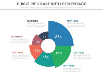
Presenting our new "Six Staged Circle Pie Chart with Percentage PowerPoint Slides" slides for business and finance related presentations. This PowerPoint template diagram has been crafted with the graphic of six staged circle pie chart and percentage diagram. This PPT diagram contains the concept of financial analysis representation, professionals can use this PPT diagram for business and finance related presentations. The concept of pie chart used here displays different sections with different percentage figure and filled with interesting colors. We have created a design you cannot miss, aligned with appropriate elements and eye catching colors. This PPT slide has been crafted with the graphics of interesting icons placed in a Pie Chart With Percentage which at first glance is bound to catch the attention of the viewer. So be done with your business presentations relating to your business and finance related concern. Download our "Six Staged Circle Pie Chart with Percentage PowerPoint Slides" and leave an enduring impression. Our Six Staged Circle Pie Chart With Percentage Powerpoint Slides take all factors in hand. Extend your control as far as you can.
People who downloaded this PowerPoint presentation also viewed the following :
Six staged circle pie chart with percentage powerpoint slides with all 4 slides:
Back them completely with our Six Staged Circle Pie Chart With Percentage Powerpoint Slides. Your guidance won't be half hearted.
FAQs for Six staged circle pie chart with
Pie charts work best when you've got 3-7 categories and want people to quickly grasp proportions without thinking too hard. Everyone understands them right away - even my boss who hates numbers gets pie charts. They're perfect for stuff like market share or budget breakdowns where visual impact trumps precise comparisons. Just don't go crazy with tiny slices that you can't even label properly. Honestly, I see way too many pie charts with like 12 microscopic wedges that tell you absolutely nothing. Keep it simple and your audience will actually absorb the info instead of squinting at your chart.
Pick colors with strong contrast so people can actually tell segments apart. Don't put similar shades next to each other - like light blue touching dark blue. So many pie charts are total disasters because of this! Use your company's brand colors if you can, but readable beats pretty every time. Also check that colorblind folks can see the differences - ColorBrewer's great for that. Bold or warm colors work best for the important stuff you want to pop. I always start with the biggest segment and build out from there.
Oh, pie charts! They're great for showing parts of a whole - like budget breakdowns or survey results. Keep it to 3-7 categories though. Any more and people's eyes just glaze over trying to read it. Perfect for stuff like market share or demographic splits, but don't use them for data that changes over time. That's just confusing. Also, if you've got tiny slices under 5%, just lump them into "Other" - nobody wants to squint at a sliver that says "miscellaneous expenses: 2%." Trust me on that one.
Definitely put the percentage labels right on each slice - nobody wants to play guessing games with data. Start your biggest segment at 12 o'clock and work clockwise by size. Contrasting colors are your friend here, trust me. Group those tiny slivers under 5% into "Other" or your chart gets messy real quick. Oh and throw similar categories next to each other when you can. Always add a legend with the colors, plus I'd include the actual numbers too alongside percentages. Makes it way more useful.
Don't go crazy with slices - 5-7 max or it gets messy. Start at 12 o'clock, not some random spot. Those 3D effects? Seriously outdated and they mess with how people read the data. I always arrange mine biggest to smallest, and throw the percentages right on there so people don't have to guess. Skip the rainbow thing too - pick a solid color palette and make your most important slice pop with the boldest color. Oh, and if you've got an "other" category, stick it at the end even if it's huge. Trust me on that one.
Don't just rely on color for your pie chart - throw in some patterns or textures too. Maybe 8% of guys can't distinguish red from green, so those sections might look identical to them. I'd add stripes, dots, or hatching to each slice. Even better? Just label everything directly with the percentages. There are browser extensions that simulate colorblindness - honestly pretty eye-opening to see what others actually see. You want people reading your data easily, not squinting and playing guessing games with which slice represents what.
Direct labels on pie slices are so much better than legends. Nobody wants to keep looking back and forth trying to match colors - it's annoying. When you put the labels right on the slices, people get it instantly. No mental work required. Sure, legends might work if you've got like 20 tiny slivers, but honestly? That's probably a sign you should just use a bar chart instead. For most pie charts though, slapping the percentages or values directly on each slice makes everything way clearer and easier to read.
Honestly, regular pie charts are so boring now. Try donut charts instead - put your key numbers right in the center. Or do exploded slices where the important stuff pops out. Semi-circle charts look way cooler too, kind of like gauges. If you've got layered data, nested pies work great. You can even get weird with it - make actual pizza slices or clock faces depending on what you're showing. I always start with the biggest slice and work from there. Just match whatever style fits your audience, you know?
Honestly, using software for pie charts is a game changer. No more calculating angles by hand or whatever - just dump your data in and it does the math. Excel, Google Sheets, even Tableau if you're feeling fancy. They all let you mess with colors and labels to make things look decent. The best part? When your numbers inevitably change at the last second, everything updates automatically. Some tools even do those hover effects that make you look way more tech-savvy than you actually are. I'd just start with whatever you already have on your computer before spending money on anything new.
Honestly, pie charts are pretty useless in a bunch of situations. Don't use them if you've got more than 5-6 categories or when all your values are basically the same size - people can't tell the difference between similar slices. They're awful for showing changes over time too (like, why would you even do that?). Skip them if you need precise comparisons between segments or if your data has negative numbers. Bar charts work way better for comparisons, and line charts are perfect for trends. Trust me, your readers will thank you.
Honestly, more than 5-7 slices and your pie chart turns into a hot mess. People can't tell the difference between tiny wedges, and good luck trying to label everything clearly. I learned this the hard way in a presentation once - total disaster. The colors start blending together too. If you've got tons of categories, just lump the small ones into "Other" or switch to a bar chart instead. Your brain processes bar charts way easier anyway. Trust me, your audience won't squint at your chart wondering what they're supposed to be seeing.
Oh definitely! Most presentation apps like PowerPoint let you animate the slices to appear one by one - looks way cooler than a static chart. The spin-in effect is pretty slick, though maybe don't go crazy with it lol. You can also make the labels pop up after each slice loads. I always use "fade in" or "fly in" for a clean look. Just don't make the timing too fast or people won't actually absorb what they're seeing. Actually, animating the callouts separately works really well too - keeps people focused on each data point.
Oh man, don't use 3D pie charts! They totally screw with how people read the data. Your brain gets fooled by the perspective - some slices look way bigger or smaller than they really are. I mean, yeah they look cooler I guess, but nobody can actually tell what the numbers mean. With regular flat charts, you can compare the slices properly without your eyes playing tricks on you. Trust me, 2D is the way to go. Save yourself the headache and just keep it simple.
Yeah definitely go bigger with pie charts! Small ones are basically useless - those skinny slices just vanish and you can't read anything. I learned this the hard way on like three different projects lol. You need enough space so even your smallest slice actually means something visually. Plus bigger charts give you room for decent labels, whether you put them inside or use those little pointer lines. Honestly if you're stuck with a tiny space, just use a bar chart instead. Way more readable when you don't have the real estate.
Honestly, pie charts work best when you pair them with other stuff - like bar or line charts. The pie shows you the breakdown, then bars/lines show trends over time. I do this all the time with budgets - pie for the split, line chart for spending patterns. Start with your pie chart to show the big picture first. Then get into the detailed charts that break down specific pieces. Oh, and keep your colors consistent across everything so people can actually follow what you're showing them. Just don't cram too many charts together or it'll look like a hot mess.
-
Appreciate the research and its presentable format.
-
Colors used are bright and distinctive.