


Circle chart with percentage values for financial data powerpoint slides




Try Before you Buy Download Free Sample Product
 Impress Your
 Audience
 100%
100% Editable
 Save Hours
 of Time


If you are keen to present your business and finance related Information in an Organised and professional manner then Simply merge our Expert Designed Circle Chart with percentage values for Financial data PPT templates with your presentation to have a wondrous experience. Also, the main topics and the titles can be highlighted using these patterns to make them easily noticeable by the viewers. Apart from this, memorising the content of these layouts is easy due to the vibrant colours and designs. Adding to its value, its feature of complete modification will enable the user to customise the content of these illustrations as per the need of the organisation. Moreover, fiscal management being an extremely crucial and vital concept needs to be proposed accurately so that the Organisational status is clear in front of the viewers and that’s what our diagrams aim to provide. Therefore, quickly grab these amazing designs and be a presentation Pro. The cup flows over with our Circle Chart With Percentage Values For Financial Data Powerpoint Slides. You will definitely get more than your fill.
People who downloaded this PowerPoint presentation also viewed the following :
Content of this Powerpoint Presentation
Description:
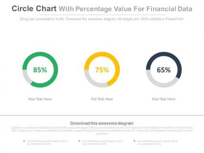
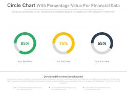
The image displays a PowerPoint slide titled "Circle Chart With Percentage Value For Financial Data." It features three circular charts (donut charts), each representing a different percentage value: 85% in green, 75% in yellow, and 65% in grey. Below each chart is a placeholder for text, currently showing "Your Text Here" or "Put Text Here," indicating that these can be customized to describe what each percentage represents.
Use Cases:
These types of slides can be employed in a broad range of industries for visually representing statistical data, performance metrics, or completion rates:
1. Finance:
Use: Displaying investment growth or fund allocation
Presenter: Financial Analyst
Audience: Investors, Clients
2. Marketing:
Use: Showing campaign reach or conversion rates
Presenter: Marketing Manager
Audience: Marketing Team, Executives
3. Sales:
Use: Representing sales targets or quota attainment
Presenter: Sales Director
Audience: Sales Staff, Management
4. Healthcare:
Use: Illustrating patient recovery rates or treatment adherence
Presenter: Healthcare Administrator
Audience: Medical Professionals, Patients
5. Education:
Use: Demonstrating graduation rates or course completion percentages
Presenter: Academic Administrator
Audience: Educators, Students
6. Manufacturing:
Use: Showing production completion or quality control pass rates
Presenter: Operations Manager
Audience: Production Team, Quality Assurance Staff
7. Non-Profit:
Use: Visualizing fundraising goals or program progress
Presenter: Development Officer
Audience: Donors, Board Members
Circle chart with percentage values for financial data powerpoint slides with all 4 slides:
Capabilities acquire another dimension with our Circle Chart With Percentage Values For Financial Data Powerpoint Slides. Experience greater facility in functioning.
FAQs for Circle chart with percentage values for financial
Circle charts work really well when you want to show how your money breaks down - like budget categories or different income sources. People can instantly see the proportions without squinting at spreadsheets. Honestly, anything that saves time in financial meetings is a win. Your biggest expenses or revenue streams will jump right out. They look clean in reports too. One thing though - don't go crazy with tiny slices. I'd stick to maybe 5-7 categories tops, otherwise it gets messy and hard to read.
Dude, pie charts are honestly a game-changer for budgets. You'll instantly spot what's draining your cash instead of squinting at spreadsheet rows. Like, seeing marketing take up 30% versus IT's tiny 15% slice? Way more obvious than just numbers. I've literally caught budget problems in seconds that I missed completely in tables - it's kind of embarrassing how effective they are. Perfect for catching overblown categories or areas you're starving of funds. Your stakeholders will actually get it right away instead of glazing over during presentations. Trust me on this one.
Circle charts are great for budget breakdowns or showing where your money goes - basically anytime you need to show parts of a whole. Works best with 3-7 categories that add up to 100%. Portfolio allocation? Perfect use case. I see them everywhere though, maybe too much honestly. Don't use them for tracking changes over time - that's what line charts are for. Oh, and if you've got tiny slices under 5%, just lump them into "Other." Nobody wants to squint at a chart trying to read microscopic labels. Keep it simple and your audience won't hate you.
Ugh, pie charts are the worst when percentages look too similar - people can't tell the difference between wedges. More than 5-6 categories? Forget about it. Bar charts are so much better for actual comparisons. Plus circles can't handle trends or negative numbers at all, which is annoying. I made this mistake once in a big presentation and felt like an idiot! Really it comes down to whether you're showing "parts of a whole" or need detailed comparisons. Just sketch both versions quickly and see which one clicks immediately.
Dude, colors totally mess with how people interpret your pie charts. Red makes viewers think something's wrong - even if it's your biggest revenue stream. Green's the opposite, screams "this is good stuff." Honestly, I've seen people completely misread charts just because of weird color choices. Bright colors grab way more attention than they should, making small segments look super important. Meanwhile, dull colors make your big wins look boring. Just match the colors to what makes sense - green for profits, red for losses, that kind of thing.
Put your percentage labels inside the bigger slices, but use those little leader lines for tiny ones - nobody wants to squint. Double-check that everything adds up to 100% because honestly, I've seen so many charts where someone forgot basic math. Stick with whole numbers unless your boss is obsessed with precision. Also, if you've got room, throw in the actual values too since percentages alone don't tell the full story. One last thing - if you end up with a bunch of microscopic slices, just lump them into "Other." Trust me, it'll look way cleaner.
Yeah, circle charts work great for engagement! People can instantly see proportions without having to add up numbers in their head. Just don't go overboard with colors - I've seen some that look like a kid went crazy with crayons lol. Keep it to maybe 5-6 segments tops, use colors that actually contrast, and put your biggest slice at the top. Oh, and if you're presenting live, those little animations where segments pop in one by one? Total game changer. Your audience won't zone out when they can actually follow what you're showing them.
Honestly, just use Excel or Google Sheets unless you really need something fancier. Most people already know how to read those anyway. Tableau and Power BI are solid if you want interactive stuff or live data feeds, but don't overcomplicate things. I've watched so many executives get confused by overly complex charts - it's painful to watch. Canva actually works great for quick presentation slides too, which surprised me. Oh, and keep your pie slices to like 5-6 categories tops or nobody will understand what you're trying to show them. Start with whatever software you've already got before spending money on new tools.
Dude, animated circle charts are a game changer for financial presentations. You can build suspense by revealing segments one at a time instead of dumping everything at once - like first showing marketing costs, then R&D kicks in, then operations. Way better than those dead static charts that put people to sleep. Your audience actually follows along with the story you're telling. I swear people remember more when there's movement involved. Perfect for showing budget changes over time or comparing quarters. Makes the whole presentation feel alive instead of just... blah.
Okay so the big trap with pie charts? Just because percentages hit 100% doesn't mean you're getting the full picture. Your "whole" might be based on like 50 people or some weird subset of data. Plus those fancy 3D charts with the exploded slices - they're basically designed to trick your brain into thinking certain pieces are way bigger than they actually are. Honestly drives me crazy when I see that in presentations. Watch out for when the visual size doesn't match the real numbers too. Always double-check what that 100% actually represents before you make any decisions.
Oh man, I totally messed this up before so learn from my mistakes! First thing - make sure all your data sources are using the same time frames and currency. Otherwise your percentages will be completely off and won't add up to 100%. I always create this master validation sheet now where I can double-check that each slice actually matches the real numbers. Document where each piece comes from too, trust me on this one. Pro tip: start with your smallest data source when you're checking for errors. Way easier to catch problems there first, then work your way up to the bigger stuff.
Side-by-side pie charts work if you keep colors and scales the same across periods. But honestly? They're kind of terrible for showing changes over time - your brain just can't track how the slices shift easily. A small multiples layout helps, where each time period gets its own chart in a grid. Though I'd probably just switch to a line chart instead. Way easier to spot trends that way. Stacked bars could work too if you're dead set against lines. The main thing is keeping your categories identical so people can actually follow what's happening. Trust me, your audience will thank you for ditching the pie charts.
Okay so first - double check your percentages add up to 100%. Sounds basic but I've seen so many people mess this up and it looks terrible. Make sure your categories don't overlap either, like having "Marketing" and "Digital Marketing" as separate slices when one should obviously be inside the other. Check your source data matches what's actually showing in the chart, especially if you're combining different datasets. Label where the data came from and when you collected it. Honestly, just have someone else look at it before you present - you'll miss stuff that's super obvious to fresh eyes.
Honestly, just throw them right into your executive dashboards as live widgets. Works great for annual reports too - way better than boring tables when you're showing budget stuff. I've noticed investor newsletters with pie charts get way more attention than text-heavy ones. Board meetings are perfect for this - people love quick visual breakdowns of department spending. Oh, and budget proposals become so much clearer when you can see the split at a glance. Pick whatever report makes your eyes glaze over with numbers and test a simple pie chart there first. You'll be surprised how much easier it makes everything to digest.
Dude, interactive circle charts are a game changer for financial presentations. Instead of people zoning out at boring pie charts, they can actually click around and explore stuff themselves. Like, they'll hover over expense categories to see the real numbers or drill into revenue segments by quarter. Honestly, I've seen people who usually hate data suddenly get curious and start asking good questions. The trick is adding tooltips with actual dollar amounts and maybe some year-over-year comparisons. When stakeholders discover insights on their own instead of you just telling them, they're way more likely to buy into whatever strategy you're pitching. It's pretty satisfying to watch.
-
Great designs, Easily Editable.
-
Designs have enough space to add content.