


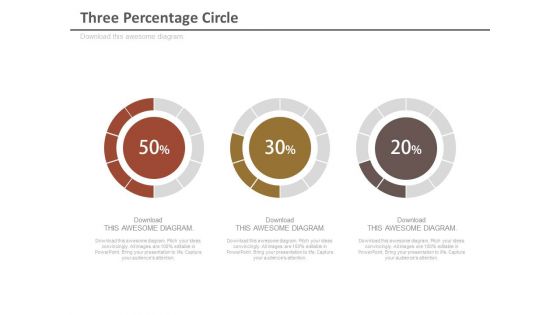
Three percentage circle chart for analysis powerpoint slides




Try Before you Buy Download Free Sample Product
 Impress Your
 Audience
 100%
100% Editable
 Save Hours
 of Time


When you are in procedure of developing your business, you require graphics that can be help you in displaying the percentage of achieved objectives and forthcoming methodologies accomplices and focused on market. SlideTeam is one stop answer for such business visionaries as it gives predesigned three percentage circle chart for analysis PPT template designs. Our three percentage analysis PowerPoint formats are made with inventive symbols and illustrations that they itself characterize the thought process of the introduction. This presentation template has been planned with realistic of business arrangement, timetable and venture symbols. Most advantage of downloading these PPT formats symbols is that business visionaries can sending these for other related introduction subjects like business advancement, business arranging, business methodologies, business marking, vital administration, business examination, business handle, business operations, business insight, group administration, and business bargain moreover. Along these lines, break the record and leave your objective market and gathering of people stunned by downloading our three percentage circle chart for analysis PowerPoint templates and slides. Really compelling presentations need really compelling design. Thousands of Three Percentage Circle Chart For Analysis Powerpoint Slides designs are here to get your message across.
People who downloaded this PowerPoint presentation also viewed the following :
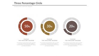
Three percentage circle chart for analysis powerpoint slides with all 4 slides:
Flow your thoughts through our Three Percentage Circle Chart For Analysis Powerpoint Slides. They will funnel them in the correct direction.
FAQs for Three percentage circle chart for
Pie charts are clutch because people instantly understand how pieces fit together - no explanation needed. Way better than staring at boring spreadsheet rows. They're perfect for showing market share or budget breakdowns, stuff like that. Honestly, they're pretty hard to mess up design-wise. Just don't get carried away with the colors - I've seen some truly hideous rainbow disasters. Keep it to like 5 or 6 slices max, otherwise it gets unreadable fast. Your audience will actually pay attention instead of glazing over.
Honestly, your brain just processes visual proportions way better than scanning through a bunch of numbers. Circle charts let you instantly spot what's eating up most of your budget - like seeing marketing gobbles up 40% without doing any math. Perfect for meetings since nobody wants to calculate percentages on the spot. Just don't go crazy with too many slices or it'll look like a rainbow exploded. I'd stick to maybe 5 categories tops. They're clutch for budget breakdowns and survey stuff where you need that quick "oh, I get it" moment from people.
Use pie charts for stuff that adds up to 100% - like budget breakdowns, market share, or survey results where people picked one answer. They're great for showing parts of a whole. Honestly, anything over 5-6 slices gets super cluttered and annoying to read. They work best when you want to highlight one big segment, like "look, 70% of users want this feature!" Also, those 3D pie charts? Total nightmare for actually comparing sizes - just stick with the flat ones.
Oh totally, pie charts can be pretty annoying actually. When you've got tons of tiny slices, good luck trying to tell which one's bigger - our brains just aren't wired for that. Also they're completely useless unless your data adds up to 100%, which is trickier than it sounds. You can't show multiple datasets either, or anything over time. I usually tell people to keep it under 6 categories max. Honestly though? Bar charts are way better if you need people to actually compare the numbers properly.
Colors are honestly where you'll see the biggest impact - swap in your brand palette instead of default blues and grays. Change the fonts to match what you're already using elsewhere. I'd also mess with the thickness and spacing to make it feel more custom. If it's interactive, the animation style matters too (though that might be overkill depending on where you're using it). Throw your logo nearby if there's space. Use your accent colors for different segments but don't go crazy - you still want people to actually read the thing. Start with your main brand colors and everything else will fall into place pretty naturally.
Excel or Google Sheets are your best bet honestly - they're already on your computer and super easy for basic pie charts. If you want something prettier, try Canva (my personal favorite for quick stuff) or Tableau if your work has it. Adobe Illustrator works too but feels like overkill unless you're doing something fancy. Python people always mention matplotlib but that's probably more hassle than you need. I'd just stick with Sheets to start - it handles like 90% of what you'll actually use. You can always get fancier later if you hate how it looks.
Dude, color contrast is EVERYTHING with pie charts. My boss literally stared at my all-blue monstrosity for like 30 seconds trying to figure out the segments - so embarrassing. You need high contrast between slices or people can't tell where one ends and the next begins. Skip red-green combos too since colorblind people are screwed. I usually stick to 3-5 max colors, otherwise it looks like a kindergarten art project. Pro tip: print it in grayscale first. If the segments blur together, your colors suck and you need more contrast.
Make sure each slice has the category name plus percentage - sounds obvious but you'd be surprised how many people skip this. Put labels right on the bigger sections if they fit, otherwise use those little lines pointing to smaller pieces. Horizontal text only please, nobody wants to crane their neck reading sideways labels. Oh and if you've got sections under 3-4%, just throw them into "Other" - trust me, it looks way cleaner. Start your biggest slice at the top and go clockwise. Double-check your percentages add to 100% before sending it out!
Honestly, pie charts are kinda overused. They're only good for showing parts of a whole - like if you're breaking down expenses or survey responses. But here's the thing: once you get past 5-6 slices, they become impossible to read. Bar charts crush them for comparing exact numbers or handling lots of categories. And obviously you can't show trends over time like line charts do. I mean, pie charts do have that instant visual punch when you want people to grasp proportions quickly. Just don't use them for everything - only when that "slice of the pie" idea actually makes sense.
Skip pie charts when you've got more than 5-6 categories - they turn into a hot mess. Also bad when all your values are similar (like 15-20% each) since people can't tell the difference between slices. Don't use them for time comparisons either. That's just painful to look at. If your percentages don't add to 100% or you have negatives, forget it. They're terrible for accessibility too - screen readers hate them. Honestly, I used to love pie charts but bar charts just work better. Your data will actually make sense to people.
Honestly, digital percentage charts are so much better because you can add animations and make segments clickable. People can hover over stuff to see details too. But here's the thing with print - you've gotta use really high contrast colors and label everything super clearly since there's no hover text to save you. Actually, print does let you go crazy with bold design choices that might look too intense on screen. Digital needs interaction, print needs to tell the whole story instantly. Makes sense when you think about it - totally different mediums.
Hover effects are your best friend here - they'll show exact percentages without cluttering the chart. Pick colors that actually make sense to your audience, not just whatever looks pretty. Smooth loading animations are honestly kind of addictive to watch and grab attention right away. If you can, make segments clickable for more details. Direct labels work great on bigger slices, but smaller ones need a legend. Oh, and people shouldn't have to play guessing games about what each section means! Start with the hover states though - easiest way to level up your chart.
Yeah, reading patterns mess with how people view pie charts - right-to-left vs left-to-right readers scan from totally different starting points. Colors are tricky too. Red screams "danger" here but means luck in lots of Asian countries, so your "poor results" slice might confuse people. I bombed a presentation in Tokyo because of this! Oh, and watch your legends - religious or cultural symbols can backfire. My advice? Find someone from that culture to give it a quick look first, or at least google their color meanings before you present.
Don't go crazy with slices – more than 5 or 6 just looks like a hot mess. Start at 12 o'clock because that's where everyone looks first. Similar colors next to each other are the worst (seriously, red next to orange makes me want to cry). Your percentages should add up to 100% but you'd be surprised how often people mess this up. Skip the legend if you can and just label the slices directly. Oh, and I always double-check my math because there's nothing more embarrassing than presenting wonky data to your boss.
High contrast colors are your friend here - but don't just rely on color alone. Throw in some patterns or textures too. Alt text is crucial for screen readers, and honestly, data labels right on the chart make life easier for everyone. Font size matters more than you'd think (speaking from experience with tiny pie chart text that nobody could read). Oh, and here's something I learned the hard way - view your chart in grayscale first. If it still works, you're golden. Keep those raw numbers handy somewhere too, maybe in a table.
-
Perfect template with attractive color combination.
-
Excellent products for quick understanding.