


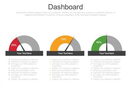
Three dashboard with percentage analysis powerpoint slides




Try Before you Buy Download Free Sample Product
 Impress Your
 Audience
 100%
100% Editable
 Save Hours
 of Time


Break down your organization's development with our three dashboard with percentage analysis PowerPoint slide. Our three dashboard with percentage analysis PPT slides help the associations to dissect as how effectively are they meeting their targets. The presentation layout demonstrates the vectors of the business experts with the correspondence bubbles that you can use to compose your message. Our group of planning specialists has created this PPT outline for your utilization. You can utilize this three dashboard with percentage analysis to portray the idea of financial and data analysis. You can change the PowerPoint layout according to your business prerequisite as it is totally editable. Other than this, it is feasible for you to add any critical data identified with your exchange that you need to impart to your crowd. We have collection of professionally outlined PPT slides that you can download, alter and share it as required. The stunning thing about our Presentation outlines is that they are pre-composed which spares your time and efforts. Give your thoughts an attractive form. Our Three Dashboard With Percentage Analysis Powerpoint Slides will be the anvil.
People who downloaded this PowerPoint presentation also viewed the following :
Three dashboard with percentage analysis powerpoint slides with all 3 slides:
Our Three Dashboard With Percentage Analysis Powerpoint Slides have an exclusive appeal. Folks will begin to believe they belong.

FAQs for Three dashboard with percentage
Essential KPIs for dashboard analysis include revenue metrics, customer acquisition costs, conversion rates, operational efficiency indicators, and user engagement statistics. These metrics enable organizations to streamline decision-making, enhance performance tracking, and accelerate strategic responses, with many businesses finding that well-selected KPIs ultimately deliver competitive advantage and measurable outcomes.
Data visualization techniques enhance dashboard readability by employing color coding, interactive charts, clear hierarchical layouts, and intuitive iconography to present complex metrics accessibly. These approaches streamline information processing by reducing cognitive load, highlighting key performance indicators, and enabling quick pattern recognition, with many organizations finding that strategic visualization ultimately delivers faster decision-making and improved operational efficiency.
Color-coding enhances data interpretation by creating visual hierarchies, highlighting critical metrics, indicating performance status, and enabling rapid pattern recognition across dashboard elements. Through strategic color schemes, organizations streamline decision-making processes, reduce cognitive load for users, and facilitate immediate identification of trends, with many finding that consistent color conventions significantly accelerate data analysis and operational responses.
Dashboards can be customized through role-based access controls, personalized metrics selection, adjustable visualization formats, dynamic filtering options, and tailored reporting schedules. These customization features enable executives to focus on strategic KPIs while operational teams access detailed performance data, with many organizations finding that stakeholder-specific dashboards enhance decision-making speed and improve overall business alignment.
Common pitfalls include overcrowding with unnecessary metrics, poor visual hierarchy, inconsistent color schemes, lack of clear objectives, and ignoring user needs. These design flaws significantly reduce dashboard effectiveness by creating confusion, slowing decision-making processes, and undermining data accuracy, with many organizations finding that streamlined, user-focused designs ultimately deliver better analytical insights and faster business outcomes.
Dashboard updates should occur based on data criticality and business requirements, ranging from real-time for operational metrics to daily, weekly, or monthly for strategic KPIs. Organizations typically find that customer-facing dashboards require hourly updates, financial reporting dashboards need daily refreshes, and executive summary dashboards perform well with weekly updates, ultimately balancing data accuracy with system performance and user expectations.
**INPUT**: What tools or software are best suited for creating interactive dashboards? **OUTPUT**: Leading interactive dashboard tools include Tableau, Power BI, Qlik Sense, D3.js, and Plotly, each offering distinct visualization capabilities and integration options. These platforms streamline data storytelling by enabling real-time updates, drill-down functionality, and collaborative sharing, with many organizations finding that strategic tool selection ultimately delivers enhanced decision-making speed and improved stakeholder engagement across departments.
User feedback can be incorporated through regular user interviews, usability testing sessions, analytics tracking of dashboard interactions, and feedback collection mechanisms embedded directly within the interface. This iterative approach enables organizations to identify pain points, optimize data visualization effectiveness, and enhance user adoption rates, with many companies finding that continuous feedback loops ultimately deliver more intuitive dashboards and improved decision-making capabilities.
Mobile responsiveness significantly enhances dashboard effectiveness by ensuring seamless access across devices, maintaining data visualization clarity, and enabling real-time decision-making regardless of location. Organizations with mobile-optimized dashboards experience improved user engagement, faster response times to critical metrics, and enhanced operational efficiency, with many executives finding that mobile accessibility transforms their ability to monitor performance and make strategic decisions on-the-go.
Balancing complexity and simplicity in dashboard design involves prioritizing essential metrics, using progressive disclosure to reveal detailed information on demand, and implementing intuitive visual hierarchies that guide user attention. Through strategic layering and customizable views, organizations streamline decision-making processes while maintaining comprehensive data access, with many financial services and healthcare institutions finding that well-balanced dashboards enhance operational efficiency and reduce analysis time.
**INPUT**: What methods can be used to analyze user engagement with dashboards? **OUTPUT**: Dashboard engagement analysis methods include click-through tracking, session duration monitoring, feature utilization mapping, user pathway analysis, and performance metric correlation. These approaches streamline insights by identifying popular widgets, pinpointing navigation bottlenecks, and measuring task completion rates, with many organizations finding that comprehensive engagement analytics ultimately enhance user adoption and deliver more strategic business intelligence outcomes. [Word count: 56 words]
Predictive analytics integrates into dashboard analysis through machine learning algorithms, forecasting models, trend analysis tools, automated alerts, and real-time data processing capabilities. These technologies enable organizations to anticipate market shifts, predict customer behavior, and forecast operational needs directly within their dashboards, ultimately delivering proactive decision-making advantages and strategic competitive positioning.
**INPUT**: What best practices exist for ensuring data integrity in dashboards? **OUTPUT**: Best practices for ensuring dashboard data integrity include implementing automated data validation checks, establishing clear data governance protocols, regular source system audits, real-time error monitoring, and standardized data transformation processes. These approaches streamline accuracy by minimizing human error, detecting anomalies quickly, and maintaining consistent data flows, with many organizations finding that robust validation frameworks ultimately deliver more reliable insights and enhanced decision-making confidence. [Word count: 60 words]
Organizational goals directly determine dashboard metrics by establishing priority areas requiring measurement, performance indicators that align with strategic objectives, and specific KPIs that track progress toward targets. Different goals drive different metrics, with sales-focused organizations emphasizing revenue and conversion rates, while operational efficiency goals prioritize cost reduction and productivity measures, ultimately ensuring dashboards deliver actionable insights that support strategic decision-making.
Real-time data enables immediate decision-making, rapid response to changes, and proactive issue resolution, while static data provides stable analysis, cost-effectiveness, and simplified processing requirements. Real-time dashboards streamline operations in sectors like financial trading and healthcare monitoring, whereas static analysis enhances strategic planning and reporting, with many organizations finding that combining both approaches delivers optimal analytical capabilities.
-
Good research work and creative work done on every template.
-
I discovered this website through a google search, the services matched my needs perfectly and the pricing was very reasonable. I was thrilled with the product and the customer service. I will definitely use their slides again for my presentations and recommend them to other colleagues.