


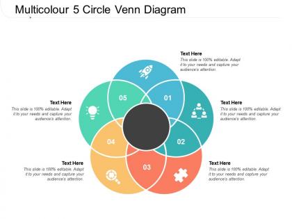
Multicolour 5 circle venn diagram




Try Before you Buy Download Free Sample Product
 Impress Your
 Audience
 100%
100% Editable
 Save Hours
 of Time


Always have aces in your hand with our Multicolour 5 Circle Venn Diagram. You will never feel handicapped.
People who downloaded this PowerPoint presentation also viewed the following :
Multicolour 5 circle venn diagram with all 5 slides:
Hand out great advice with our Multicolour 5 Circle Venn Diagram. Add a dash of brilliance to your thoughts.
FAQs for Multicolour 5
Basically you've got circles (or whatever shapes work) that overlap in different spots. Where they cross over? That's your shared stuff between categories. The parts that don't touch show what's unique to each group. Super simple concept, honestly - I use these all the time for work presentations. Just make sure you size everything right and label clearly so people actually get it. Oh, and don't overthink the design part. Next time you need to compare different groups or show relationships, draw some overlapping circles and start dumping your info into the right sections. Works every time.
Honestly, Venn diagrams are clutch for spotting overlaps in your data - like when you're looking at customer segments or which features people actually use. The visual makes it way easier than staring at spreadsheets all day. Just stick to 2-3 circles max because anything more turns into a hot mess (learned that one the hard way). They're great for showing stakeholders where different groups intersect without making them wade through boring tables. Perfect for finding shared traits between user types or figuring out what gaps you're missing. Super handy tool once you get the hang of it.
Don't cram too much text into each circle - nobody wants to squint at tiny font. Also make the overlap sections big enough to actually read. Honestly, I'd stick to 3 circles max because anything more looks like a hot mess. Size your circles based on how important each thing is. Double-check that stuff in the middle actually belongs to both categories (you'd be surprised how often it doesn't). And for the love of god, pick colors that don't blend together. I've seen so many where you literally can't tell sections apart. Keep it clean and show someone before you present it.
So basically those overlapping parts show you what belongs to both groups at the same time. Like if you've got one circle for "math kids" and another for "athletes," whoever's in that middle bit does both things. Makes sense, right? Bigger overlap = more stuff in common between your groups. You can get pretty crazy with this too - I've seen diagrams with like 4 circles all overlapping each other, gets messy fast lol. But yeah, anything sitting in those shared spaces has whatever traits from all the circles it touches.
Dude, Venn diagrams are super useful across subjects! Math teachers use them for set theory and probability - kids can actually see the overlaps. English classes too, when comparing characters or themes. Science works great for classification stuff. History teachers even use them to compare time periods, which honestly never occurred to me until I saw it in action. The visual thing just works for kids who get lost in abstract ideas. Oh, and definitely start simple with two circles before jumping into those crazy three-circle ones that make your brain hurt.
Honestly, going digital is so much better than trying to draw perfect circles by hand. You can resize stuff instantly and the overlaps actually look clean. I usually just use whatever I already have - Google Drawings works fine, but Canva's pretty nice if you want it to look fancy. The best part? You don't have to start over when you mess up. Just drag things around until it looks right. Oh, and if you're presenting to people, some tools let you animate the reveals which looks way more professional than just throwing up a static image. Lucidchart's good too if you need interactive stuff.
Honestly, Venn diagrams are a lifesaver when you're dealing with messy problems. They show you exactly where things overlap and where they don't - way better than just making random lists in your head. I sketch them out whenever I'm stuck on something with multiple factors. Like, you can spot gaps you'd totally miss otherwise, or see where you're doing redundant work. They're perfect for mapping out competing priorities or shared resources too. I know it sounds kinda basic, but seriously - next time you're facing something complicated, just draw some overlapping circles and see what jumps out at you.
Honestly, Venn diagrams are way more flexible than people think. You just swap out what the circles represent depending on your field. Marketing folks use them for customer segments or product features - helps find those sweet spots where things overlap. Scientists map data sets or species traits. For sociology? They're perfect for survey responses and social groups since there's always overlap there. The trick is getting creative about your categories. Pick 2-3 main things from your work that might intersect, then see what patterns pop up. Sometimes you'll spot opportunities you totally missed before. Works for pretty much anything with overlapping categories, which is... most things, really.
Oh man, I've made this mistake before - use different colors for each circle and keep your labels short! Put them inside the circles or use arrows, whatever looks cleaner. The overlapping parts are usually what people actually care about, so don't forget to label those. I always mess up the spacing at first, so give everything room to breathe. Consistent fonts help too. Honestly? Show it to someone else before you finalize it - they'll spot stuff you missed. Trust me on that one.
Colors are honestly a game-changer for Venn diagrams. Your audience can spot patterns instantly instead of squinting at labels every single time. It's basically a shortcut for people's brains. Black and white diagrams are just... boring? Nobody wants to stare at those. Consistency matters though - stick with the same colors throughout your whole presentation. Oh, and definitely use contrasting colors where the circles overlap. Those intersection parts need to really stand out since that's usually where the interesting stuff happens. Trust me, a little color goes a long way in keeping people engaged.
Look at the overlapping parts first - that's where the magic happens. Those intersections show you shared elements between your data sets, which is gold for finding correlations or audience segments. The non-overlapping bits? They tell you what's unique to each group. Empty spaces might mean you're missing data or opportunities (though sometimes there's just nothing there, which is fine). I always check the biggest overlaps first since they usually have the most actionable insights. It's honestly like getting a bird's eye view of how everything connects. Work outward from there to figure out what's driving those shared traits.
Honestly, Venn diagrams are pretty basic but that's kinda the point. They're specifically for showing how different groups overlap - like what's shared between sets of data. Flowcharts handle processes, mind maps branch out from central ideas, but Venn diagrams? Just comparisons. Use them when you need to see what categories have in common or where groups intersect. They won't do complex workflows like flowcharts can. But if you're analyzing relationships between different groups, they make it super obvious at a glance. Way more focused than the other options.
Try live polling with Mentimeter or Poll Everywhere - your audience votes on where items go and the diagram fills in real-time. Super satisfying to watch, honestly. Make PowerPoint versions clickable so each section reveals hidden stuff when people click. Oh, and breakout rooms work great for team building - each group tackles a different part. For virtual meetings, annotation tools let people drag items right onto your shared screen. I mean, anything beats just staring at a boring static diagram, right? The whole point is getting people involved instead of just presenting at them.
Honestly, Venn diagrams are clutch for brainstorming sessions. Draw a few overlapping circles and start dumping ideas into different sections - the overlap zones are where you'll find the good stuff. They're perfect when you've got input from multiple teams or departments that seems totally disconnected at first. I've seen people have those lightbulb moments just by seeing how their random ideas actually connect. Super easy to throw on a whiteboard too. Works way better than those fancy brainstorming apps, in my opinion. Next time your team's stuck, just grab a marker and start mapping things out visually.
Dude, Venn diagrams are actually genius - John Venn created them in 1880 and they totally changed how we think about logic. Before that, math concepts were super abstract and hard to grasp. His circles made it visual for the first time. They built on Euler's earlier stuff but were way more organized. Honestly, I can't imagine learning basic logic without them now - they're everywhere in probability and set theory. Quick tip: whenever you're dealing with categories or trying to reason through something, just draw the circles first. It'll make everything click way faster. Works every time for me.
No Reviews