


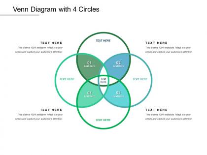
Venn diagram with 4 circles




Try Before you Buy Download Free Sample Product
 Impress Your
 Audience
 100%
100% Editable
 Save Hours
 of Time


Highlight actions that can be dangerous with our Venn Diagram With 4 Circles. Identify factors that cause injury.
People who downloaded this PowerPoint presentation also viewed the following :
Venn diagram with 4 circles with all 5 slides:
Handle injuries with our Venn Diagram With 4 Circles. Initiate action to counter the hurt.
FAQs for Venn diagram
Honestly, 4-way Venn diagrams are clutch because you can see how all your data sets connect in one spot. Sure, they look crazy messy at first - like, there's overlaps everywhere. But that's actually the whole point! You'll spot patterns in the 3-way and 4-way intersections that you'd totally miss in spreadsheets. I learned this the hard way trying to compare customer segments last month. Pro tip: use different colors or make some sections see-through, otherwise you'll go cross-eyed trying to read all those tiny overlapping bits.
So basically, four-circle Venn diagrams show you where all four data sets overlap - super useful for spotting weird patterns you'd totally miss in spreadsheets. Like seeing which customers hit multiple segments or how product features actually connect. Honestly, they can look like a hot mess if you don't color-code properly, but that's half the battle. The cool part? You'll instantly see those complex relationships between variables. Perfect when you're comparing four things that might influence each other. I used one last month for marketing segments and it was a game-changer for finding our best customer overlaps.
Use them when you've got four categories that actually overlap in meaningful ways. Customer data works great - like age, income, location, and buying habits. Same with comparing product features or survey results where people fit multiple groups. The overlaps need to matter though. Don't just throw four things together because you can. Marketing channels, team skills, that kind of stuff where the intersections actually tell you something useful. Fair warning - they get cluttered fast. I've seen some that look like abstract art instead of data visualization. Your audience has to genuinely need all those intersection details, otherwise you're better off simplifying.
Honestly, the trick is picking categories that actually make sense together. Don't just grab random stuff or you'll have a bunch of weird empty spaces that tell you nothing. Pick your main topic first, then find four aspects that naturally connect. Like with customer data - maybe "frequent buyers," "big spenders," "newsletter people," and "app users." Each circle needs to share real common ground with the others. I always sketch it out first to see if I can actually fill most of the overlap sections with real examples. Trust me, it's way better than forcing connections that aren't there.
You'll want to check out **Lucidchart** first - it handles all those crazy overlapping sections really well. **Draw.io** (they renamed it diagrams.net or something) is solid too and it's free. **Canva** has templates that look nice if you're in a hurry. Excel technically works but ugh, the formatting will make you want to throw your laptop. If you know some coding, **R** with the VennDiagram package is actually pretty sweet for generating them from real data. I always end up going back to Lucidchart though - super intuitive and exports to whatever format you need without being weird about it.
Yeah, totally! Four-circle Venn diagrams work great for this stuff. Put each stakeholder group in their own circle - customers, execs, your team, end users, whatever. Where they overlap? That's your goldmine of shared interests. Honestly, most PMs I know are shocked how much common ground exists when they actually map it out visually. The conflicts become obvious too, which helps. I used this last month when our stakeholders were pulling in different directions - turned out they agreed on way more than anyone realized. Makes those crazy competing demands so much easier to navigate.
So basically, each section shows you which traits belong to which combos of your categories. Two circles overlap? Those traits are shared by just those two. Three overlap? Shared by three categories. The center where all four meet - that's your universal stuff everyone has in common. I'd honestly start with just one overlap at a time instead of staring at the whole messy thing. It gets way less overwhelming that way. You can spot the unique stuff, the partial matches, and what everything shares pretty quickly once you break it down. The more circles in a section, the more categories are sharing those particular traits.
Ugh, don't do four circles - they're a nightmare! You'll have like 16 different intersection zones and nobody can figure out what's what. I tried making one once and honestly gave up halfway through because the geometry gets weird (circles can't all overlap symmetrically like with three). Your audience will just stare at it confused, especially if they're sitting in the back squinting at tiny text. Three circles max, or just pick a different chart type entirely. Trust me on this one - the whole point is clarity, not giving people headaches.
Four-circle Venn diagrams are actually perfect for teaching! Start with something familiar - like comparing four book characters or historical events. Students can see all the overlaps way clearer than just making lists. I'd use different colors for each circle so it doesn't look like a mess. Have them work together filling in the intersections - that's where the magic happens. They'll spot connections they totally missed before. Templates work great too; just give them the framework and let them populate it. Oh, and definitely start simple before jumping into abstract stuff. Trust me, it beats traditional methods every time.
Honestly, four-circle Venn diagrams can be pretty fun to mess with! If you're going digital, Lucidchart lets people hover over sections to see the data - super clean. For something more hands-on, I've seen people use hula hoops on the floor (sounds weird but it actually works great for group stuff). You could also layer transparent sheets or use colored string on a table. Post-it notes work too, though it gets chaotic fast. The tricky part is those overlapping sections - there's like a million intersection points with four circles. I'd start with your biggest overlaps first, then fill in the rest.
So four-circle Venn diagrams are completely different from bar charts or pie charts. They're meant to show how four different groups overlap, not actual quantities. Bar charts compare amounts, pie charts show percentages of a whole. But Venn diagrams? They reveal which stuff belongs to multiple categories at once. Honestly though, four circles get super cluttered - I've tried making them before and they're kind of a nightmare to read. You'd want this for analyzing complex overlaps, like different customer types with shared behaviors. If you just need to show numbers or percentages, definitely go with bars or pies instead.
Four-circle Venn diagrams pop up a lot in market research and bioinformatics. Marketing folks use them for customer segments across different demographics. Genomics researchers love them for comparing gene sets too. Business strategy teams find them helpful when looking at overlapping market opportunities or competencies. You'll also see them in academic settings - social sciences especially. Honestly though, they get messy fast. Way more confusing than the three-circle ones we all remember from school. I'd start with three circles first to see if that works for what you need. Then add the fourth if you really have to.
Oh man, you NEED colors for four-circle Venns or people will be totally lost. Pick high-contrast ones so everyone can follow which data goes where. Transparency is your friend - let those overlapping sections show through. I'd stick with your usual brand colors if possible, but honestly clarity beats pretty every time. Also throw in some patterns if you've got colorblind folks in the room (learned that one the hard way). Short version: make a legend and maybe label those crazy intersection areas directly. Your audience will thank you later.
Ugh, four-circle Venn diagrams are brutal! I'd start simple - maybe show just two circles first, then add the others step by step. Color coding helps a ton, and definitely label everything clearly. Honestly, even smart people get lost in those things. Focus on the intersections that actually matter and use arrows or little callout boxes for your main points. Oh, and maybe create a stripped-down version next to the full one? Just the big relationships. Trust me, your audience will appreciate not having their brains melted all at once.
So hover effects are your best friend here - they'll highlight specific intersections without cluttering things up. Most tools like PowerPoint handle this pretty well, or if you're going web-based, add some pop-up tooltips when people mouse over areas. Toggle buttons are clutch for showing/hiding different circles too. Start basic with hover states, then maybe add expandable sections under the diagram. I've seen some where you can filter data in real-time which honestly looks way cooler than it probably needs to be, but people love clicking around instead of just staring at static stuff. Your audience will definitely dig being able to explore rather than guess what those overlapping sections mean.
No Reviews