


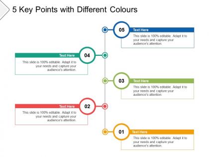
5 key points with different colours





Try Before you Buy Download Free Sample Product
 Impress Your
 Audience
 100%
100% Editable
 Save Hours
 of Time


Keep the enthusiasm going for your thoughts. Our 5 Key Points With Different Colours will not let it ebb.
People who downloaded this PowerPoint presentation also viewed the following :
5 key points with different colours with all 5 slides:
Do not let the tide ebb. Maintain control of the flow with our 5 Key Points With Different Colours.
FAQs for 5 key points
Honestly, it comes down to four basics. High contrast between text and background is clutch - nobody can read light gray on white from the back. Size matters too: make your main points way bigger than the fluff. Color's your friend here, but don't rainbow everything to death. Where you put stuff counts. Top left corner's where people look first, or just slam it center stage if it's super important. Oh, and don't try doing all this fancy emphasis stuff at once - pick one thing per slide and nail it. Way less overwhelming that way.
High contrast is your best friend here - dark text on light backgrounds or flip it around. The yellow highlighter trick from school? Same idea. I'd aim for at least 4.5:1 contrast ratio (accessibility thing), but honestly just squint at your screen and see what jumps out. Your brand's accent color works great against neutral backgrounds. Or try reversing out important stuff in colored boxes. Bigger the contrast difference, the more it'll grab attention. Sometimes I'll literally step back from my monitor to test if something actually pops.
Okay so typography is honestly your best friend for guiding people's eyes around the page. Bold headlines hit first, obviously. Then smaller body text keeps readers moving through everything. Different font weights and sizes create that hierarchy you need - some stuff pops forward, other elements fade back. Italics work great for subtle emphasis (though I'm totally guilty of overdoing them). Spacing and color help too. Oh, and try this weird trick - squint at your design and see what jumps out first. Works every time.
Honestly, visuals are a game-changer for presentations. They make complicated stuff way easier to understand and keep people from zoning out. Nobody wants to stare at walls of text while you're talking - that's just painful for everyone. Charts and photos help your audience actually *see* what you mean instead of just hearing it. Plus they're more likely to remember your points later. Just don't go overboard with random graphics that don't add anything. I learned that the hard way once. Stick with clean, high-quality images that actually back up what you're saying. Simple beats cluttered every time.
Honestly, color contrast is your best friend here - bright text on dark backgrounds or flip it around. Make your fonts bigger and bolder for the stuff that matters. White space around important points works wonders too. You could throw in some arrows, highlights, or callout boxes. Just don't go animation-crazy like everyone else does (seriously, it's gotten out of hand). Simple underlines work fine. Here's the thing though - pick maybe two techniques max per slide. When you emphasize everything, nothing actually stands out. I'd start with playing around with colors and font sizes first. Those two alone will get you pretty far.
White space is honestly like magic for drawing attention. Give something room to breathe and boom - your eye goes straight there. It's the same reason a single word on a blank page hits so hard. You can mess around with alignment too, or make things different sizes to create contrast. I swear it's basically visual feng shui when done right. The key is being intentional about it though. Don't just randomly space stuff out. Try giving your main element tons of breathing room and watch how much more punch it has.
Ugh, the worst thing you can do is try highlighting everything at once. Just makes it all look messy and nothing pops out anyway. Don't go crazy mixing different techniques either - like bold + neon colors + huge text. Recipe for disaster lol. I've definitely done this before and it was... not good. Your emphasized stuff shouldn't be competing with each other. Pick one or two main things to highlight first, then work from there. Stick with a simple color scheme and make sure there's enough contrast so people can actually see what you're trying to show them. Way less overwhelming that way.
Here's the thing - motion literally hijacks people's attention. Your brain can't help but look at whatever's moving on screen. So if you animate your CTA button or main headline, boom, that's where eyes go first. You can actually control the order people notice stuff by timing different animations. Pretty cool, right? But seriously, don't make your site feel like a slot machine. I've seen designers go way overboard with bouncing everything. Simple stuff works best - fade in your text, add a subtle hover effect. Test what actually helps instead of just looking flashy. Motion should guide focus, not distract from it.
Honestly, I swear by the 70/30 thing - let your visuals do most of the talking, not your text. Bold images should back up what you're saying without turning into some chaotic Pinterest explosion (I've sat through way too many of those). Keep text short. Let pictures handle the emotional stuff or complicated data. Here's what works: your audience should glance at any slide and instantly get both your point AND why they should care. Quick test - strip away all the words and see if your visuals still tell the story. If not, you're probably overthinking it.
So visual hierarchy is basically your secret weapon for grabbing attention. People's eyes follow a path when they look at stuff - size, color, contrast all guide where they look first, second, third. Without it? Total chaos. Your audience gets lost and misses the point completely. Here's what's crazy - good hierarchy can boost comprehension by like 40%. That's huge. I always tell people to pick their top three elements first, then make each one stand out more than the next. It's honestly one of those things that seems obvious once you get it, but makes such a difference in whether people actually engage with your content or just scroll past.
Make your key data pop first - that's what matters. I always use bright colors (like red) for the important stuff and keep everything else gray and boring. Bigger, bolder numbers for what counts. Don't crowd things together either - white space actually helps people focus. Arrows or callouts can guide their eyes where you want. Strip out any random chart elements that don't support your main point. Honestly, half the battle is just asking yourself "what's the ONE thing they need to walk away with?" Then build everything around that.
So basically, white space is like giving your important stuff room to breathe. When you surround something with empty space, it naturally becomes the thing people notice first - nothing else is fighting for attention. It's kinda like a spotlight effect, you know? Works great for buttons, headlines, or whatever you want people to actually see. I used to just randomly leave gaps everywhere, but being intentional about it makes such a huge difference. Try adding more padding around your key content and you'll see what I mean. The difference is honestly pretty dramatic.
Focus on contrast and hierarchy - that's your best bet. Use different colors, sizes, or fonts to make key stuff pop against the background. Position important content in spots people naturally look first, like top-left or center. Here's the thing though - I've seen way too many designs try to emphasize everything at once. Big mistake. Pick one, maybe two elements max to highlight. Otherwise it just becomes visual chaos and nothing actually grabs attention. Oh, and don't overthink the hierarchy part - just guide people's eyes in a logical order.
Oh man, this is such a big deal that most people don't think about! Red means "important" here but in Asia it's either lucky or dangerous depending on context. Your whole design changes based on who's looking at it - where you put text, how much white space you use, even which colors you pick. Right-to-left readers scan pages totally differently than we do, so that throws off your whole layout. I learned this the hard way on a project once. Seriously though, find people from your target culture and test with them first. Saves you from looking like an idiot later.
Honestly, Canva's your best bet to start - super easy to use and their templates are actually decent. PowerPoint works too if you're good with tweaking fonts and colors, but most people just use the boring defaults. Figma gives you way more control but you'll spend forever learning it (probably not worth it unless you're doing this regularly). Oh and Prezi? The zooming thing looks cool but can be pretty distracting tbh. I'd just grab a Canva template that doesn't look terrible and customize it from there. Way easier than starting from scratch.
No Reviews