


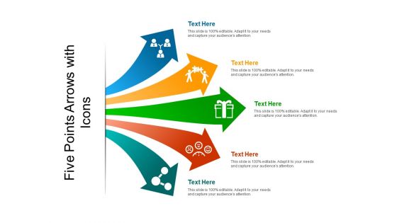
Five points arrows with icons





Try Before you Buy Download Free Sample Product
 Impress Your
 Audience
 100%
100% Editable
 Save Hours
 of Time


Our Five Points Arrows With Icons are free from any error. They have been carefully checked for any.
People who downloaded this PowerPoint presentation also viewed the following :
Five points arrows with icons with all 5 slides:
Increase the confidence to advance boldly with our Five Points Arrows With Icons. It helps change their gingerly approach.
FAQs for Five points
Honestly, arrows are like magic for presentations. They guide people's eyes exactly where you want them to go - from step 1 to 2 to 3 without getting lost. Super helpful for timelines or showing how processes work. You can use different arrow styles to show cause-and-effect or relationships between ideas too. Just stay consistent with your style throughout the whole deck or you'll confuse everyone. I probably overuse them, but they're just so good at creating that visual flow that makes complex stuff actually digestible.
Honestly, just go with high contrast - dark arrows on light backgrounds or flip it around. Blue and white is super safe (maybe too safe if you ask me), but your brand colors work fine as long as there's enough contrast. Red's actually perfect for "back" buttons since people naturally think "stop" when they see it. One thing though - definitely test it on your phone first. I've seen arrows that look great on desktop but completely disappear on mobile screens. Quick accessibility check wouldn't hurt either - you want at least AA contrast standards. Trust me, your users will thank you when they can actually find the navigation.
Arrows are honestly a game-changer for data presentations. Up arrows for good metrics, down for bad ones - pretty obvious stuff. Right-pointing arrows work great for showing step-by-step processes instead of those bland bullet points everyone uses. You can get creative with curved arrows too if you're showing cycles or feedback loops. One thing though - keep your arrow style consistent throughout the whole deck. Nothing looks more amateur than mixing different arrow types randomly. Oh, and size them big enough so people in the back can actually see them. I learned that the hard way at my last presentation when half the room was squinting.
Don't go crazy with arrows everywhere - it just looks messy. Also make sure they're big enough that people can actually see them from the back row (learned this the hard way lol). Your arrows should match your color scheme and style, not just be random decorations. Each one needs a real purpose - like showing workflow or pointing to key data. I always keep the same arrow style throughout, otherwise it looks sloppy. Oh and definitely check your slides from across the room first! You'd be surprised how tiny things look from audience distance.
Honestly, arrow styles are way more important than people think. Thin ones feel super modern and clean - they won't annoy users. But chunky bold arrows? Those practically yell "CLICK HERE!" which works great for buttons but feels kinda aggressive for regular navigation. I'm weirdly particular about this, but rounded arrows just seem friendlier than those sharp pointy ones. Filled arrows grab attention while outlined ones are more like gentle hints. You'd never want to use some bold red arrow for a simple "next page" thing, you know? Just match the style to how urgent the action actually is.
Arrows are like visual GPS for your slides - they guide people's eyes exactly where you want them to go. Super helpful when you're dealing with complex diagrams or walking through processes step-by-step. Without them, your audience might be staring at the wrong chart while you're explaining something completely different (awkward). They're clutch for showing cause-and-effect stuff too. Just make sure you keep the same arrow style throughout your whole presentation - mixing styles looks messy. Oh, and make them thick enough that people in the back can actually see them!
Honestly, arrows work best when you put them right before action items or after stuff you really want people to notice. They're like little "hey, look here!" signs. Just stay consistent - if you're using them for benefits, don't randomly switch to using them for warnings halfway through. Spacing matters too - cramped arrows look awful. But here's the thing that trips everyone up: don't use too many different arrow styles or your design turns into a hot mess. I learned this the hard way on a project last year. Less is more with arrows - overuse them and suddenly nothing stands out anymore.
Those animated arrows are honestly game-changers for presentations. Your audience instantly knows where you're going next, which keeps everyone on track. Static slides just feel... clunky? The arrows guide people's eyes naturally, especially when you're explaining complicated stuff or going through processes step by step. Plus they make your deck look way more polished without being distracting. Just stick with simple animations - maybe a subtle fade-in or gentle slide movement. Nothing too crazy though, you don't want people focusing on fancy effects instead of your actual content. Trust me, it makes a huge difference in flow.
Honestly, it's all about reading the room with arrows. Corporate folks want those clean, minimal ones - like simple chevrons or straight lines that don't scream for attention. Students? They actually need the chunky, obvious arrows pointing at stuff because they're trying to learn. But creative presentations are where you can go wild - colorful, hand-drawn, whatever matches your vibe. I've noticed executives get annoyed by flashy graphics (they want subtle), while students appreciate clear direction. Creative audiences eat up visual personality though. Just match your arrow game to who's sitting in those seats.
Yeah so arrows are trickier than you'd think! Western folks see right arrows as "next" but cultures that read right-to-left might find left arrows more intuitive. Sometimes arrows can even feel aggressive instead of just navigational - depends on context I guess. Honestly learned this the hard way on a project once. Your best move is adding text labels alongside arrows, especially if you're going international. Oh and for media stuff? Those triangle play buttons work way better than arrows since everyone gets those. Definitely test with different user groups though - you'll catch weird issues early.
Honestly, just match your arrow thickness to whatever line weight you're already using - that's like 80% of the battle right there. Same goes for colors; stick with your brand palette or go neutral. I've seen so many people stress over this when it's actually pretty simple. The style should follow your brand too. Rounded corners everywhere? Get rounded arrows. More geometric vibe? Go angular. Oh, and outlined arrows look cleaner on minimal designs while filled ones work better if you're going bold. Start small - maybe grab 3-4 arrow styles that fit your guidelines and build from there.
Honestly, Canva's probably your best bet if you're just getting started - super easy and you'll have something decent in like 5 minutes. Figma's great too, gives you way more control over the details. Adobe Illustrator is obviously the fancy option but kinda overkill unless you're doing this professionally. Oh, and don't sleep on PowerPoint's built-in arrow tools! Most people have no idea they exist. Google Drawings works fine for basic stuff too. You can export whatever you make as PNG or SVG. I'd definitely go with Canva first though.
Map out your process steps first, then connect them with arrows - they're like breadcrumbs that naturally guide people's eyes through the workflow. I actually get pretty nerdy about arrow styles lol. Curved ones work great for feedback loops, branched arrows for decisions, thick vs thin shows importance levels. Just stay consistent with what each style means throughout your whole process. Dense text explanations are honestly the worst for complex workflows. Arrows break everything into bite-sized visual steps instead. People instantly get the flow without their brain shutting down from information overload.
Dude, SVG arrows are seriously the way to go for presentations. They scale up or down without getting all pixelated and gross - you know how PNGs look terrible when you stretch them? SVGs stay crisp whether you're on your laptop or that huge projector screen. File sizes are super small too, so your presentation won't turn into some massive file that takes forever to open. Oh, and you can change colors easily in most design programs instead of searching for new icons every time. Honestly once you start using them, regular image files feel pretty outdated.
Yeah, so arrows are getting super minimal right now - think thin lines with those smooth micro-animations that don't make you want to punch your screen. The whole glassmorphism trend is making everything look translucent and soft, which honestly looks pretty slick on arrows too. What's really cool is how they're becoming contextual - changing colors or direction based on what you're doing. Neumorphism is adding those subtle shadows that make buttons feel almost touchable. You'll definitely want animated versions in your library, and make sure they scale properly. Nothing worse than a chunky arrow on mobile, you know?
-
Understandable and informative presentation.
-
Unique and attractive product design.