


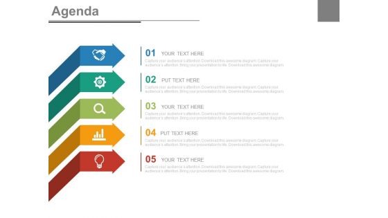
Five staged arrows and icons for business agenda powerpoint slides





Try Before you Buy Download Free Sample Product
 Impress Your
 Audience
 100%
100% Editable
 Save Hours
 of Time


Looking for a PowerPoint presentation for managing the topics of discussion, setting the agendas, redefine and strengthen the business plans, set the priorities and make the executive process easy. Then our team of very professional experts present to you five staged arrows and icons graphic for business agenda PowerPoint slide which help to captive audience clients with dispersed and well arranged information so that the meeting task is accomplished well in time with the available resources and budget. To help feature the internationally recognized trends to boost revenue figures, this PPT visual is unique design in itself as it plays a crucial role in aligning the agenda and action plans separately so that so section is left unattended and helps to ensure the set objectives are specific and measurable results are attained via putting to use presentation slide show. If the company is looking for a consistent and continuous effort planner designed presentation layout to systematize then this is the right platform for you.Pay the bills with our Five Staged Arrows And Icons For Business Agenda Powerpoint Slides. They keep the coffers full.
People who downloaded this PowerPoint presentation also viewed the following :
Five staged arrows and icons for business agenda powerpoint slides with all 4 slides:
Don't allow anything to hamper you with our Five Staged Arrows And Icons For Business Agenda Powerpoint Slides. Gain effective control over circumstances.
FAQs for Five staged arrows and icons for business
Focus on making them readable at tiny sizes first - that's where most icon designs fail. Use simple shapes and familiar symbols (clock = time, stick figures = people, you know the drill). Your whole set should look like they belong together style-wise. Don't make color the only way to tell them apart since some people can't see certain colors or might be viewing in black and white. I always test mine at actual phone size before calling it done - learned that the hard way when my "brilliant" detailed design turned into an unreadable mess. Simple beats clever every time.
Oh totally, color choice matters way more than people think! Your brain processes those colors before you even read the text. I always go with red for urgent stuff, blue for regular info (boring but reliable), and green for positive updates or anything "go" related. Yellow's tricky - gets attention but feels like a warning sign? Honestly, the worst presentations are when everything's just one color. Looks so bland. Stick to maybe 3-4 colors max and actually be consistent with what each one means. People will start recognizing your system without realizing it.
Oh man, don't go too detailed with your icons - they'll look like garbage when they're tiny. Mixing styles is another big one I see all the time, like throwing flat and 3D icons together. Looks super amateur. Colors that clash or blend into each other? Nightmare. You want that perfect middle ground where people know exactly what the icon means without having to think about it, you know? Too literal is boring, too abstract and nobody gets it. Test them small before you call it done - trust me on this one.
Honestly, icons are a game changer for agendas. Your brain processes pictures way faster than words, so people instantly get what each section's about. I learned this the hard way - used to do plain bullet points and half my team would zone out. Now I throw in calendar icons for scheduling stuff, pie charts for budget talks, lightbulbs for brainstorming (maybe a bit cheesy but whatever). People actually follow along better and don't get blindsided by topic changes. Just don't go crazy with fancy designs - simple works best.
Honestly, symbols work so well for icons because everyone just *gets* them instantly. Think about it - a clock means time whether you're in Tokyo or Toronto. Your brain doesn't have to translate anything. I'd stick with the obvious ones first: lightbulbs for ideas, handshakes for partnerships, that kind of stuff. Don't get too fancy with regional symbols that might confuse people from other countries. Once you've got your basic icon library down, then you can play around with variations. It's wild how universal this visual language actually is.
Start with contrast and simplicity - your icons need to pop against backgrounds and use shapes people actually recognize. Don't forget alt text so screen readers work properly. I can't tell you how many gorgeous icons I've seen that are totally useless because they're way too abstract or artsy. Size matters too, especially for mobile tapping. Test with real users if you can swing it. Short version: if someone squints at your icon and goes "what the hell is that supposed to be?" then you need to go back to the drawing board.
So I'm seeing three big things happening with business icons right now. Minimalism is everywhere - clean lines, simple shapes, way less visual noise. Honestly, I think some companies are going a bit overboard with it, but whatever. Accessibility matters way more now too, which means better contrast and clearer layouts so everyone can actually use the interface. Then there's this shift toward inclusive imagery - diverse teams instead of just generic suit-wearing dudes. You should probably look at your current icons and see which ones feel super outdated. Some quick updates could make a huge difference.
Honestly, animated agenda icons are a game changer for keeping people awake during presentations. The movement naturally guides everyone through where you are - way better than boring bullet points. Plus it looks way more professional than static slides. I've noticed people actually follow along better in longer meetings when there's some visual flow happening. Just keep the animations simple though - fade-ins or gentle slides work great. Don't get carried away with flashy stuff or it'll backfire and distract from what you're actually saying.
Start with your company colors - that's the low-hanging fruit right there. You can pull in subtle stuff like geometric shapes from your logo or those signature patterns, just keep them readable when they're tiny. Don't go crazy slapping your full logo on everything though, it'll look like a hot mess. Your brand's typography style works great for any text bits too. Honestly, I'd focus more on creating that consistent visual vibe that feels like "you" rather than being super literal about it. Test out maybe 2-3 icons first and see how they actually look in your agenda before going all-in.
Honestly, colors will trip you up fast - red screams "danger" here but it's lucky in China. White's pure to us, means death elsewhere. Don't even get me started on hand gestures or religious stuff. Clock icons? Useless in cultures where "10am" means "sometime before lunch" lol. I bombed a Dubai presentation because of this exact thing. Arrows work everywhere though. So do basic shapes and generic business icons. They're boring but they won't accidentally insult anyone's grandmother, which is probably more important than looking creative.
Adobe Illustrator or Figma are your best bets - they're what most pros use for vector icons that stay crisp at any size. Canva's pretty decent if you want something simple, though you can't customize as much. I know it sounds weird, but PowerPoint's drawing tools actually work okay in a pinch (I've done this more than I'd like to admit). Sketch is good too if you're on Mac. Just make sure whatever you use exports vectors, not just regular images. Oh, and decide on a consistent style before you start - trust me on this one.
Your team's feedback is honestly the best way to fix those agenda icons. They're using them every day, so they'll tell you straight up what's confusing or just doesn't work. I'd do quick surveys or casual check-ins - sometimes you can just watch how people react during meetings. Trust me, they'll roast the icon you thought was brilliant. You might discover icons that look too similar or find out you're missing obvious ones. Set up something regular, like a monthly check-in, then actually use what they tell you. Don't be one of those people who asks for input then ignores it.
Yeah, go minimal for sure! Simple icons are way easier to recognize at a glance. You don't want people squinting at some fancy graphic when they should be reading your actual agenda items. Our brains process clean shapes super fast - it's honestly like highway signs vs trying to read fine print while driving (terrible analogy but you get it). The bonus is they'll look sharp whether someone's viewing on their phone or you're projecting it big. Just stick with basic shapes and maybe two colors max. Trust me, less is definitely more here.
So basically, agenda icons are like visual shortcuts for your meeting topics. Pick a lightbulb for brainstorming sessions, clock for timeline stuff, dollar sign when you're talking budget - you get the idea. People can scan and immediately know what's coming up without reading through tons of text. Honestly, it just makes everything look cleaner and less overwhelming. The best part? Your team can quickly spot which sections they actually need to pay attention to versus the parts where they can zone out a bit. I'd start with maybe 5 or 6 icons for whatever meeting types you do most often and see how it works.
Honestly, custom agenda icons are totally worth it. Your presentations will look way more polished instead of using those tired stock images everyone's already seen everywhere. You can actually match your brand colors and style perfectly - no more settling for whatever random stuff you find online. The licensing thing is huge too. You won't have those awkward moments where a competitor ends up using your exact same icons (happened to my old company once, super embarrassing). I'd probably start with like 5-10 solid icons you can reuse. They don't have to be fancy, just clean and yours.
-
Topic best represented with attractive design.
-
Great designs, really helpful.