

Five staged colored funnel diagram with business icons flat powerpoint design




Try Before you Buy Download Free Sample Product
 Impress Your
 Audience
 100%
100% Editable
 Save Hours
 of Time


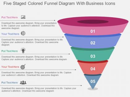
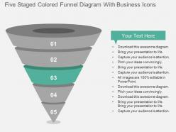
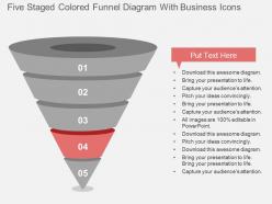
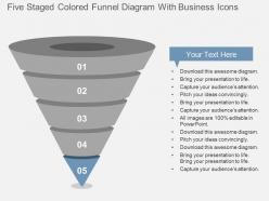
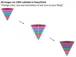
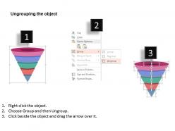
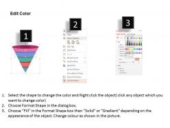
Choose our five staged colored funnel diagram with business icons flat PowerPoint Template Slide Design to meet your business requirements. Funnel charts are a type of chart, often used to represent stages in a sales process and show the amount of potential revenue for each stage. This type of chart can also be useful in identifying potential problem areas in an organization’s sales processes. Five staged colored funnel diagram with business icons has been used to design this PPT Diagram. This PPT Slide contains the concept of business process flow representation. Use this slide for business and marketing related presentations. Each funnel stage represents a percentage of the total. So, in most cases, a funnel chart is shaped like a funnel - with the first stage being the largest, and each subsequent stage smaller than its predecessor. Funnel charts are one of many types of data visualizations used to organize and present data in a way the audience can understand and take action on. So, just start downloading the editable slide and share in your business meetings. Overachievers can finally step away from their computers. With our Five Staged Colored Funnel Diagram With Business Icons Flat Powerpoint Design flawless design is only an easy click away.
People who downloaded this PowerPoint presentation also viewed the following :
Five staged colored funnel diagram with business icons flat powerpoint design with all 9 slides:
Our Five Staged Colored Funnel Diagram With Business Icons Flat Powerpoint Design forecast a glittering future. Expectations get a genuine boost.
FAQs for Five staged colored funnel diagram with business icons
So basically funnel diagrams show your conversion process - starts wide at the top with all your visitors or leads, then gets skinnier as people drop off at each step. Think of it like an actual funnel, you know? Each section's width matches how many people are still in the game at that point. Pretty brilliant for spotting where you're bleeding the most users. I'd honestly start by fixing whatever stage has the biggest drop-off first - no point optimizing something that's already working decent when you've got a massive leak somewhere else. Super visual way to see your bottlenecks without digging through boring spreadsheets.
Funnel diagrams are seriously underrated for tracking your customer journey. Map out each stage from awareness to purchase, then measure where people drop off. The visual makes it super obvious where you're bleeding potential customers - way easier than staring at spreadsheets all day. Once you spot the weak points, throw more resources at fixing those specific stages. Like if barely anyone knows about you, focus on top-funnel content instead of optimizing your checkout page. Start simple though - just track your current process first, then you'll see exactly what needs work.
Marketing and sales teams use these things constantly - they're perfect for showing how leads move through different stages. HR departments also love funnel diagrams for tracking candidates through the hiring process. Business development and customer success teams find them super useful too, basically anywhere you need to show drop-off rates. I've seen consultants throw them into client presentations all the time (way better than boring spreadsheets honestly). They work great when you're dealing with any process where numbers decrease at each step. Once you start noticing funnel opportunities, you'll spot them everywhere.
Start with your brand colors - that's honestly where you'll see the biggest difference right away. Then swap out the default fonts for whatever your company uses. Most templates are pretty flexible, so you can mess around with the funnel shape and resize sections as needed. Don't forget your logo! Icons and background stuff can be changed too. I'd tackle one section at a time though, otherwise it gets messy fast. The trick is making it look like *your* brand without losing readability. Oh, and some templates have these weird default graphics that you'll definitely want to ditch.
Don't cram a novel into each stage - nobody can read that tiny text anyway. Your funnel doesn't need to match real percentages unless that's literally the point. People get way too obsessed with making the math perfect when you're just showing how things flow from one step to the next. Stick to 5-6 stages max or it looks like a nightmare. Keep your colors the same throughout and label everything clearly. Oh, and definitely show it to someone else first - I've learned this the hard way when my "obvious" diagrams made zero sense to anyone else.
Funnel diagrams show stuff moving through stages where you lose data at each step - like how many people visit your site vs actually buy something. They're way different from regular bar or pie charts because they focus on that flow between stages. Pretty niche honestly, but that's what makes them useful. You'll spot bottlenecks super fast, which is clutch for figuring out where your process is breaking down. Bar charts just sit there comparing things. If you're tracking conversions or any process where people drop off, definitely use a funnel instead.
Dude, funnel diagrams are perfect for this stuff. They show the whole progression at once - where people drop off, what's working, all of it. Your executives won't get overwhelmed by data tables, but analysts still get the detail they need. Sales processes, user journeys, whatever - they just make technical info way easier to digest. Each stage tells part of the story but you see the big picture too. Oh, and definitely use different colors for each stage with percentage labels. Makes it so much cleaner to follow.
Honestly, Lucidchart is probably your easiest bet - their templates are solid and you can collaborate if needed. Canva's another good option, especially since their stuff automatically looks decent even if you're not great at design. PowerPoint actually has some SmartArt funnel options that people forget about (though they're kinda basic). Oh, and Figma works well if you're already messing around with it for other projects. I'd just grab Lucidchart's free trial first and see if their funnel templates do what you need. Way faster than starting from scratch.
Think of your customer journey like a funnel with different layers. Your biggest audience sits at the top - that's your awareness stage. Then you track how many actually visit your site, sign up, try your product, whatever. The cool thing? You'll instantly spot where people are bailing out. Calculate conversion rates by dividing who moved forward by who started each stage. Honestly, this part can be pretty eye-opening. Those percentages show you which steps are broken or confusing. Start fixing the stages with the worst drop-offs first - that's where you'll get the biggest bang for your buck.
Color psychology is super important for funnels - people subconsciously read way more into colors than you'd think. Go with colors that feel like natural progression, like dark to light or a gradient that lightens as it narrows down. Never use red unless you're actually highlighting problem areas (learned that one the hard way). Blues and greens work great because they feel trustworthy. Warm colors can add urgency if that's what you're after. Keep it to 2-3 colors max - I've seen rainbow funnels that just look messy and confusing. Make sure there's good contrast too. Run it by a couple people first!
Dude, funnel diagrams are honestly game-changers for figuring out where your processes are broken. Like, you can instantly see if people are dropping off at stage 3 of your sales process or whatever. Super helpful for hiring workflows too - though I probably use them way too much now lol. The cool thing is you don't have to guess anymore which problems to fix first. Just look at where the biggest drop-offs happen and boom, there's your answer. Way better than walking into meetings with just "I think maybe..." Start tracking your stuff this way and you'll actually have real data to back up your points.
Conversion rates between stages are what you really need to watch. I'd focus on volume, drop-off rates, and how long people spend at each step. Cost per acquisition too if you're paying for traffic. Pick stage-specific stuff that actually moves the needle - email opens for awareness, click-throughs for consideration, conversions at the end. Honestly though? Don't get crazy with metrics. Two or three per stage max, or you'll just confuse yourself with all the numbers. Start with your worst drop-off points and fix those first. Way easier than trying to optimize everything at once.
There's a couple ways to tackle this. You can build separate funnels side-by-side - honestly this is probably the cleaner approach if you've got space. Tools like Tableau make it pretty easy, even PowerPoint works fine for basic ones. Or go with the single funnel route and use different colors for each channel within the same stages. Just make sure your conversion stages match up across channels, otherwise you're not really comparing the same thing. I'd probably start with whatever your best performing channel is as your reference point - makes the differences way more obvious when you're presenting it.
Honestly, start simple - just track conversion rates between each funnel stage and where people are dropping off. Your sales team's feedback on lead quality is gold, so loop that back to marketing. A/B test results get messy on the diagram but they're worth it. I'm obsessed with adding user behavior data at every touchpoint because it shows what's actually happening vs what you think is happening. Customer satisfaction scores help too. Don't go crazy though - pick one or two feedback loops that tackle your worst conversion problems first, then add more once you're not drowning in data.
Yeah definitely! Funnel diagrams work for basically any process where you lose people along the way. Education's a good example - tracking students from enrollment through graduation, or how many finish online courses. Healthcare too, like screening programs where tons of people start but way fewer actually complete treatment. I've honestly seen these used for the weirdest stuff - website clicks, hiring processes, even tracking how many people RSVP to events vs. actually show up (brutal reality check there). Just swap out the sales language for whatever makes sense in your field and focus on those drop-off points.
-
Graphics are very appealing to eyes.
-
Presentation Design is very nice, good work with the content as well.