


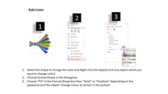
Rr six staged one to many arrows with icons flat powerpoint design




Try Before you Buy Download Free Sample Product
 Impress Your
 Audience
 100%
100% Editable
 Save Hours
 of Time


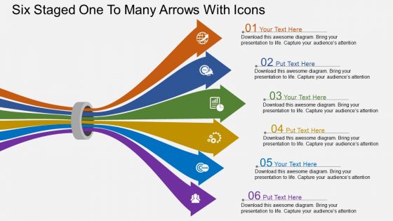
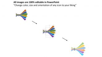
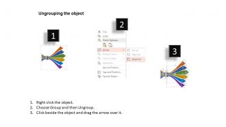
You are just a few clicks away in converting your idea into a mesmerizing PowerPoint show. Do not let your vision remain held up and download our six staged one to many arrows with icons flat PowerPoint Presentation. Our designers have skillfully used the elements to make this PowerPoint slide background stand out from others in the same class. Strikingly rich colors are interwoven among each other to form a wonderful piece of art. Moreover, it lets you convey more information to your viewers per white space available. Your audience will be able to sense the information going through the bottleneck and projecting itself to convey information that you require them to see. Each PPT infographics arrow represents visual data well represented by stylish icons. Finally, you can enter more information about topics in the text areas provided at the end. Feel free to change colors, shape size, orientation of the objects and grouping or ungrouping them for custom use. Our Rr Six Staged One To Many Arrows With Icons Flat Powerpoint Design care for your commercial gains. They are a good mode to advertise your thoughts.
People who downloaded this PowerPoint presentation also viewed the following :
Rr six staged one to many arrows with icons flat powerpoint design with all 4 slides:
Put your thoughts in the safe custody of our Rr Six Staged One To Many Arrows With Icons Flat Powerpoint Design. They will ensure their safe passage.
FAQs for Rr six staged one to many arrows with icons
Honestly, it's great for breaking down one big idea into six clear parts. Your audience gets it right away - they can see how everything connects without getting lost. Clean design with icons helps too because nobody wants to stare at messy slides. Works perfectly when you've got like one main strategy that splits into different tactics, or maybe one problem with a bunch of solutions. I use it whenever I need to make complicated stuff actually make sense to people. Short sentences mixed with longer explanations seem to work best. You'll definitely want this format when things get complex but you still need people to remember what you said.
Dude, icons are a game changer for PowerPoint. People process visuals way faster than text - nobody wants to read paragraphs on slides anyway. They'll help break up your six-stage flow so it doesn't look overwhelming. Plus your audience will actually remember the content better since our brains are wired for visuals over words. For your arrow design, just pick icons that clearly represent each stage. Oh and make sure they're all the same style - mixing different icon sets looks super amateur. Trust me, it's worth the extra few minutes to find matching ones.
Yeah definitely! That arrow design is super flexible - you can use it for basically anything. Marketing teams love it for customer journey mapping. Works great for education stuff too, like curriculum steps or learning paths. I've seen it used for project timelines, employee onboarding... honestly the list goes on. The icons are usually swappable so you can customize them for whatever industry you're in. It's really just a visual framework, so you throw in your own content and boom - you're done. Way easier than starting from scratch, trust me.
You'll want one-to-many arrows when showing how a single idea splits into multiple parts. Great for org charts, cause-and-effect stuff, or breaking down strategies into tactics. I actually end up using this format constantly - way more than I expected when explaining complicated concepts. Perfect for showing how one problem creates several consequences or how your main strategy turns into specific actions. The six branches give you room to explain each outcome without making it look messy. Just double-check that your central idea actually connects logically to all six things you're presenting, otherwise it'll feel forced.
Just click each icon and hit delete, then go Insert > Icons for Microsoft's stuff or Insert > Pictures if you've got your own. Keep them all the same size though - nothing looks worse than random sized icons scattered around. Oh, and stick with one style throughout, like all outlined or all filled. I learned that the hard way on a presentation last month. After you swap them, double-check the alignment so your arrow flow still looks clean. It's honestly pretty straightforward once you get the hang of it.
For flat PowerPoint templates, ditch the shadows and 3D stuff - stick with solid colors instead of gradients. Simple geometric icons work way better than clipart (trust me on this one). I'd limit your palette to maybe 3-4 colors tops, and don't be afraid of white space. Sans-serif fonts look cleaner too. Skip any fancy text effects like beveling. Oh, and sketching your six-stage flow on paper first actually saves time later. Just keep consistent spacing between arrows and stages when you build it digitally. The whole "less is more" thing really applies here.
Hey! So color schemes can make or break those arrow diagrams. Warm colors like red scream "urgent!" while blues feel more chill and trustworthy. Don't go overboard though - I made that mistake with neon yellow arrows once and everyone was practically squinting at the screen. You want good contrast between each stage so people can actually follow along. But here's the thing: too many colors just creates chaos. Stick to maybe 2-3 colors max, with one accent for the most important parts. Your audience should focus on the actual steps, not wonder if they're looking at a rainbow explosion.
Dude, don't go crazy with arrows everywhere - I've seen decks that look like conspiracy boards lol. Mix different icon styles and it'll look super unprofessional. Keep everything consistent throughout. Make your arrows thick enough and icons big enough so people in the back can actually see them. I learned this the hard way when presenting to like 50 people once. Your arrows should connect logically too, not just be random decoration. Honestly, simple beats fancy every time. Stick to one visual style and you'll be golden.
Start with the center piece, then hit each branch one by one with like half a second between them. I'd go with "Appear" or "Fly In" - anything fancier just looks cheesy honestly. Your icons come last, after each arrow finishes showing up. The timing thing is key though - 0.5 seconds gives people time to actually follow what's happening instead of getting overwhelmed. Oh, and definitely set it up so you can click through manually during your presentation. Sometimes you need to stop and explain stuff, and auto-advance will just keep going without you. Run through it a few times first to make sure the flow feels right.
Honestly, Canva Pro is probably your best bet - tons of arrow templates and icon libraries that'll save you forever. PowerPoint's built-in stuff works okay but looks kinda basic. If you want more control, grab Adobe Illustrator (though it's pricey) or try Figma since it's free. Sketch is solid too if you're on Mac. These give you way better control over colors and that clean flat look. I'd probably start with Canva Pro since it's easiest, then maybe mess around with Figma later if you get into it.
Honestly, that six-stage thing works because people can actually follow where you're going. Nobody's sitting there confused about what comes next. The icons give everyone these little mental breaks too - like "okay we finished step 2, moving on." Way better than those endless presentations that just... keep going. Short chunks feel less overwhelming, you know? Plus that arrow layout makes connections super obvious between ideas. Oh and definitely point out which stage you're on while presenting - keeps people from zoning out.
So instead of just listing boring bullet points, tell a story through your arrows! Start with a problem someone actually faces, then show how things progress (and get messy) through each stage. I always cringe when I see those feature-heavy presentations - nobody cares about specs. What works is showing real consequences at each step. Frame it like "here's what happens when..." and suddenly you've got flow. Your icons should connect the dots too, not just look pretty. Oh and throw in some conflict - people love seeing problems get solved step by step.
Honestly, high contrast is everything - limit yourself to maybe 3-4 colors tops. I used to make my arrows way too thin and nobody could see them from the back. Space things out generously too, cramped icons look terrible. Each stage should have consistent icon sizes, and go with stuff people recognize instantly. Oh and here's what really helped me - walk back from your screen like 6 feet. If you can't read it clearly from there, your audience is screwed. Trust me on this one, I've been there squinting at my own messy slides before!
Watch for engagement clues during your presentation - questions about each stage, people taking notes, or referencing your arrows later. Head nods and forward leaning are weirdly reliable indicators (I swear this actually works!). Send a quick survey asking which stage hit hardest and if the flow made sense. The real test? Whether they can explain your six stages to someone else afterward. Monitor if they actually use what you presented. Two weeks later, do a brief follow-up meeting to see what stuck. Sometimes the most obvious metrics tell you everything you need to know.
Oh definitely! There's actual research backing this up - people retain like 65% of visual stuff after three days, but only 10% when it's just text. Pretty wild difference, right? Those six-stage arrow designs with icons work because you're giving people a clear path to follow. Each icon becomes this little memory anchor. The arrows show progression so nobody gets lost halfway through your point. Honestly, I'm a bit obsessed with using distinct colors for each stage too - makes everything pop. Way better than drowning people in bullet points again!
-
Great quality slides in rapid time.
-
The Designed Graphic are very professional and classic.