

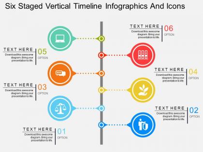
Cw six staged vertical timeline infographics and icons flat powerpoint design




Try Before you Buy Download Free Sample Product
 Impress Your
 Audience
 100%
100% Editable
 Save Hours
 of Time


Select our six staged vertical timeline PowerPoint slide if you are creating presentation on key achievements of your business. This Presentation visual allows you to demonstrate the perfect corporate story. You may use it to show your viewers which can be investors, business partners or even team members as what you have achieved as an organization in these years and what you want to achieve in the next few years. Apart from this, the PPT illustration can also be useful in showing the business values to your viewers. Our designing experts have created this wonderful slide for you. The PowerPoint template is accessible with perfect blend of colors and matching icons that improves the overall quality of the design. The timeline is the perfect way to share your business journey. So what are you waiting for, quickly download this attractive PPT image and then incorporate in your presentation to fulfill your objective. To check some more innovative designs, you may browse through our entire gallery where you will find one of the best designs available in the industry. Chart out their development with our Cw Six Staged Vertical Timeline Infographics And Icons Flat Powerpoint Design. Communicate the great benefits that are bound to accrue.
People who downloaded this PowerPoint presentation also viewed the following :
Cw six staged vertical timeline infographics and icons flat powerpoint design with all 4 slides:
Expose them to the benefits with our Cw Six Staged Vertical Timeline Infographics And Icons Flat Powerpoint Design. They will find your facilities attractive.
FAQs for Cw six staged vertical timeline infographics and icons
Okay so first thing - make sure people can actually follow the sequence without getting lost. Use clear markers for each event and keep your descriptions short so they don't take over the whole design. I'd say consistent colors and fonts help guide people's eyes naturally. Also, don't cram everything together! White space is your friend here. Honestly, zigzag timelines are the worst - they just confuse everyone. Oh and definitely show it to someone else first. If they can't figure out the flow right away, you'll need to clean it up more.
Keep it simple with colors - 2 or 3 max. You'll want good contrast so people can actually read the thing. I usually do one main color for the timeline backbone, then maybe a pop of color for important dates. Clean fonts are your friend here. Arial, Helvetica, those basic sans-serif ones that don't give you a headache when you're squinting at small text. Headers can be fancier if you're feeling it. Oh, and here's something I learned the hard way - print a test copy in black and white first. You'd be surprised how many "perfect" color combos turn into gray mush on paper.
Canva's honestly your best bet to start - crazy easy with tons of templates you can tweak. PowerPoint works too if you're already familiar with it (I know, I know, but hear me out). Adobe Illustrator's amazing if you want total control, though it'll take some time to learn. Figma's clutch for team projects since it's all online. There's also Timetoast and Tiki-Toki if you want something interactive, but that might be overkill. I'd mess around with Canva first, then maybe graduate to Illustrator later if you get hooked on design stuff.
Dude, timeline infographics are seriously underrated. They turn boring data dumps into actual stories people want to follow. Your brain processes visuals like 60,000x faster than text (crazy stat, right?). But here's the thing - timelines create this natural suspense where viewers get curious about what happened next. Way better than those awful bullet point lists everyone defaults to. Plus people remember stuff better when it follows a clear sequence. Our brains are wired for chronological flow. Next time you're stuck presenting project milestones or historical events, ditch the text blocks. A clean timeline will get way more engagement.
Honestly, the worst thing you can do is cram everything together with tiny fonts. Nobody wants to squint at your timeline! Also, pick one date format and stick with it - mixing "Jan 2020" with "January 15th, 2021" looks sloppy. Colors should mean something, not just be random decoration. If you've got overlapping events, maybe skip the basic linear layout? Short descriptions work better than novels, and definitely test it on someone first. They'll catch the weird spacing issues you didn't notice. Trust me on this one.
Think of it like telling a story visually - you're guiding people through events so they can see how everything connects. Pick the moments that actually matter for your main point (company milestones, project phases, whatever). Don't dump every single detail though - that's just overwhelming. Use different colors, icons, and sizes to make the big stuff pop. Here's what works for me: figure out your endpoint first, then backtrack to choose which events best lead up to that moment. The whole thing should feel like it's building toward something, you know?
So linear timelines are perfect for history stuff or project deadlines - super clean and easy to follow. I use these way too much honestly because they're just so simple! Circular ones are clutch for things that repeat, like seasons or business cycles. When you're comparing multiple storylines, parallel timelines are the way to go. Gantt charts? Those are gold for project management when tasks overlap. The trick is thinking about how people naturally process your topic - does it cycle back or build forward? I'd definitely run it by a couple people first to see what makes sense immediately.
Here's the thing - your visuals should back up the story, not fight with your text. Keep icons small and text short but punchy. I totally bombed this once by cramming way too much stuff everywhere! Put your text in the same spot each time (above, below, whatever) so people aren't hunting around. Size things based on how important they are. Colors need to flow naturally from beginning to end. Honestly, just sketch it out first before you touch any design software. Trust me, you'll thank yourself later when you're not doing a million revisions.
Honestly, layered storytelling is where it's at - let people zoom from decades down to specific moments. Creates this addictive drilling-down effect. Branching narratives work great too, where choices lead to different historical paths. I always get sucked into the ones with side-by-side timeline comparisons (probably spend way too much time on those). Scroll animations that reveal events as you move through time feel super smooth. Drop in multimedia hotspots - videos, audio clips, maybe some mini-games at key moments. The goal is making it feel like actual exploration, not just... reading a boring timeline. Focus on where interactivity genuinely helps the story rather than adding bells and whistles everywhere.
So basically you just switch up the vibe depending on who's gonna see it. Tech companies? Go with sleek colors and focus on product launches or whatever. Healthcare stuff needs those little medical symbols and patient-friendly language. The timeline itself doesn't change - just how you dress it up. Detail level matters too. Executives honestly just want the big picture bullets, but specialists are gonna dig into all the nitty-gritty data. I always figure out what the audience actually cares about first, then pick colors and fonts that match their world. Makes such a difference in how people receive it.
Honestly, icons are like your secret weapon for timelines. People can scan them super fast to get what's happening without reading every single detail. They break up all that text so it doesn't look like a history textbook threw up on your page. The trick is picking a consistent style - I learned this the hard way when I mixed cartoon icons with serious ones and it looked terrible. Guide people's eyes down the timeline with them, but don't go crazy. You want them helping tell your story, not turning it into some weird visual circus.
First thing - figure out what timeframe you're covering and your main milestones. That'll keep you from going crazy with research later. Then hit up solid sources like official records, news archives, academic stuff. Honestly, I always end up down some weird research rabbit hole at this point, but don't! Just dump everything into a spreadsheet with dates, events, and where you found it. After that, pick out the biggest moments and see if there's any natural grouping happening. Sort by date, then figure out what your audience actually cares about. Oh, and definitely verify dates from multiple places - you'll thank me later when you're not scrambling to fix errors.
Big font only - people in back can't see tiny text anyway. Point to each milestone as you go chronologically, don't bounce around or you'll confuse everyone. I bombed a quarterly review doing exactly that lol. Go left-to-right or top-to-bottom consistently. Your transitions between periods need practice so they don't sound clunky. Here's the thing though - pause at each major point and actually explain why it matters. Don't just read dates off the slide. People need a second to absorb what you're saying before you jump to the next thing.
Dude, timeline infographics are perfect for this! Kids can actually see how events connect and what caused what - way better than just reading paragraphs. History lessons, science processes, even math concepts work great. Visual learners especially love them since textbooks can be brutal. I made one for photosynthesis last month and my students finally got it. Don't overcrowd them though - keep it clean or you'll lose them. Start simple and maybe have the class build one together? That's always more fun than just showing them a finished product.
Dude, timeline infographics are so much better than boring text blocks. People actually look at them instead of just scrolling past. You can use colors and icons to make the important stuff pop, plus the visual flow makes it way easier to follow along. I've literally watched people share infographic timelines on Instagram when they wouldn't even read a regular article about the same topic. Complex historical stuff becomes super digestible when you can see how everything connects at once. Trust me - if you're presenting any kind of chronological data, go visual. Your audience will actually pay attention for once.
-
Qualitative and comprehensive slides.
-
Commendable slides with attractive designs. Extremely pleased with the fact that they are easy to modify. Great work!