


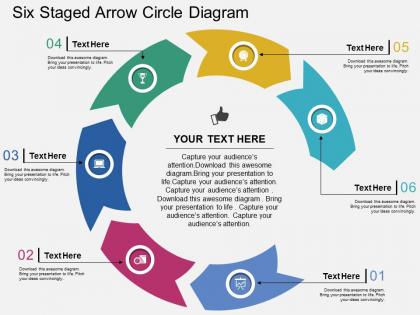
Il six staged arrow circle diagram flat powerpoint design




Try Before you Buy Download Free Sample Product
 Impress Your
 Audience
 100%
100% Editable
 Save Hours
 of Time


Looking for an extra ordinary way to present your ideas? Everyone today is running in the mad race of competing shoulder to shoulder, but due to paucity of time and effort, we hardly think of creating an integrated PPT design, which not only a touch of creativity but also gives professional feel to the work. Gone are the days when different files and colored sheets were used to keep the record offline, now we have online PowerPoint design with six staged arrow circle diagram which has been segregated colorfully into different sections. To serve the customers best with the deals all you need is compile your data in an effective and efficient mode, which, may be a PPT layout for better compilation and representation of thoughts. To understand the dynamics of increasing the performance, support individual motivational factors; modify the approach for easily attaining the set goals and objectives, all you need is a good presentation slide show loaded with sufficient art graphics. Eliminate disparities with our Il Six Staged Arrow Circle Diagram Flat Powerpoint Design. Be absolutely fair in your every deal.
People who downloaded this PowerPoint presentation also viewed the following :
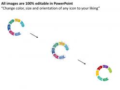
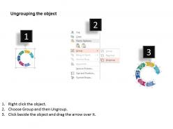
Il six staged arrow circle diagram flat powerpoint design with all 4 slides:
The color combos of our Il Six Staged Arrow Circle Diagram Flat Powerpoint Design have an advantage. They bring in a carnival effect.

FAQs for Il six staged arrow circle diagram
Honestly, six-step arrow circles are perfect because people can actually follow them without their brains shutting off. They're detailed enough to matter but won't make anyone's eyes glaze over like those crazy 15-step flowcharts do. The circular thing works really well when you're showing something that repeats or cycles back - project phases, feedback loops, that kind of stuff. They look polished too, which doesn't hurt. Way better than just throwing bullet points at people. Next time you've got stakeholders who need to understand a process, definitely go with one of these instead.
Honestly, six-step arrow circles are perfect for this stuff. Your brain can only handle so much at once, right? Breaking big processes into smaller chunks makes everything way more followable. The circular arrows show it's ongoing, not just a one-and-done list. Different colors for each stage help too - sounds obvious but people actually track better that way. Plus our brains are wired to love patterns like this. Way easier remembering six connected steps than trying to wrap your head around one giant mess of information. The visual connection back to the start is what sells it.
Six-stage arrow circles work great for processes that repeat endlessly. Project cycles, product development, continuous improvement stuff - you know the drill. I actually love these diagrams because they show stakeholders that things don't just stop after step six. Everything loops back around. PDCA cycles are perfect examples. Software sprints too. Honestly, they're clutch for quarterly reviews since people always think there's some magical endpoint. The circular format makes it super obvious that completion just kicks off the next round. Way better than linear diagrams for this kind of thing.
Start with making your arrows thick enough to actually see - thin ones are just annoying to follow. Go clockwise and keep the text short since you don't have much room in those segments anyway. Colors should pop against your background but still look like they belong together (personally hate when diagrams look like a rainbow exploded). Size matters too - cramped circles are unreadable, but huge ones lose their punch. Oh, and definitely check how it looks at presentation size before you're done. Trust me on that one.
Color coding works great for showing relationships in your six-stage arrow circle. Don't just do one color per stage though - that's kinda boring. Try warm colors for input stages and cool ones for outputs instead. Or use different shades to show what's most important. You could even pick one color for related stuff across multiple stages. But seriously, don't go crazy with it. I made that mistake once and my diagram looked like a kindergarten art project. Stick to maybe 4-5 colors max, otherwise it'll just confuse people.
Oh man, the worst thing you can do is jam too much info into each step - people's eyes will just glaze over. One action per arrow, that's it. Skip the rainbow colors too (seriously, I cringe every time I see someone go overboard with design). Your flow has to actually make sense - if step 3 randomly jumps to something unrelated in step 4, everyone will notice. Test it on someone else first because what's obvious to you might be total gibberish to them. Keep it simple. You can always add more later if you really need to.
Yeah, totally! The whole point of those diagrams is that you can swap out the labels for whatever makes sense in your field. Manufacturing might go "Design → Prototype → Test → Produce → Distribute → Feedback." Healthcare could be "Assess → Diagnose → Plan → Treat → Monitor → Evaluate." Honestly, most business stuff is cyclical anyway, so the circular format just works. You'll want to figure out your main process steps first, then arrange them in order around the circle. Same visual concept, different words - that's it.
Make each stage super specific - include who's doing what and how you'll know it's done. I always think of it like giving directions to someone who's never been there before. Map out your six main phases first, then fill in the details. The flow between stages matters too - show how one naturally leads to the next or gets handed off. Honestly, the circle format works great because people can see the whole process at a glance. Just don't be vague or you'll end up answering a million questions later (been there). Each arrow should feel like an obvious next step, not a random jump.
Okay so basically six-staged circles are for stuff that repeats forever - like your team's sprint cycles or whatever. Linear diagrams? Those have a clear beginning and end. I'd go circular when your process loops back on itself, but linear for one-off things like employee onboarding. People mess this up constantly and wonder why their presentations are confusing! With circles, you can jump in anywhere which is nice. Linear assumes everyone starts at step one. Honestly just sketch both and see what clicks - sometimes you don't know until you actually draw it out.
For six-stage arrow circles, I'd go with PowerPoint's SmartArt first - super easy to customize even though the default colors are kinda meh. Canva's got way prettier templates if you want something that actually looks professional. Lucidchart works great too if you're picky about getting everything perfectly aligned. Honestly, even Google Slides does the job for basic stuff. Just make sure your arrows go clockwise and give each section equal space around the circle. Oh, and definitely start with a template - I learned that the hard way after spending like two hours trying to build one from scratch.
Okay so for your arrow circle thing - start with just the center showing, then animate each stage to pop in one at a time following the flow. Makes people actually pay attention to what you're talking about instead of staring at everything at once. I'd use "Fade" or "Fly In" animations with like half-second delays between each one. You could add some subtle rotation effects too since it's cyclical and all, but honestly don't overdo it or it looks cheesy. Sequential reveals work way better than dumping all six stages on people immediately.
Honestly, typography can totally make or break these things. Keep your font sizes consistent across all six stages - nobody wants one part screaming louder than the rest. Bold headers are clutch for quick scanning. I'd stick to just one or two font families because more than that gets messy real quick. White space is your friend here, don't cram everything together. Also make sure there's good contrast between your text and background colors. Here's something that actually works: squint at your diagram. Can you still read the important stuff? If yes, you're golden.
Honestly, getting feedback on your six-stage diagram is super helpful - people will call out the confusing parts you totally missed. They'll point out where the flow gets weird or doesn't make logical sense. Short sentences hit different sometimes. When someone asks "wait, how did we jump from stage 2 to 4?" that's your cue that the transition sucks. I always think my own stuff makes perfect sense because, duh, I made it. But fresh eyes catch those weak spots where arrows don't actually connect well. Grab feedback early so you're not scrambling to fix major issues right before presenting.
Oh, these work great for business presentations! McKinsey-style consulting decks use them all the time for continuous improvement cycles. Product teams show ideation → design → prototype → test → launch → iterate with them. Change management presentations love these too since transformation doesn't just stop - it loops back. Marketing uses them for customer journeys, and honestly, they beat bullet points every time for showing feedback loops. My old boss was obsessed with these diagrams. Next time you've got something cyclical to present, sketch one out. People get the flow way faster.
So basically, map each arrow to a different part of your story - problem, rising action, conflict, turning point, resolution, then your call-to-action. It's like having a visual roadmap that keeps people hooked instead of just droning through slides. The arrows naturally pull viewers along, which honestly makes such a difference for flow. Each stage gets one key story moment. That way your whole presentation feels more like you're taking them on an actual journey rather than... well, death by PowerPoint. Trust me, it works way better than random bullet points everywhere.
-
Great product with effective design. Helped a lot in our corporate presentations. Easy to edit and stunning visuals.
-
Unique design & color.