

5 sliding scale designs ppt examples slides




Try Before you Buy Download Free Sample Product
 Impress Your
 Audience
 100%
100% Editable
 Save Hours
 of Time


Benefit from the efforts of our 5 Sliding Scale Designs Ppt Examples Slides team. They have created the right vehicle for your ideas.
People who downloaded this PowerPoint presentation also viewed the following :
Content of this Powerpoint Presentation
Description:
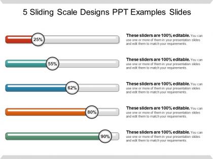
The image shows a PowerPoint slide titled "5 Sliding Scale Designs PPT Examples Slides." The slide features five horizontal sliding scale graphics, each representing a percentage value. These sliding scales are visually designed to indicate progress or level of completion, with different colors for each bar and a circular indicator showing the percentage achieved:
The first scale is red, showing 25% completion.
The second is teal, indicating 55% completion.
The third is blue, showing 62% completion.
The fourth is orange, representing 80% completion.
The fifth is green, indicating 90% completion.
Beside each sliding scale, there is a note stating, "These sliders are 100% editable. You can use one or more of them in your presentation slides and edit them to match your requirements." This suggests that the slides can be customized for different presentations, with the ability to alter the percentage values and colors as needed.
Use Cases:
Such sliding-scale designs can be utilized across various industries for multiple purposes:
1. Sales:
Use: Tracking sales targets and achievements.
Presenter: Sales Manager
Audience: Sales team, company executives
2. Project Management:
Use: Showing project milestones and progress.
Presenter: Project Coordinator
Audience: Project team members, stakeholders
3. Education:
Use: Indicating student progress in different subjects.
Presenter: Teacher
Audience: Students, parents, educational staff
4. Healthcare:
Use: Monitoring patient health improvement or treatment progress.
Presenter: Healthcare Provider
Audience: Patients, medical team
5. Human Resources:
Use: Visualizing employee performance reviews.
Presenter: HR Manager
Audience: Employees, department heads
6. Finance:
Use: Demonstrating financial goals and fiscal health of departments.
Presenter: Financial Analyst
Audience: Investors, management team
7. Manufacturing:
Use: Representing efficiency or output levels of production lines.
Presenter: Operations Manager
Audience: Production staff, management
5 sliding scale designs ppt examples slides with all 5 slides:
Convey your belief in being forthright with our 5 Sliding Scale Designs Ppt Examples Slides. It helps avoid any brinksmanship.

FAQs for 5 sliding scale designs
So there are three main things: progressive disclosure, contextual adaptation, and letting users control complexity levels. Basically don't dump everything on them at once - show features when they actually need them. It's like peeling an onion (cheesy analogy but whatever). Each layer gives them more as they get comfortable or want advanced stuff. The trick is making clear paths to those fancy features while keeping the default view super clean. I'd start by mapping your feature hierarchy first - that'll show you the natural progression points. Short version: reveal gradually, let users dig deeper when they're ready.
So basically, sliding scale design means your UI elements resize proportionally when screen sizes change. Pretty smart for scalability. Rather than making separate designs for every single device, you create these fluid relationships that scale smoothly everywhere. One flexible design that just works - honestly, it's kind of genius. Your dev team won't hate you since they're not constantly building device-specific stuff. Oh, and you can launch on new devices without starting over from scratch. Start with key breakpoints, then set consistent ratios for text, spacing, and components.
Oh man, sliding scale pricing is literally everywhere once you notice it. Netflix has different tiers, your electric company charges more for heavy usage, freelancers adjust their rates based on what clients can afford. Even doctors do this - my dentist gave me a payment plan last year. The genius part? You're not stuck with one price that either scares away broke customers or undercharges the rich ones. Figure out who your customers are and what they'll actually pay, then create tiers around those sweet spots. Way better than guessing.
Honestly, your sliding scale won't work if people can't actually use it. Make sure the text is readable and your contrast is solid - I've seen way too many sites that look sleek but are impossible for anyone with vision problems to navigate. Don't use confusing financial jargon either. Screen readers need to work properly too, which seems obvious but you'd be surprised. Test it with real people who have different abilities. The irony of making an accessibility tool that's not accessible is just... ugh. Your cheapest option should be super easy to find and click.
Honestly, the coding gets pretty messy - your devs will spend way more time making everything scale smoothly. Testing becomes a nightmare too since you can't just check a few screen sizes anymore. Performance takes a hit because browsers are constantly recalculating stuff. Plus debugging responsive issues? Total pain when everything's fluid. Layout consistency across different devices gets tricky to maintain. I'd probably start with a mix - fluid typography but keep some breakpoints for major layout changes. Way less headache that way.
Sliding scale pricing is honestly a game changer for engagement. People don't bounce when they see pricing that actually works for their budget - it's like Netflix doing regional pricing, but for your product. You'll snag users who'd never convert with fixed rates. The psychology is simple: users feel valued instead of priced out. That builds real loyalty over time. I mean, who doesn't want to feel like a company actually gets their situation? Test different ranges though. Find that sweet spot where you're getting both new signups and keeping people around long-term.
Your users' cultural backgrounds totally shape how they see sliders. Reading direction matters - left-to-right vs right-to-left changes how people expect values to increase. Colors are tricky too. Red screams "stop" here but means good luck in China. Some cultures honestly just hate anything in-between and want clear options instead of sliding around in the middle. Oh, and discrete choices feel way safer than ranges for certain groups. You'll definitely want to test with different users early on or you'll miss these gaps completely.
Make sure your slider has clear tick marks and a handle that's actually easy to grab - I've seen way too many where you can barely tell what you're supposed to click. Always show the current value somewhere obvious, because people hate guessing where they landed. Spacing between elements should be consistent, and honestly, color coding is clutch for stuff like pricing (green = cheap, red = expensive, whatever). Oh and test mobile early! Touch targets need to be huge compared to desktop. Readable labels at key points are non-negotiable too.
So basically, track where people are dropping off and which income groups actually convert vs just bounce. Check how long they're staring at your pricing page too - that's usually telling. The data will show you if your thresholds are wonky or if your tier descriptions are confusing as hell. I'd also look at completion rates across different demographics to catch any equity issues. Then just A/B test different amounts, maybe tweak your qualification questions or the whole layout. Oh, and obviously set up proper tracking first (learned that one the hard way). Once you've got solid data, keep adjusting until the conversion numbers actually improve.
Healthcare and SaaS companies kill it with sliding scale designs - they're already juggling tons of different user types anyway. Education too, obviously. Your users aren't cookie-cutter people, so don't design like they are. E-commerce sites especially need this since they've got everyone from tech nerds to your confused aunt trying to buy stuff online. Financial services? Same deal. Honestly, just map out who's actually using your product first. Then figure out where you can add flexibility without making everything a mess. Oh, and subscription models are perfect for this - you can test different approaches pretty easily.
So basically, responsive design handles your breakpoints while sliding scale keeps everything proportional at each screen size. Way better than just shrinking everything down like we used to do - that always looked terrible. Your text stays readable and spacing actually makes sense whether someone's on their phone or tablet. I'd start with setting up the responsive breakpoints first, then add your sliding scale values for each range. It's honestly such a cleaner approach than having text that just jumps around randomly between sizes.
Honestly, the biggest thing is not making people feel shitty about using the cheaper options. Like, nobody wants to feel like they're getting the "poor person" version, you know? Keep the experience the same for everyone - same respect, same quality treatment. Don't make people prove they're broke enough to deserve a discount either. That's just degrading. Keep applications simple and straightforward. Oh, and be upfront about how your pricing actually works instead of being all mysterious about it. Think of it more like you're making your thing accessible to more people, not doing some big charitable act.
So basically, A/B testing is perfect for dialing in your sliding scale design. Test different versions against each other - scale length, where you put the labels, how it looks, even how you word the question. Scale length is usually where I'd start since that tends to mess with user behavior the most. You can only test one thing at a time though, otherwise you won't know what actually worked. I've literally seen conversion rates go up 15-20% just from changing the visual design - it's crazy how much that stuff matters! The whole point is figuring out what gets people to actually finish and give you better answers.
Honestly, I'd go with Figma for this - it's free and pretty intuitive to pick up. The auto-layout stuff is solid for responsive designs. Adobe XD works well too, similar features but sometimes feels a bit heavier if that makes sense? Sketch is fine but kind of annoying for responsive work compared to those two. Oh, and if you actually want to test how the sliding works (not just design it), Webflow's really good for that. The main thing is setting up components that resize themselves automatically. Makes your life so much easier when you're working across different screen sizes. Start with Figma though - you can always switch later if it doesn't click.
Definitely build feedback right into each cycle - grab user responses after they mess with your sliding scale, then dig into patterns and where people get confused. Quick surveys work great after big changes since people interpret scales way differently than you'd think. Check if users are bunching up at certain spots or getting lost with the labels. Honestly, I've seen so many scales fail because designers assume too much. Small tweaks based on real usage beat guessing every time. Just set up regular feedback collection so you catch problems early instead of wondering why your scale isn't working later.
-
Very well designed and informative templates.
-
Excellent template with unique design.