


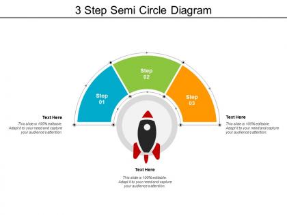
3 step semi circle diagram




Try Before you Buy Download Free Sample Product
 Impress Your
 Audience
 100%
100% Editable
 Save Hours
 of Time


Increase the degree of informality with our 3 Step Semi Circle Diagram. Get folks to indulge in friendly chats.
People who downloaded this PowerPoint presentation also viewed the following :
3 step semi circle diagram with all 5 slides:
Get folks to indulge in friendly chats with our 3 Step Semi Circle Diagram. It increases the degree of informality.
FAQs for 3 step
So you need the curved arc obviously, plus clear labels for each section and something in the center - like your main title or whatever. Break your semi-circle into logical chunks that make sense for your data. Maybe it's process steps or categories, depends what you're showing. Definitely use different colors though, makes everything way easier to read. Here's the thing - semi-circles naturally pull your eye toward the middle, so don't waste that prime real estate. Keep labels readable and not squished together. Oh and honestly? Stick to like 5-7 segments tops or it just looks chaotic.
Oh, semi-circle charts are actually perfect for messy data! They show hierarchical stuff really naturally - your eye just follows the flow. You can pack in multiple layers too, like arc size for quantities and different colors for categories. Way better than shoving everything into boring bar charts. They're honestly just more engaging to look at, which helps a ton when you're presenting to people who'd rather be checking their phones. Great for survey data, budgets, project progress - basically anything where you want the story to actually stand out instead of putting everyone to sleep.
So basically, semi-circles work best when your data splits into two main chunks or you're showing progress toward something. Like "we've hit 60% of our fundraising goal" - that kind of thing. They're perfect when you're cramped for space too. Full pie charts get messy real quick with tons of tiny slices that nobody can read anyway. I'd stick to maybe 3-5 categories tops. Plus they force you to group stuff more logically instead of showing every little detail. Honestly? They just look way cleaner and help people focus on what actually matters.
Honestly, semi-circle charts are pretty solid for showing parts of a whole. The curved shape just looks way better than boring bar charts – more eye-catching, you know? Perfect for survey results or budget stuff, but don't go crazy with too many slices or it gets cluttered real quick. I'd stick to like 3-5 categories max. They take up less space than regular pie charts too, which is nice for dashboards. Oh, and percentages feel more natural to read in that arc format for some reason. Next time you've got data that adds up to 100%, definitely give them a shot!
Ok so colors literally make or break your diagram - I learned this the hard way lol. Bright ones grab attention first, muted colors disappear. If you use similar shades for different segments, people won't see the distinctions you're trying to show. Really annoying when that happens. For progression data, go with sequential colors (like light to dark blue). Different categories? Use contrasting colors instead. The key is being intentional - what's the main point you want people to notice first? Start there and build your color story around it.
You know how pie charts show parts of a whole? Semi-circles do the same thing but look way cooler. Perfect for survey results, budget breakdowns, voter turnout - stuff like that. I love using them for before/after comparisons too. They work great when your data adds up to 50% or you've got limited response categories. Just don't force it if your data doesn't actually work as proportional segments. People will get confused. Honestly, I always sketch mine out first to see if it tells the right story visually.
Put your labels around the outside edge of the arc - way cleaner that way. Leader lines are your friend here, they connect stuff without making it messy. I always put measurements like radius right next to where they actually show up visually (honestly saves so much confusion later). Keep fonts the same size throughout, and if you've got different data sets, use different colors. Oh, and group similar annotations together! Leave some breathing room between sections too. Nothing worse than a diagram that looks like someone just threw text everywhere. Trust me on this one.
Honestly just use PowerPoint - you probably already have it anyway. The arc tool works great, or you can crop a regular circle. Canva's got some nice templates too, but their free version kinda sucks sometimes. Google Slides is decent if you're working with other people. I've seen friends mess around with Lucidchart but that's way overkill unless you're doing something super complicated. PowerPoint's SmartArt menu has most of what you need. Oh, and the shapes menu too - forgot about that one. Start there and you'll be fine.
Okay so three main things to focus on: color, text, and having backup formats. Don't just rely on color alone - throw in some patterns or textures too. High contrast is your friend. Text should be at least 12pt (I made this mistake once with tiny labels and my manager was NOT happy lol). Keep language simple and clear. For digital stuff, always add alt text descriptions. Honestly, tables are amazing for this - screen readers eat them up way better than fancy graphics. Give people options because not everyone processes visual info the same way. Takes a bit more work but totally worth it.
So these actually go way back - like 18th century when William Playfair and other statisticians started using them for parliament seats. Makes sense since legislatures literally sit in semi-circles, right? They kept popping up through the 1800s for political stuff. Honestly, they're genius for showing parts of a whole when you want that "assembly hall" vibe instead of a boring pie chart. Way more intuitive too. I mean, you immediately get what you're looking at. They're super space-efficient if you're cramped for room in whatever you're designing.
Honestly, semi-circle diagrams are clutch for project stuff. Great for mapping out stakeholder relationships or showing how different workstreams connect to your main goal. I'm kinda obsessed with using them for stakeholder mapping - way less intimidating than those rigid org charts that make everyone feel ranked. You can also flip them for timelines where the arc shows your project timeline. Works really well when you're explaining messy relationships to your team. Way better than just listing everything out in bullets (which is what I usually default to, not gonna lie). Next time you're stuck explaining something complex, sketch one out.
Oh man, don't cram everything into one diagram - it'll look like a hot mess. Most people mess up the segment sizes too, which is basically just lying with data (happens all the time though). Keep colors simple and make sure they actually contrast well. I always start the biggest slice at the top and go clockwise since that's how people naturally read. Also, this might sound obvious but double-check your proportions are right. Nothing screams amateur like a 30% slice that looks bigger than the 40% one next to it.
Honestly, semi-circle diagrams are perfect for this stuff. They split up space proportionally but everything stays connected visually - which is clutch. Map one variable along the arc, then use radius or sectors for your second variable. People find the curved layout way easier to read than shoving data into boring bar charts (trust me on this one). You'll see patterns and correlations pop out naturally. Just don't forget clear labels and consistent scaling. Otherwise your colleague will be staring at it like "what am I even looking at?" The flow really helps viewers connect the dots between datasets.
Semi-circle diagrams work great for storytelling in presentations! Put your problem at one end, walk through the journey in the middle, then hit them with the solution at the other end. The curved shape actually makes people's eyes follow along naturally - way better than boring bullet points. Color-code each section so it's super obvious what's happening. You can totally use this for customer journeys too, or showing how different things lead to one big result. Oh, and they're perfect for before/after stuff. Trust me, audiences love following a clear visual story like this.
Dude, semi-circle diagrams are perfect for this stuff. They show progress way better than just throwing numbers at people - like when you're at 70% of your sales target, that visual gap screams "we're so close!" Your audience gets it instantly without having to think. I use them all the time for project updates, budget burn rates, market share... basically anything where you want people to see how much runway you have left. Honestly, they're kind of manipulative in a good way? Creates that urgency you need when asking for resources or pushing teams harder.
No Reviews