


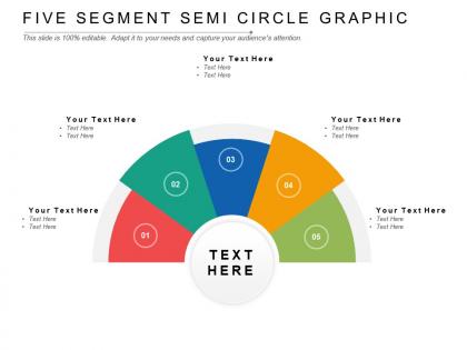
Five segment semi circle graphic




Try Before you Buy Download Free Sample Product
 Impress Your
 Audience
 100%
100% Editable
 Save Hours
 of Time


Create amusing experiments with our Five Segment Semi Circle Graphic. Give folks a bit of intellectual entertainment.
People who downloaded this PowerPoint presentation also viewed the following :
Five segment semi circle graphic with all 5 slides:
Give folks a bit of intellectual entertainment with our Five Segment Semi Circle Graphic. It helps create amusing experiments.
FAQs for Five segment
Honestly, these charts are perfect for making data actually readable instead of throwing boring tables at people. They show proportions super clearly, plus you save space since they don't take up your whole slide vertically. Your audience naturally follows from left to right too, which helps when you're trying to walk them through the story. Survey results look great this way - same with budget stuff. Oh, and definitely label everything clearly because nobody wants to play guessing games with your data. Way better than standard bar charts if you ask me.
Honestly, five-segment semicircle charts are perfect for messy data situations. They slice everything into bite-sized pieces so people can actually understand what they're looking at. Each segment gets its own category or whatever metric you're tracking. Way cleaner than those overstuffed pie charts that make my eyes hurt. Color-code each section and slap some decent labels on there - nobody wants to decode tiny percentages. Just make sure your five segments actually mean something, not random splits. The visual setup makes it obvious which areas are crushing it and which ones... aren't.
Oh man, these charts are everywhere in healthcare - perfect for patient satisfaction scores or quality ratings from "terrible" to "amazing." Finance teams use them constantly for risk assessments. Manufacturing loves them for safety metrics and defect tracking. Honestly, they're kind of genius because they look like speedometers, which everyone just gets immediately. Works best when you've got 3-7 categories to show. Project managers swear by them for completion stages too. If your data fits into clear performance tiers, you should totally try one - makes dashboards so much easier to scan quickly.
Okay so definitely make your colors super distinct - like, what looks obviously different to you might be confusing to someone else. I'd test it with a friend first honestly. Position all your labels the same way, either inside every segment or outside with those little lines. Don't make the gaps between sections too wide or it'll look weird and broken. But give them some space to breathe. Oh and start with your most important piece at the top, then go clockwise from there. The spacing thing is probably more important than people realize.
Pick colors that actually stand out from each other - I learned this the hard way when I made a chart with three different shades of blue that basically looked identical. For data with a natural order, go with gradients or sequential colors. Random categories? Use totally different colors instead. Your brand colors are fine if they're distinct enough. Just make sure colorblind people can tell them apart too (there's tools for testing this). Oh, and preview it first - colors look different on screens than you'd expect. Honestly, a good color palette tool saves so much time here.
Honestly, **Tableau** or **Power BI** are your best bet - they've got semicircle templates built right in. **Excel** works in a pinch if you mess around with pie charts and hide half, but it's kinda janky. **D3.js** is amazing for interactive stuff, though you need to know some coding. For pure design control, **Adobe Illustrator** or **Canva Pro** let you tweak every little detail perfectly. I'd probably go with Tableau first if you can get your hands on it. The learning curve isn't too bad and it handles this exact type of visualization really smoothly. Way less headache than trying to force Excel to cooperate.
Honestly, the five-segment semicircle works best as a roadmap - drop it in after you introduce your main idea but before getting into the nitty-gritty details. I'd use it to show progress or break down something complex. The key thing is actually referring back to it throughout your talk, not just throwing it up there once. Point to each segment as you go. I've watched too many people just randomly plop charts into presentations and wonder why nobody follows along. Oh, and it's perfect for decision frameworks too if that's more your vibe.
Honestly, the worst thing you can do is cram way too much info into those segments - your audience will just zone out. Pick colors that don't make people's eyes bleed (seriously, some of those rainbow charts are brutal). Labels need to be readable, even on tiny slices. Your segments should tell a cohesive story together, not look like you randomly threw categories at a wall. Oh, and if you're tempted to go beyond five segments? Just pick a different chart type. Trust me on this one - stakeholders actually need to understand what they're looking at.
Okay so semicircle charts are just pie charts chopped in half, but honestly they work way better for comparing stuff. The segments get spread out more so you can actually tell the difference between similar values - which is super annoying with regular pies. They don't hog as much vertical space either, which is clutch when you're trying to fit multiple charts on one page. Something about the half-circle just feels less intense too? Like people don't get as overwhelmed looking at them. Perfect for when you've got 3-5 categories and want something that looks clean but still hits hard visually.
Yeah, those five-segment semicircle charts work great for performance stuff! Each segment can show different KPIs - sales, customer satisfaction, productivity, whatever you're tracking. Way better than staring at spreadsheet rows all day. The semicircle shape catches people's attention right away, and honestly, it makes spotting problems vs wins pretty obvious. Color-code each segment based on how well you're hitting targets. Green for crushing it, red for needs work, you know? Makes your reports actually look decent instead of like something from 1995.
Use five-segment semicircle charts when your data splits naturally into five categories - like survey ratings, department budgets, or performance tiers. Each piece should represent part of a meaningful whole. The semicircle saves space over full pie charts, which is actually pretty convenient. Just make sure your categories don't overlap and they cover everything. Don't go this route if your data's super uneven though - those tiny slices become impossible to read and honestly look weird. Check that you've got five logical groups before you commit. Otherwise you'll end up forcing data into categories that don't really make sense.
So you want your chart segments to appear one by one - that way people actually focus on each piece instead of getting hit with everything at once. Build them in order of importance or whatever makes sense for your story. Honestly, data people love this stuff, it's like unwrapping gifts but nerdier. Don't rush the timing though - let each segment sink in before the next one pops up. You could slide the whole thing in first, then trigger individual pieces. Just avoid those crazy spinning effects that make you dizzy. Keep it clean so you're guiding their eyes exactly where you want them.
Pick different colors for each slice and bump up your font sizes - seriously, nobody wants to squint during your presentation. I'd keep labels short, maybe just one or two words tops. Put the actual numbers right on the segments instead of forcing people to decode some legend. Honestly, legends are kind of annoying anyway. Try to stick with colors that match your brand or make sense for what you're showing. Oh, and definitely test it out by stepping back or shrinking it down on your screen. You'll catch readability problems way easier that way before you actually present it.
Yeah, totally depends on who you're showing it to. Executives and older folks usually love semicircle charts - they remind them of those dashboard gauges, you know? But younger audiences might think it looks kinda outdated. Also consider how comfortable people are with data stuff. Semicircles are way harder to read accurately than regular bar charts, so if your audience isn't super data-savvy, they'll probably get confused. Honestly, I'd just figure out what your specific group is used to seeing and go with that. Better to use something they'll actually understand than look fancy but lose everyone.
Oh that's actually a cool way to think about it! Map each segment to story beats - setup, rising action, climax, falling action, resolution. Works really well since the semicircle already has that natural arc feel to it. I've also seen people track character emotional journeys this way, like going from rock bottom to success across the five parts. Color-coding each section helps a ton, and throw in some little icons if you want to get fancy. Honestly the semicircle shape just feels more complete than a boring straight timeline. You could even use it as a journey map for how your audience experiences something.
No Reviews