


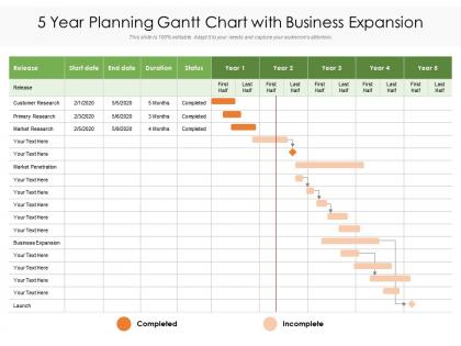
5 year planning gantt chart with business expansion




Try Before you Buy Download Free Sample Product
 Impress Your
 Audience
 100%
100% Editable
 Save Hours
 of Time


Our 5 Year Planning Gantt Chart With Business Expansion are topically designed to provide an attractive backdrop to any subject. Use them to look like a presentation pro.
People who downloaded this PowerPoint presentation also viewed the following :
5 year planning gantt chart with business expansion with all 2 slides:
Use our 5 Year Planning Gantt Chart With Business Expansion to effectively help you save your valuable time. They are readymade to fit into any presentation structure.
FAQs for 5 year planning gantt chart
Dude, break your Gantt chart into chunks like market research, location scouting, permits, and hiring phases. Dependencies matter big time - don't even think about hiring until permits come through (trust me on this one). Legal stuff always takes forever, so pad those timelines. I'd also track budget releases tied to hitting certain milestones. Oh, and separate your soft launch from full launch dates - gives you wiggle room if things go sideways. Honestly, the whole point is just keeping track of everything so you don't forget something crucial when you're drowning in expansion madness.
Honestly, Gantt charts are a game-changer for spotting risks early. You get this bird's-eye view of everything laid out with timelines and dependencies. Makes it super obvious when one delayed permit could wreck your entire launch date - that domino effect hits hard. Resource conflicts become way more apparent too. Like, your marketing team can't realistically juggle three massive campaigns at once (learned that one the hard way). I always build in buffer time because something always takes longer than planned. Pro tip: color-code by risk level so the sketchy stuff practically screams at you during meetings.
If you've got Microsoft Project already, that's probably your best bet - it handles complex stuff really well. Otherwise Asana and Monday.com are way easier for teams to actually use. Smartsheet's decent if you're into the spreadsheet vibe. Excel works too for basic expansions, though it gets chaotic pretty quick. My buddy's company tried this super expensive tool last year and literally nobody used it because it was such a pain. So honestly? Pick whatever your team won't hate using. Best tool is the one people actually open.
Dude, Gantt charts are honestly a lifesaver for this stuff. Everyone can see exactly what's happening when, plus who's doing what. No more of those awkward "wait, where are we again?" moments in meetings. You'll spot which tasks are falling behind and how that screws over other people's deadlines. Different teams can actually coordinate since they see how their work connects to everyone else's. The visual timeline thing just makes sense - way better than trying to keep everything straight in your head. Oh, and don't be like my old boss who made one then never touched it again. Update it or you're wasting your time.
Honestly, I'd go with 12-24 months for most expansions. Break it into chunks - market research takes maybe 2-3 months, then planning and approvals eat up another 3-4 months. Setup and hiring? That's your 4-6 month phase right there. After 24 months you're basically just guessing anyway and will have to redo half of it. I learned that the hard way on my last project. For really complex stuff like going international, maybe push it to 36 months max. Start with quarterly goals, then get specific with monthly tasks for the next 6 months where you actually need to track everything.
Put your milestones at the big moments - market research done, location locked down, first sale in the books. You know, the stuff worth celebrating over drinks. Every 2-4 weeks works well so your team has regular check-ins and can spot problems early. Make each one super specific so there's no "wait, did we actually hit this?" confusion. I always color-code mine differently than regular tasks because honestly, they need to jump out at you during meetings. Space them around key decisions and completion points throughout your timeline. Short ones keep momentum going.
Honestly, Gantt charts are way more adaptable than people think. When stuff inevitably goes sideways during expansion, you can shift timelines around and move resources between tasks pretty easily. The visual part is clutch - you'll instantly see how one delay messes with everything else downstream. I always build in buffer time for the big milestones, and you can even map out different scenarios for various "what-if" situations. Oh, and update it weekly or you'll lose track fast. Don't get too attached to your original plan though - sometimes you just gotta completely restructure when the market throws you a curveball.
Your Gantt chart basically becomes a roadmap for who's handling what and when. Map out team members, budget, and resources for each task so you can catch conflicts early. Trust me, you don't want your marketing person juggling three things during launch week - been there, done that. The visual layout makes it obvious where you're overloaded or missing coverage. Short tasks here, longer planning phases there. Use it to rebalance workloads upfront instead of playing catch-up when everything's already falling apart mid-project.
So basically, dependency visualization shows you that whole domino effect thing - like which tasks are stuck waiting on others. Super helpful for catching bottlenecks before they screw up your timeline. I always spot critical path problems way earlier this way, plus resource planning becomes easier since you can actually see when people will be available again. Honestly saved me tons of stress! The best part? When something gets delayed, you've got visual proof to show stakeholders exactly how it ripples through everything else. Oh and try color-coding the dependency lines - makes it way less confusing to read.
You need to watch both the money side and operational stuff alongside your Gantt chart. Budget burn rate, revenue hits, cash flow - the usual suspects. Then track customer acquisition, market penetration, team productivity metrics. Honestly? I've watched way too many expansions tank because people obsessed over hitting deadlines but ignored whether the numbers made sense. Weekly dashboard pulling everything together is clutch - shows if you're actually winning or just... on time, I guess. Oh, and don't sleep on risk stuff like regulatory delays or supply chain mess-ups.
Honestly, the key is making your Gantt chart tell a story instead of just being a boring timeline. Show clear dependencies and who owns what - but don't overwhelm them with details. I always build in buffer time too because nothing ever goes perfectly to plan, right? Focus on those early wins and milestones that'll get people excited. Walk through it step by step during your presentation. Oh, and definitely save time for questions at the end - stakeholders hate feeling rushed through these things. The visual aspect is huge though. Way better than drowning them in spreadsheets and bullet points.
Oh man, timeline optimism is the killer here - everything takes way longer than you think it will. Also don't cram a million details into one chart, it just becomes this unreadable mess. Build in buffer time because delays are guaranteed. Seriously, regulatory stuff and hiring? Those always drag on forever. Keep updating it too, otherwise you're looking at this fantasy timeline that has nothing to do with reality. I always start with the big milestones first, then chunk those down. Way easier to wrap your head around.
Yeah, you can definitely customize Gantt charts for different expansion types. Mergers need due diligence phases, regulatory stuff, integration milestones - that whole mess. Market entry is more about research, finding local partners, compliance, launch timing. Honestly, people get way too obsessed with fancy templates when they should just make it work for them. I'd start by listing out your actual phases first - like what really needs to happen in your situation. Then build the timeline around those. The critical path mapping is where you'll save yourself headaches later.
Yeah, Gantt charts are actually pretty clutch for expansion stuff. Starbucks mapped out their whole international thing with timelines for market research, location hunting, store openings - kept everything coordinated across different countries. Amazon did something similar when they rolled out AWS globally, tracking regulatory stuff and data center timelines. Dependencies are where you really gotta focus though - like getting permits before you build, hiring before training people. That's honestly where most expansion projects fall apart. Even smaller companies crush it with this approach. Saw this brewery case study recently that was super well done. Timeline visualization just makes everything way clearer when you're trying to scale up.
Honestly, I've learned you gotta build in way more buffer time than you think - like 20% per phase. Set your big milestones as hard deadlines but keep everything in between flexible. Our last project taught me that lesson the expensive way lol. Don't go crazy with dependencies or one hiccup will mess up everything downstream. I update mine weekly and shuffle tasks around when priorities change (which happens constantly). Short sentences work. Longer ones help break up the rhythm and keep people reading. Always have backup plans ready. Your timeline should feel alive, not like some rigid contract nobody can touch.
-
Excellent design and quick turnaround.
-
Helpful product design for delivering presentation.
-
Helpful product design for delivering presentation.
-
It saves your time and decrease your efforts in half.
-
Really like the color and design of the presentation.