


Aerospace Powerpoint PPT Template Bundles





Try Before you Buy Download Free Sample Product
 Impress Your
 Audience
 100%
100% Editable
 Save Hours
 of Time


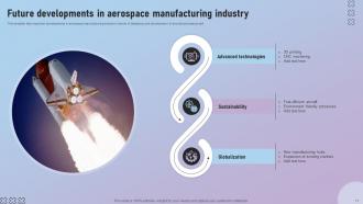
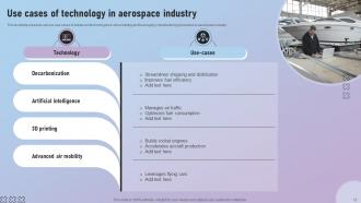
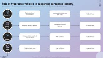
Aerospace is the technical and industrial field that works on the creation, design, manufacture, and upkeep of spacecraft also known as aviation and aeroplanes also known as astronautics. Aircraft, helicopters, and spacecraft, as well as rockets and satellites, are examples of the vast array of activities and technology that fall under this category. Use our PowerPoint presentation on Application Rationalization to explore the world of aeronautical engineering. Discover the complexities of hypersonic technology in aviation and learn about the tactical method of application rationalization to ensure the best alignment with aeronautical engineering objectives. This presentation offers insightful information on how to streamline programs for improved productivity and creativity. With our Application Rationalization PPT, stay ahead of hypersonic breakthroughs, navigate the ever changing field of aerospace engineering, and improve the application portfolio. Its a comprehensive guide that can help elevate aerospace development.
People who downloaded this PowerPoint presentation also viewed the following :
Aerospace Powerpoint PPT Template Bundles with all 28 slides:
Use our Aerospace Powerpoint PPT Template Bundles to effectively help you save your valuable time. They are readymade to fit into any presentation structure.














FAQs for Aerospace Powerpoint
Stick with clean, minimal design since aerospace data gets messy quick. White space is your friend here. Color-code different systems consistently - makes everything way easier to follow. Sharp, readable fonts only (seriously, save the fancy stuff for wedding invites). You'll need dedicated sections for tech specs, safety notes, and all that regulatory compliance stuff. Build comparison slides and timeline templates right into your master - trust me, you'll use them constantly for before/after scenarios. The trick is making complex engineering digestible without treating people like idiots. Oh, and high-quality diagrams are non-negotiable.
Dude, those aerospace templates are game-changers for making aviation concepts actually stick with students. Real industry layouts with aircraft diagrams and cockpit views beat boring bullet points any day. Students connect way better when they see cutaway aircraft illustrations alongside the theory stuff. Honestly, half the battle is just making aviation content look as cool as it actually is - and proper templates nail that. The visual consistency helps organize all those complex systems too. I've noticed students get way more into lessons when you use templates with flight paths and technical schematics. It's like they finally see how everything connects in real aerospace work.
Okay so with aerospace people, white space is your best friend - they need room for all those complex diagrams and charts. Go with high-contrast colors like dark blues, grays, whites. Skip the flashy stuff that'll compete with CAD drawings (learned this the hard way once). These folks honestly don't care about your fancy animations anyway. They want clean grid systems for lining up data sets and space for detailed legends. Keep it readable above all else. Sure, it might look a bit boring compared to marketing decks, but your audience will actually focus on what you're saying instead of getting distracted by unnecessary visual noise.
Definitely embed your videos right into the slides instead of linking to external files - trust me on this one. Nothing kills a presentation faster than frantically searching for that one video while everyone stares at you. Use animations to actually show something useful like how aircraft components work or flight trajectories, not just random spinning text (honestly, those are the worst). Compress your videos first so they don't make your file huge. Test everything on the actual projector beforehand since those things are weirdly picky. Oh, and make backup slides without any multimedia - aerospace presentations seem to attract technical disasters like magnets.
Honestly, resist cramming too much technical stuff on each slide - people zone out fast when they can't follow. Your font needs to be readable from way back (learned this the hard way). Those flashy animations might look cool but they're usually distracting. Oh, and don't just force your content into whatever template layout you picked - make it actually fit properly. The biggest thing though? Change up the colors and fonts so it matches your company branding. Nobody wants to see the same generic template everyone else uses.
Look, each aerospace area has its own personality you need to match. Commercial aviation? Go clean and professional - blues, whites, that whole "trust us with your life" airline vibe. Military stuff needs bold, darker colors like navy or olive green to show you mean business. Space presentations are where you can get fun with it - dramatic imagery, deep colors, futuristic fonts that scream "we're going to Mars." I've seen people bomb presentations just because their template felt wrong for the room. Blues work great for space too, by the way. Bottom line: your audience has expectations, so don't fight them.
Look, color schemes can totally make or break your aerospace presentation. Go with dark blues and grays - they just feel right for the industry and your audience expects it. High contrast is key though, otherwise your diagrams will look like garbage. I learned this the hard way lol. Use consistent colors to organize everything hierarchically. Main headers get one color family, supporting data gets another. Honestly, just grab a proven aerospace template instead of starting from scratch. Trust me, it'll save you hours of tweaking colors that already work perfectly fine.
Dude, these templates are lifesavers. They handle all the design grunt work so you just drop in your data and charts. No more spending hours trying to make technical diagrams look decent or keeping 30+ slides consistent - that stuff's brutal honestly. The good ones already have aerospace layouts built in, plus color schemes and spots for system schematics, performance data, compliance stuff. Way better than fighting with PowerPoint formatting when you should be focusing on your actual analysis. Just find a pack that covers your usual presentation types - briefings, tech reviews, whatever.
Focus on color contrast first - make sure text really pops against backgrounds. Technical diagrams are messy enough without squinting to read them! Font-wise, go sans-serif like Arial and bump it up to 24pt minimum for presentations. Don't forget alt text for images and charts. Slide numbers help too, plus consistent headings so screen readers can actually navigate your deck. Honestly, I used to think accessibility was just extra work, but it makes everything cleaner for everyone. Your regular audience will thank you for the clarity.
Keep it simple with high-contrast visuals that actually highlight the important stuff. Blues and grays are solid for aerospace - just don't go crazy with colors, maybe 2-3 max per chart. Make your labels big enough so people in the back can read them (and always include units!). Complex data? Split it across multiple slides instead of shoving everything together. Trust me, I've sat through way too many presentations that looked like someone threw up a rainbow on the screen. Your stakeholders will actually understand your flight test data when they can see it clearly.
Dude, you absolutely need crisp visuals for aerospace stuff. People can't grasp complex tech concepts without seeing detailed schematics or satellite pics clearly. Blurry images just confuse everyone and honestly make you look sloppy. The field is so advanced that low-res graphics feel ancient - it kills your credibility instantly. When stakeholders are deciding on million-dollar projects, they need sharp visuals to understand intricate systems. I learned this the hard way once. Always go for 300 DPI minimum and definitely test everything on the actual projector setup first.
Those aerospace templates are perfect for storytelling actually. Start with the problem, then boom - your innovation saves the day. The sleek design keeps people locked in instead of getting distracted by random fonts or whatever. I'd go: current limitations → your breakthrough → real impact. The rocket/satellite graphics work great for emphasis too - like use a launch slide for your big moment or satellite imagery when you're talking global scale. Honestly, the polished aerospace vibe does half the work for you. Just pick slides that flow naturally from one story beat to the next.
Interactive stuff is everywhere now - 3D visuals, embedded diagrams that actually move. Way better than boring bullet points, honestly. Color-wise, everyone's ditching those awful bright corporate templates for darker teches - navy, charcoal, that whole vibe. Some companies are even experimenting with AR, though that's still pretty out there for most presentations. The storytelling thing is huge too. Instead of just listing specs, people walk through actual mission scenarios chronologically. Makes way more sense. I'd definitely look for templates with built-in animation features - you'll need them.
Oh man, you definitely need to think about this stuff! Colors can totally screw you over - red means danger to some people, good luck to others. Europeans want all the technical details right away. Asian audiences? They expect relationship-building slides first, which honestly makes sense. We Americans just want that executive summary, obviously. Even fonts and reading direction affect how people understand your presentation - didn't realize that was a thing until recently. Just research their communication style beforehand and maybe tweak a few key slides for different regions. It's worth the extra effort for international deals.
Honestly, SlideModel is probably your best bet - their aerospace stuff is actually organized well and doesn't look like garbage. PresentationGo has some decent aircraft and satellite designs too. GraphicRiver's got tons of options but you'll be scrolling forever to find the good ones, which is kinda annoying. TemplateMonster and SlideSalad are worth checking out for more specialized designs. Most templates run like $10-50 each. Pro tip though - look for bundle deals if you're gonna need multiple presentations. Way better value and you won't hate yourself later for spending $200 on individual templates.
-
Top Quality presentations that are easily editable.
-
SlideTeam makes creating presentations easy. Unlimited products, premium quality designs and affordable.