


Agenda slide design angular for technology with light background powerpoint slide


Try Before you Buy Download Free Sample Product
 Impress Your
 Audience
Editable
of Time


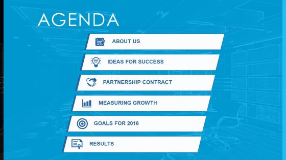
Set your schedule up and running with our agenda slide design angular for technology with light background PowerPoint slide. Now you don’t have to look anywhere else for a suitable example of PPT. Whether you need a basic meeting agenda template for your business or you are a student looking for inspiration on how to write a to do list, you have come to the right place. Our PowerPoint slide lets you use the power of a good PPT inspiration and draw your viewers’ attention towards your content. With its stylishly looking icons to beautiful designed PPT infographics, you are already up to date with the world of information design. You just need to insert your ideas in the form of words and let the information flow through your audience’s eyes. Additionally, the light-colored background strikes the right balance in terms of visual appearance and contrast. Also, you can edit the icons/objects and add more from our massive collection online. Have it in the bag with our Agenda Slide Design Angular For Technology With Light Background Powerpoint Slide. The deal is bound to come to you.
People who downloaded this PowerPoint presentation also viewed the following :
Agenda slide design angular for technology with light background powerpoint slide with all 4 slides:
Get handpicked with our Agenda Slide Design Angular For Technology With Light Background Powerpoint Slide. They assure you an excellent assessment.

FAQs for Agenda slide design angular for technology with light
Okay so for agenda slides you basically need three things: a clear title (just call it "Today's Agenda" or whatever), your main topics with bullets or numbers, and time estimates for each part. Don't overthink it! I swear half the agenda slides I see are way too busy and just confuse people. Your audience wants to know what's happening and when they can escape lol. Stick with clean fonts, skip the weird graphics. Oh and remember what slide number it is - you'll want to jump back to it when someone inevitably derails the whole thing with random questions.
Color psychology totally works for agendas! Blue's your safe bet for serious meetings - screams professional. Green's perfect when you want that collaborative feel. Orange gives energy without being crazy intense (red's just too much, honestly). Consistency beats everything though. Pick 2-3 colors that fit your meeting's vibe and don't deviate. Save your boldest color for the stuff you really want people to notice. Oh, and definitely test colors on whatever screen you're using - projectors are weird and shift colors sometimes. Found that out the hard way last month.
Always kick off with quick context so people know why they're there. Then I organize stuff chronologically or by importance - whatever makes sense. Group similar topics together instead of ping-ponging around different subjects. Here's what I've learned: put your biggest discussions in the middle when everyone's still alert. Nobody wants heavy stuff right after lunch when they're food-comatose. Be specific about time limits for each item. You'll want to wrap up with clear action items. Oh, and send it out 24 hours early! People need prep time, not surprises.
Honestly, icons are a game-changer for agendas. Your brain processes visuals way faster than text, so people instantly get what each section's about without reading every word. Like, throw a dollar sign next to "Budget Review" and boom - everyone knows what's coming. Short sentences work great here. When you reference that budget section later, they'll remember the icon and connect the dots. I learned this the hard way after watching people zone out during meetings with boring text-heavy agendas. Just don't go crazy with random decorative stuff - pick icons that actually match your content and keep the style consistent throughout.
Dude, just go with Arial or Calibri - nothing fancy. Make your main agenda items 24-28pt because trust me, the people stuck in back chairs will hate you otherwise. I learned this the embarrassing way when my boss couldn't read my slide from like 10 feet away lol. Don't get cute mixing fonts either, it looks messy. Bold your main topics, then drop sub-items to 20-22pt in regular weight. That's honestly all you need. The whole point is making sure everyone can actually see what you're talking about without doing that awkward lean-forward squint thing.
Dark backgrounds need light text, light backgrounds need dark text - sounds obvious but you'd be surprised how many people mess this up. Avoid busy patterns behind your text at all costs. I made that mistake once and could barely see my own agenda from where I was standing, let alone the people in back. Solid colors work best, maybe a subtle gradient if you're feeling fancy. Honestly, high contrast is your friend here. Pro tip: shrink your slide way down on your screen first - if you can't read it tiny, nobody's reading it projected either.
Okay so whitespace is seriously a game changer for agenda slides. Like, don't pack everything together or people won't know where to look first. Give your agenda items some breathing room with actual spacing between them. Bigger margins too - I know it feels weird leaving parts of the slide "empty" but trust me on this one. It creates this natural flow where your audience's eyes move from point to point without getting lost. Try this: cut your text by maybe 30% and double the spacing. Sounds crazy but it'll look way cleaner.
Dude, try Mentimeter or Slido - they're lifesavers for boring agenda slides. You can throw in live polls or real-time Q&A right there in your presentation. PowerPoint actually has some decent interactive stuff built in too, which is kinda surprising honestly. If you're feeling fancy, Prezi lets people jump around topics however they want instead of sitting through everything linearly. But don't go crazy right away - maybe just start with a quick "what's your main priority today?" poll. I learned that the hard way after overwhelming people with too many bells and whistles at once!
Honestly, the worst thing you can do is cram way too much detail in there. Nobody wants to read a novel when they're just trying to figure out what the meeting's about. Stick to bullet points instead of long paragraphs. Oh, and please don't go crazy with animations - watching agenda items fly across the screen one by one is painful. Use a decent font size too because squinting automatically puts people in a bad mood. Keep everything clean and focused on what you'll actually talk about. A good agenda should take like 30 seconds to scan, not forever to decode.
Honestly, this stuff is trickier than people think! First off, check if your audience reads left-to-right or right-to-left - totally changes how you should lay out info. Time zones are super important too, and I'd stick with 24-hour format to avoid confusion. Colors can be weird - like red means danger somewhere but good luck elsewhere. Some cultures want every tiny detail mapped out while others just want the big picture overview. Oh, and skip any idioms that won't translate well. I always look up the cultural norms first before diving into design. Saves you from those awkward "wait, what does that mean?" moments during the actual presentation.
Honestly, icons next to each agenda item are a game changer - way better than boring bullet points. Number your sections so people can actually follow along. Group similar stuff together with some light backgrounds or dividers. I swear, most agenda slides look like someone's grocery list! Mix up your font weights to show what's most important. Don't cram everything together either - white space is your friend. Oh, and if you've got more than 7-8 items? Just split it into two slides. Nobody wants to stare at a wall of text.
So basically, you gotta match your agenda to who's gonna be sitting there. Corporate folks want everything super formal with clear timing - they hate surprises. Educational stuff can be way more chill and conversational. Honestly, creative presentations are where you can actually have fun with it - throw in some icons or whatever instead of boring bullets. The trick is figuring out your room beforehand. Startup pitch? Make it feel energetic. Board meeting? Keep it tight and serious. Oh, and always put time estimates no matter what. People get weird when they don't know how long they're stuck there.
Honestly, putting timelines on agenda slides is a game-changer. Everyone's secretly wondering "how long will this drag on?" so you're just answering that upfront. People can actually plan their mental energy when they know what's coming. Breaks become something to look forward to instead of a mystery. I'd throw estimated minutes next to each topic too - like "Budget review (15 mins)" or whatever. It shows you're not just making things up as you go. Plus when people can see the whole flow laid out, they don't spend half the meeting checking their phones or stressing about their next call.
Hit that agenda slide about 2-3 times during your presentation. I usually do it right after the intro, somewhere in the middle, and before I wrap things up. Think of it as a quick "here's where we are" moment - honestly, people's attention spans are terrible these days. For longer presentations (like 30+ minutes), throw in an extra checkpoint. Just keep it super brief though. Quick mention of where you're at and what's next. Trust me, your audience will actually follow along instead of zoning out and thinking about lunch. Nobody wants to sit through one of those meandering presentations where you have no clue what's happening.
Honestly? Watch how people react when you show your agenda slide. Are they actually paying attention or scrolling their phones? That tells you everything. I always check post-presentation feedback too - people will straight up say if things felt scattered or hard to follow. Oh, and if you're constantly running out of time or rushing through stuff, your agenda was probably too ambitious from the start. The best test though is having someone else look at it first. Can they predict where you're going? Half the agenda slides I see are just there for show - totally useless. Yours should actually guide people through your talk.
-
Designs have enough space to add content.
-
Amazing product with appealing content and design.