


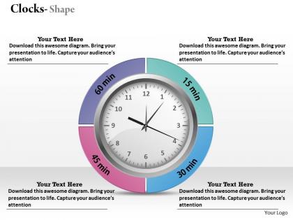
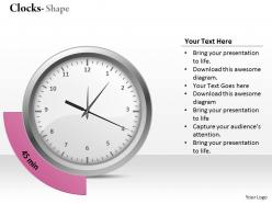
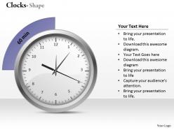
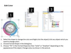
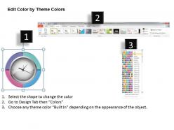
Analog clock powerpoint template slide




Try Before you Buy Download Free Sample Product
 Impress Your
 Audience
 100%
100% Editable
 Save Hours
 of Time


Astound them with our brilliant Analog Clock Powerpoint Template Slide. The audience will be left gasping.
People who downloaded this PowerPoint presentation also viewed the following :
Analog clock powerpoint template slide with all 9 slides:
Step on the gas with our Analog Clock Powerpoint Template Slide. They will accelerate your career growth.
FAQs for Analog clock
Honestly, go for templates with animated clock hands that actually move - way more engaging than boring static ones. You'll want customizable displays and readable fonts too. The interactive stuff is where it gets good though - clicking to advance time or set specific moments keeps people awake instead of staring at their phones. Multiple color schemes are clutch so it matches your slides. Oh, and countdown timers are solid for deadlines or time management presentations. Basically anything that moves or responds beats a plain image every time.
Honestly, analog clocks are perfect for this stuff! Everyone knows what they mean, so you won't confuse anyone. Map different activities around the clock face or have the hands point to your priority time blocks. Color-coding works great too - like blue for meetings, red for deep work, whatever. I've seen people use multiple clocks for before/after comparisons which is pretty clever. The circular thing makes deadlines and project timelines way more visual than boring charts. Just watch out for those fancy clock designs - sometimes the ornate ones make your text hard to read. But yeah, definitely try it!
Make sure people can actually read the thing - clear numbers, hands that pop against the background. Pick colors that vibe with your presentation but won't fight with your text. Size matters here too; if folks are squinting from the back row, you've lost them. Roman numerals vs. modern minimalist? Totally your call, but I'm partial to clean designs that don't scream "look at me!" Leave breathing room around it so your actual content doesn't get crowded out. Oh, and definitely test it on the projector first - what looks good on your laptop screen can be a total mess when projected.
Match your clock colors to whatever vibe you're going for. Red screams urgency - great for deadlines or when you need people to act fast. Blue feels trustworthy, so it's solid for corporate stuff or financial presentations. Green works perfectly for project timelines since it suggests growth and progress. Honestly, orange and yellow are kind of cheat codes - they're energetic and work for pretty much any upbeat presentation about future plans. If you need something more serious though, go with dark colors like navy or black. Just think about how you want people to feel when they see your timeline, then pick your clock face and hands accordingly.
Use analog clocks when you're showing time ranges or deadlines - they're perfect for that visual "sweep" thing. Digital ones are better for exact times, but analog helps people actually *see* chunks of time. Works great for project timelines or scheduling stuff. Plus honestly? They just look more professional and timeless (yeah, bad pun but whatever). Your audience gets a better sense of urgency and flow with the clock face. I'd definitely go analog for workflows, time management presentations, or anything historical where that classic look makes you seem more credible.
Analog clocks work best for older crowds - executives, government people, basically anyone 45+. They grew up with these, so it just makes sense to them. International audiences love them too since they're pretty universal. Younger people? They kinda tune out with analog stuff, honestly. But for formal presentations about timelines or deadlines, they're perfect. I always throw them on timeline slides because it really drives the time thing home. Oh, and corporate settings eat this stuff up - very professional looking.
Oh nice! So for the clock animations, I'd start with entrance effects - have the face fade in, then numbers pop up, then the hands appear. The "Grow & Turn" effect is honestly perfect for hands since it actually looks like real movement. You can also create custom paths to show hands moving between different times during your slides. Maybe add some subtle rotation to the whole clock between transitions? Just... don't go crazy with it lol. Stick to 2-3 effects tops or it gets distracting. Time everything with how you talk and you'll be golden.
Honestly, customizable templates are so much better than generic ones. You can match your brand colors and fonts instead of settling for whatever random design they give you. The sizing and positioning actually fits your slides too. Generic clocks just look... cheap? I mean, if you're presenting to actual clients, having everything match your company's look makes such a difference. Sure, it takes a few extra minutes to set up, but your whole presentation ends up looking way more put-together. Plus you don't have that awkward "clearly grabbed this from a free template site" vibe.
Oh man, this is actually way more complex than you'd think! Western cultures see clockwise as "forward progress," but plenty of places read right-to-left or think about time completely differently. Like, some cultures view time as circular instead of linear - it gets weirdly philosophical fast. Anyway, you'll probably want to research whether your audience prefers 12-hour or 24-hour formats first. Honestly, I'd just make a few different template versions rather than trying to create one "universal" design that works everywhere. Way less headache that way.
Teachers use them constantly for time lessons - kids actually get it when they can see the clock visually. Consultants are big on these too, especially for mapping out project timelines and deadlines. You'll find them in training sessions where timing matters. Manufacturing and healthcare love showing shift schedules this way. Honestly, I never noticed how common they were until I started looking! Pretty much any presentation about schedules or time concepts works better with a clock template. Makes everything less abstract, you know?
You know what's weirdly effective? Using analog clocks to explain complicated stuff. Everyone gets how clocks work, so you can map out your process around the clock face - put different project phases at each hour mark or whatever. It's such a simple trick but honestly works better than most other visuals I've tried. The circular thing naturally makes people's eyes follow along, and suddenly your audience actually gets what you're talking about. I started doing this for workflow presentations last year and it's a game changer. Next time you're struggling to break down something complex, just think "clock" and see what happens.
First thing - change those default colors to match your brand palette. The clock face, hands, numbers can all be swapped out pretty easily in most templates. Font style should match your brand typography too if there's text involved. I've honestly seen people get way too fancy with their clock designs and it just looks terrible against clean, minimal branding. Don't be that person lol. Keep it consistent with your presentation's vibe. Oh and try placing your logo near the clock or use it as a subtle watermark - ties everything together nicely.
Honestly, analog clocks are perfect for this! Move the hands super fast toward your deadline - creates instant panic vibes. Red coloring works great too, makes everything feel urgent. That ticking sound effect is *chef's kiss* but seriously don't go overboard or you'll annoy everyone. Oh, and here's a cool trick - put your project milestones at different hour spots around the clock face. People get clock pressure instinctively, it's hardwired into us. Throw in some "time is ticking" copy and you're golden. The whole visual metaphor just works.
Make those clock hands thick and bold - thin ones vanish when you project. Don't cram too much text or fancy stuff on the face either. Trust me, I learned this the hard way when my "elegant" font looked like hieroglyphics from the back row! Your colors need serious contrast between hands and background. Only show times that actually matter to your content. Honestly, the worst thing you can do is waste a clock as pure decoration when it could help explain your timeline or schedule. Oh, and definitely test it on a projector first - laptop screens lie to you about readability.
Look for patterns in what bombs vs. what hits with your clock templates. People keep squinting at certain time displays? Bigger fonts next time. That vintage clock worked great for the history presentation but looked ridiculous in your tech pitch - yeah, context matters way more than I used to think. Jot down comments about readability and whether the clock thing actually helped your point or just looked cool. Sometimes animations are distracting when you think they're enhancing. Quick feedback doc works - check it before your next design so you don't make the same mistakes twice.
-
Excellent design and quick turnaround.
-
Top Quality presentations that are easily editable.