


Pen powerpoint template slide




Try Before you Buy Download Free Sample Product
 Impress Your
 Audience
 100%
100% Editable
 Save Hours
 of Time


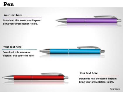
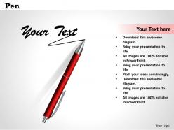
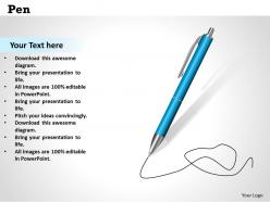
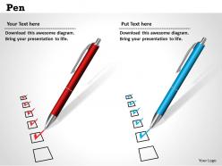
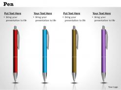
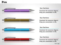
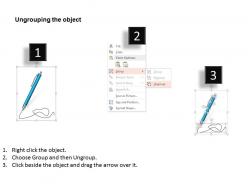
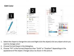
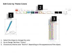
Download this ready to use PowerPoint presentation our pen Ppt template slide for drawing/art and craft/ educational purpose. There is a vector based image of pens shown in the diagram, this image can be used can copy or paste into other presentations. Our specialists have imagined ready to use PowerPoint presentation designs primarily for the executives looking for the understanding of cooperation. I this fast growing industry with a vast amount of information available outside its important to reach out the audience with the relevant content whether any field we are talking about. Our masters offer exclusive presentation slides for the officials looking for a forward strategy of achieving goals. The PPT slide can be modified as per the production requirement as some elements are readily modifiable and provide you an option to show your artistic side. It can be displayed in both standard and widescreen view. To get success in business don’t wait now and click on the download button. Even under pressure your presentations need to look their best. These Pen Powerpoint Template Slide have been designed to present your ideas in the best light possible.
People who downloaded this PowerPoint presentation also viewed the following :
Pen powerpoint template slide with all 10 slides:
Your ideas really pack a punch. Win the countdown with our Pen Powerpoint Template Slide.
FAQs for Pen
Focus on clean fonts - modern sans-serif works great and won't fight your content. White space is your friend here, seriously. I'd stick with colors like deep blues or elegant grays that feel both creative and professional. Keep pen graphics subtle - maybe as borders or light background elements? Don't go crazy with fancy effects (I've definitely been guilty of that before). Test it with real content first so you know text stays readable. Oh, and leave breathing room around everything. The whole thing should feel balanced, not cramped.
Honestly, pen templates are clutch because they keep people actually paying attention instead of zoning out on ugly slides. The whole pen/writing vibe tricks your audience into thinking "learning mode" - pretty smart psychology if you ask me. Your presentation looks way more professional too, which is half the battle when you're trying to seem like you've got your stuff together. Clean design means your important points don't get lost in visual mess. Just pick one that fits your vibe and tweak the colors to match your brand. Trust me, it's worth the extra five minutes.
Dude, go with colors that actually match real pens - deep blues with silver looks super clean. Black and gold screams fancy fountain pen too. Navy and cream is solid if you want something polished but not as boring as basic black/white. Oh, and burgundy with gold accents if you're feeling warmer tones. Honestly though? Skip the bright colors - they just don't fit the whole professional writing vibe. Two colors max, maybe three if you're pushing it. Trust me, keeping it simple will make your slides way more readable and put-together looking.
Stick with line art icons instead of filled ones - they'll match that hand-drawn vibe way better. Keep everything simple and sketchy looking, not polished. Use the same colors as your template (usually just black, white, maybe one accent). I learned this the hard way but don't go crazy with too many graphics! Size them consistently and line them up with your text. Those pen-style arrows and little doodles work great for connecting ideas. Honestly, the messier it looks, the more authentic it feels. Group similar icons together so there's some visual flow to your slides.
Oh man, typography can make or break your whole template! For a pen theme, you'll want fonts that feel handwritten and flowy - scripts work great for headers. But seriously, don't get carried away with crazy fonts or people won't be able to read anything. I usually stick to maybe 2 fonts max. Clean sans-serif for body text is your best bet. Make sure there's good contrast too - I've seen so many presentations where you literally can't read the text because someone chose light gray on white or something equally terrible. Keep sizing consistent and you're golden.
Oh that's perfect for classroom stuff! Just dump the generic text and throw in your lesson objectives or vocab words instead. The pen theme is honestly ideal for English or writing classes. I'd definitely change up the colors to match your subject - maybe blue for science, green for environmental stuff, whatever works. You can make it interactive too with fill-in-the-blanks or discussion questions. One thing though - don't make the text too small since kids in the back won't be able to read it. Also works great if you want to match your school's colors.
For your pen slides, try classic stuff like fountain pens or ink drops as background elements. Paper textures are solid too - maybe aged parchment or notebook lines? I'm obsessed with subtle ink blot graphics lately, they add personality without being annoying. Color-wise, stick with deep blues, blacks, or burgundy for that authentic ink vibe. Oh, and famous writing quotes can work as decorative text if you're into that. Just don't go overboard - you want it themed but not cluttered, you know?
Totally! Product showcase layouts are your friend here - they give you clean space for pen details without all the mess. Comparison slides work awesome if you're showing different models side by side. Before/after layouts are honestly my favorite for demonstrating ink flow or writing samples (maybe I'm weird but those are so satisfying). Oh, and feature highlight slides let you call out specific benefits with bullets and images. I'd start with any product-focused template, then just customize the colors to match your brand. Way easier than building from scratch.
Get high-res pen photos first - pixelated images look terrible on big screens. Clean backgrounds work best, or grab transparent PNGs so they don't mess with your text. Honestly? I love fancy fountain pen shots but they're usually overkill for work stuff. Simple ballpoint images actually look more professional most of the time. Horizontal pens make good section dividers. Vertical ones frame content pretty well. Just match your pen colors to your overall theme. Oh, and definitely test a few styles on your master slide first - some pens look amazing until you actually see them with your content.
Honestly, transitions can totally make or break your pen presentation. Go with subtle stuff - gentle fades or simple slides that feel like ink flowing. Skip the flashy spinning crap though, it'll just clash with that elegant vibe you want. I made this mistake once and it looked so cheesy! Simple fade-ins work great. Maybe try a gentle slide that mimics how a pen moves across paper? The whole point is keeping people focused on what you're saying. Less is definitely more here - your audience shouldn't be distracted by bouncing text when they could be listening to your actual content instead.
Don't cram too much text on your slides - these pen templates look way better when they're clean and minimal. The colors you pick should work with what's already there, not fight against it. Here's where people mess up: they go crazy adding pen clipart everywhere just because it "matches." Super tacky honestly. Your fonts need to complement the template's vibe too. Keep animations pretty subtle since the design already has enough visual stuff going on. Short sentences work. Let the template do most of the work while you focus on getting your message across clearly.
Yeah, totally doable! Just mess with the colors and fonts. Navy or charcoal looks super professional - pair those with Calibri or Arial and you're set. Brighter colors work great for casual stuff, maybe throw in a fun accent color too. The pen thing actually works for both since it's all about writing and creativity anyway. Oh, and definitely change any weird placeholder text that sounds too casual if you're presenting to your boss or whatever. The main thing is just matching what your audience expects. Some audiences are way pickier about this stuff than others, honestly.
Dude, use the pen as your story thread! Start with sketching an idea, then show how it becomes the final thing. Or map out a customer's whole journey step by step. The pen visual is perfect for this - it screams "creation" and "progress." Here's the thing though: people tune out bullet point slides instantly. Like, their brains just shut off. Structure everything around a problem-solution story instead. Keep that pen image popping up throughout to tie it all together. Way more engaging than whatever boring format you're probably using now.
Oh this is such a cool idea! Start with ink colors as your base - deep blues, blacks, maybe some rich purples. Your bar charts could totally look like fountain pen nibs (I'm kind of obsessed with that visual). Line graphs work great too if you make them look handwritten. Watercolor backgrounds are gorgeous for data slides, or go full hand-sketched on your infographics. Just don't sacrifice readability for style - learned that one the hard way. Pick 2-3 main ink colors first, then build everything else around those.
Dude, just grab a pre-made template - seriously saves so much time. The layouts are already polished and everything matches (fonts, colors, the whole deal). Way better than me trying to make slides look decent from nothing. Plus you get different slide types so it won't look boring throughout. Honestly the best part? You can actually focus on what you're saying instead of spending forever moving text boxes around. I always end up going down that rabbit hole otherwise. Download, add your stuff, done.
-
Very well designed and informative templates.
-
Very unique and reliable designs.