


Formal presentation outline ppt slide templates





Try Before you Buy Download Free Sample Product
 Impress Your
 Audience
 100%
100% Editable
 Save Hours
 of Time


Present the main and supporting ideas for a particular subject and topic using this Formal Presentation Outline PPT Slide Templates. It will help you develop a logical, coherent structure for your PPT presentation. Organize your thoughts and ideas into main points and display it with this presentation outline template. Make your audience familiar with the topics covered in the presentation with just one slide. Get this professionally designed PPT slide for formally arranging and developing your ideas. The matter in the slide can be altered as per your field of interest. Use this outline template when you are running short of time and provide an overview of the concept to your audience. Summarize whatever you want to say to your audience with this slide and present it in front of your viewers. It includes all the critical elements of your presentation. Download this template now and add or remove the matter as per your needs.
People who downloaded this PowerPoint presentation also viewed the following :
Content of this Powerpoint Presentation
Do you know why professionals resort to tedious formal presentations when casual conversations and informal documents could effortlessly do the job for them? Formal presentations are more structured, transparent, and demonstrative in themselves. They are the official modes of communication through which you can organize scattered pieces of information, highlight the most critical points, and engage your audience in a desired manner.
Despite their magnificent qualities, preparing formal presentations can be daunting. Visualization, finding a perfect design for the slides, conceptualizing content, and maintaining proper attention and informality require meticulousness, and numerous distractions can interrupt your pace.
Considering the particular challenges of formal presentations and the intricacy of the process of creating slides, SlideTeam’s Formal Presentation Outline PPT Slide Templates offer a solution. Created for every step of a perfect formal presentation, SlideTeam’s presentation templates deliver everything presenters might need to perfect their formal pitches.
With SlideTeam’s Formal Presentation Outline PPT Slide Templates, any presenter can make the most effective presentations effortlessly.
Also, check out our blog on Presentation Outline Design to enhance your presentation effectively.
Without any further ado, take your presentations to the next level with SlideTeam’s practical and innovative templates today.
Template 1: Formal Presentation Outlines PPT Slide Templates
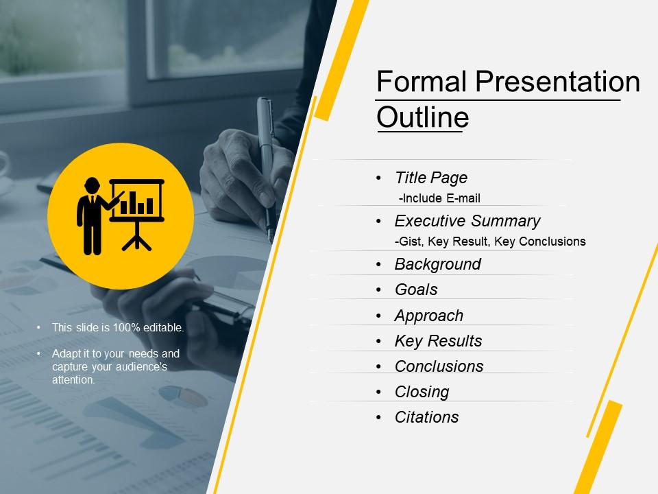
Are you trying to figure out the plot of your presentation but need help with how to organize your thoughts or what to leave out? Worry no more! This presentation design will help. With this PPT Preset, you can see all the elements required to make a perfect presentation. Starting from the layout of the title page to referencing, every aspect is neatly detailed in this PPT Slide. Whether it's about the executive summary, background information, or the key results, the formal presentation outline would accommodate them all. It would offer an intuitive beginning to your presentation that'll systematically take your audience through the main idea and supporting ideas. By the end of the presentation, the audience can be in an excellent position to understand your ideas; the formal presentation outline has done its job. Whether you are a business person, teacher, or student, this PPT Template would be handy for effortlessly producing organized and refined presentations.
Here's another impactful PPT Design to prepare your presentation outline effectively.
Boost the Presentation Impact to a Whole New Level
This next-gen formal presentation outline PowerPoint slide template is a wonderful starting point for managing your ideas' development. It will give your presentation structure and direction to help retain your target audience's interest.
PS: Check out this content-rich PPT Framework titled Meeting Presentation Outline templates to take your presentations to a new level.
Formal presentation outline ppt slide templates with all 5 slides:
Draw accurate conclusions with our Formal Presentation Outline Ppt Slide Templates. Correctly identify important information.
FAQs for Formal presentation outline
Okay so for templates, you want everything to look cohesive - same fonts, colors, spacing. Keep it simple with a title slide, content slides with lots of white space, maybe a Q&A slide at the end. Trust me, I've sat through presentations that looked like a unicorn exploded on the screen. Not good. Make sure people in the back can actually read your text, and don't go crazy with fonts - two or three tops. The whole point is supporting your message, not competing with it. Start basic and see how it feels when you practice.
Templates are honestly lifesavers for keeping your presentations consistent. Your audience won't get distracted by random fonts or messy layouts. They can actually focus on what you're saying. Most good templates already have that problem-solution flow built in, which is clutch. I've watched so many solid ideas completely bomb because the slides looked terrible—it's painful to see. You'll save hours not messing with design stuff too. That time's way better spent on making your content actually compelling. Oh, and definitely check if your company has branded ones first. They're usually tweaked for your specific crowd.
Honestly, less is more with presentation templates. White space is your best friend - don't cram everything together. Stick with maybe 2 fonts tops (3 if you're feeling fancy but probably don't). Your color scheme shouldn't assault people's retinas, and make sure there's enough contrast so folks in the back can actually read your stuff. I'd set up a grid system so all your slides look like they belong together. Oh, and those spinning transitions? Skip them - they're just annoying. The template should work FOR your content, not against it. Test it out first before everyone starts using it.
Honestly, customizing templates makes such a huge difference. Your audience can tell when you've put in the effort - like using their industry colors or fonts that match their company style. Generic slides just scream "I sent this to everyone." People actually pay attention when the visuals feel made for them, not recycled from your last presentation. It's weird how much the right color scheme matters, but it really does help your message stick. I'd start small though - just swap out the colors and maybe find images that actually relate to their world. You'll see people lean in more.
Definitely worth it! Healthcare templates are all clean lines and lots of white space - perfect for data stuff. Finance goes super conservative with tons of charts and graphs. Tech templates? They're usually way too trendy but somehow it works. The cool thing is your audience immediately gets that you know their world when you pick the right style. Check if your company already has templates first though - might save you time. Otherwise Canva or PowerPoint's gallery has solid industry options. It's one of those small details that actually matters more than you'd think.
Dude, colors can totally make or break your presentation. I've watched so many people bomb because they used neon green text on yellow backgrounds - my eyes are still recovering. Good color choices guide people's attention to what matters and create that visual flow you want. Blues feel professional and trustworthy, reds scream urgency. Keep it simple with 2-3 colors tops, make sure there's enough contrast so people can actually read your text. Oh, and test your slides on the real screen first - colors look different on projectors than your laptop.
Dude, typography can totally make or break your presentation. Go with clean fonts like Arial or Calibri - they're way easier to read on screens than those fancy serif ones. Make your text at least 24pt, bigger if you can. I learned this the hard way when half my audience was squinting at my tiny text last month. Don't use more than two different fonts or it'll look messy. Give your lines breathing room with good spacing. High contrast between text and background is key too. Oh, and dark text on light backgrounds usually works best for projectors.
Honestly, PowerPoint's still king - everyone has it and you can tweak everything. But if your team needs to collaborate, Google Slides is clutch since it's all cloud-based. Canva's where it's at though if you want something that actually looks good (way better than what most of us can design lol). Keynote's solid too if you're all Apple. I'd probably just stick with whatever your team's already using. Though seriously, check out Canva if you're tired of ugly presentations - it's pretty foolproof even for design disasters like me.
Oh man, remote presentations are totally different! Bump your font to at least 24pt because everyone's squinting at laptop screens. People zone out so much easier on Zoom (I swear half the audience is checking email), so you need way bolder colors and more white space. Cut down on bullet points too - attention spans are basically nonexistent online. In-person is more forgiving since you can actually see people's faces and adjust. Pro tip that saved me once: test your slides on your phone first to see how tiny everything looks.
Ugh okay so biggest thing - don't just copy/paste your content in there without thinking about how it flows together. Your slides will feel super choppy. And I know it's tempting to use every fancy design element, but seriously don't. I've sat through some absolutely wild presentations because people went overboard lol. Always swap out those weird stock photos for something that actually makes sense. Check your text shows up clearly too - some templates have terrible contrast. Oh and change the colors to match your brand obviously. Pro tip: click through the whole thing first to catch any wonky formatting.
Honestly, templates are a game-changer for team stuff. Everyone starts with the same fonts, colors, and branding so you don't get that mess where someone's using the wrong logo version (been there). It makes dividing up work way easier too - you can split sections and merge slides without everything looking weird together. The best part? You'll actually spend time on content instead of fighting with formatting for hours. I learned this the hard way on a project last year. Just make sure everyone's cool with whatever template you pick upfront.
Honestly, templates with good visuals are a game changer. The color schemes help organize everything so it's not just random data thrown together. Charts and fonts create this natural flow that draws people to the important stuff first. Way better than drowning your audience in bullet points - I swear some presentations are like reading a phone book. Plus you won't accidentally pick colors that clash horribly or squish everything together. Templates give you that solid foundation to work with. Then just swap in your actual data and you're golden. Trust me, it's so much easier than starting from scratch.
Your brand is basically the blueprint for your whole presentation template. Start with your brand colors - those become your slide palette. Match the fonts to what you already use in marketing stuff. Logo placement should follow whatever guidelines you've got (some companies are weirdly strict about this lol). The layout style matters too. Corporate brands usually want clean, minimal designs. Creative brands can go bolder. Your presentations should feel connected to your other materials - like they all came from the same place. Just grab your brand guide and use that as your starting point for everything.
Honestly, just track how engaged people are - are they asking questions, participating, giving decent feedback afterward? But also notice how the presentation actually felt for you. Did the template help you flow naturally or did it feel clunky? I always think the flashy templates will be amazing, then realize mid-presentation they're actually distracting. Time yourself prepping too - good templates should make things faster, not slower. Oh, and don't judge after just one use. Give it a few tries before deciding if it's a keeper or needs major changes.
Dark mode is everywhere right now, plus those bold asymmetrical layouts that honestly look pretty sick when done right. Interactive stuff is blowing up too - polls, clickable hotspots, all that. Everyone's doing gradient overlays and 3D illustrations, though some are kinda overdoing it if you ask me. The coolest thing? AI visuals are getting baked right into presentation tools now. You don't have to jump between apps anymore. Oh, and definitely grab templates with solid data viz options - storytelling with numbers is huge this year. Try the interactive features if your software has them!
-
Very unique and reliable designs.
-
Great product with effective design. Helped a lot in our corporate presentations. Easy to edit and stunning visuals.