


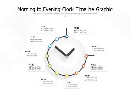
Morning to evening clock timeline graphic




Try Before you Buy Download Free Sample Product
 Impress Your
 Audience
 100%
100% Editable
 Save Hours
 of Time


Enter the fray with our Morning To Evening Clock Timeline Graphic. Your audience will soon be shouting Bravo!.
People who downloaded this PowerPoint presentation also viewed the following :
Morning to evening clock timeline graphic with all 2 slides:
Release the brakes with our Morning To Evening Clock Timeline Graphic. Your career will surely pick up speed.
FAQs for Morning to evening
Okay so for timeline presentations, you need specific dates first - none of that "Q2-ish" nonsense. Key milestones and deliverables are obvious but people forget them constantly. Dependencies matter too because that's where everything falls apart. Oh, and assign owners to each task or you'll get that fun "I thought you were doing it" moment. Color-coding honestly saves your life when presenting - makes it super scannable. I always pad major deadlines with buffer time though. Trust me on that one, delays happen no matter how perfect your plan looks on paper.
Good visual design totally transforms how people read timelines. Consistent colors help group related stuff together, and bigger markers can highlight the really important events. White space is clutch - cramped timelines are the worst. I swear, bad ones look like someone just barfed dates everywhere! Clear typography makes scanning so much easier. Start simple with a straight line layout first. Then layer on visual elements that actually support your story instead of just looking pretty. Proper alignment keeps people from getting confused about what happened when.
Keep it simple with colors - maybe 2-3 max. I usually do one for done stuff, another for what's coming up. Arial or Calibri work great since they're super readable. Make your big milestones bigger text, then scale down for the details. Oh and seriously, high contrast is everything if you're showing this to other people. Can't tell you how many rainbow disasters I've seen where nobody could actually read anything lol. Test it on your phone first - timelines can look weird on different screens. Having someone else glance at it before you send it out doesn't hurt either.
Honestly, just make those milestones pop visually - big dots or diamond shapes work great. Different colors for each type helps too (like red for deadlines, green for deliverables). Don't space them evenly though - that's a rookie mistake. Use actual time proportions so people get the real project flow. Keep your regular tasks looking more muted so the milestones stand out. Oh, and definitely add short descriptions right on there. Nobody wants to play guessing games about what "Phase 2 Complete" actually means, you know?
Honestly, I'd just start with whatever you're already using for other stuff. PowerPoint works fine but gets annoying with complex timelines. Lucidchart and Visio are solid if you need detailed project timelines with tons of data. Timeline JS is really slick for presentations - way more impressive than people expect. Tiki-Toki's another good one. Google Sheets actually handles basic timelines pretty well with their chart features, which surprised me when I first tried it. Most of these have free trials so you can mess around and see what clicks. Don't overthink it too much.
So basically, historical timelines cover huge chunks of time - we're talking decades or centuries. They focus on major events, dates, and how things connect to each other. Project timelines? Completely different story. You're looking at weeks or months, tracking deliverables and deadlines. Like, one shows "Industrial Revolution 1760-1840" while the other's more like "User testing March 15-22." It's educational vs. task management, really. Oh and project ones can be kind of a pain to keep updated, honestly. Pick based on whether you're teaching history or just trying to get stuff done on time.
Okay so basically you need to turn your timeline into an actual story people give a shit about. Don't just list dates - show how one thing led to another. Find your main thread first, then arrange everything to support that narrative. Like when you're telling someone about drama that happened (but hopefully more professional lol). You want a clear beginning, middle, and end that makes sense. The key is highlighting those big turning points and explaining why each event actually matters. Otherwise you'll just have a boring list of facts that puts everyone to sleep.
So basically, people get way more into it when they can actually click around and explore stuff themselves. You know how everyone zones out during those endless slide presentations? Interactive timelines fix that because your audience stays busy - they're zooming in on dates, clicking hotspots, digging into whatever catches their eye. It feels personalized since they control the pace. Honestly, I think it's because we're all used to scrolling and tapping on our phones constantly. Try adding some expandable sections or clickable elements next time - people will actually pay attention instead of checking their email.
Don't cram everything onto one timeline - nobody can read tiny text from across the room. Also skip the confusing date formats, they just mess people up. Spacing between events matters too, inconsistent gaps make it hard to follow the flow. Graphics can look cool but honestly? Too many just become distracting noise. Clean beats fancy every time. Quick test - back away from your screen and try scanning it quickly. Can't read it easily? Then your audience is screwed. Oh, and keep your text size readable - I've seen way too many timelines where you need binoculars to see anything.
Know your audience first - that's honestly the biggest thing. Students need the big picture stuff with simple language and visuals that actually make sense. Don't overwhelm them with details they won't use. But industry people? They want ALL the messy details because they've been burned before when timelines fall apart. Show them dependencies, buffer time, resource needs - the whole nine yards. Really though, just think about what decisions your specific audience will make with your timeline. What do they need to walk away knowing or doing? That'll tell you how deep to go and what language to use.
So for school stuff, you want those visual step-by-step timelines - like flowcharts that show cause and effect so students actually get it. Corporate is totally different though. Gantt charts and project roadmaps work better since executives just care about deadlines and who's doing what (honestly, they don't have time for the deeper stuff). Students need to understand the "why" behind everything. Business folks? They're scanning for action items and due dates. Oh, and here's the thing - ask yourself if you're teaching concepts or just tracking progress. That'll tell you which format to go with right away.
So timeline design gets tricky across cultures. Western folks expect left-to-right flow, but Arabic and Hebrew readers go right-to-left naturally. Then you've got cultures that think cyclically about time instead of linear - honestly kind of fascinating once you dig into it. Date formats mess people up too (MM/DD vs DD/MM drama). Colors hit different too depending on culture. Oh, and watch out for terms like "recently" since that's super relative. I'd definitely run your design past people from whatever cultures you're targeting first. Way easier than fixing it later when someone's confused about which direction time's supposed to flow.
Dude, interactive videos at key moments are a game changer - also audio clips from old speeches or interviews. Hover effects work great too, like revealing hidden photos when someone moves their mouse around. Oh and parallax scrolling is sick, where the background shifts as you scroll through different time periods. Clickable hotspots that pop up detailed info windows are clutch. Social feeds for recent stuff could be cool too, though maybe that's getting too fancy? I'd honestly just pick one thing first and get that working smooth, then add more layers.
Honestly, timelines are total lifesavers for strategic planning. They make you get real about when stuff actually needs to happen instead of just hoping for the best. You can map out your big milestones and catch those sneaky bottlenecks before they mess everything up. I've watched so many "plans" crash because nobody thought about realistic timeframes - it's painful to see. Work backwards from your end goals and definitely build in buffer time. Trust me on this one. Dependencies between projects will bite you if you don't plan for them. Plus when everyone sees how their work connects to the bigger picture timeline, they actually care more about hitting their deadlines.
Honestly, it depends on what you're building. Horizontal works best when you've got detailed descriptions or need more reading space - we naturally read left to right anyway. But vertical? That's your go-to for mobile and when you have a ton of events. Nobody wants to scroll sideways through 50+ project milestones, trust me. Plus vertical feels more like storytelling - this happened, then this, flowing down the page. I'd do horizontal for detailed project phases. Go vertical if it's event-heavy or mobile-first.
No Reviews