


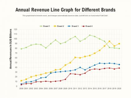
Annual revenue line graph for different brands




Try Before you Buy Download Free Sample Product
 Impress Your
 Audience
 100%
100% Editable
 Save Hours
 of Time


Our Annual Revenue Line Graph For Different Brands assure elegance in designs. They believe in good aesthetics.
People who downloaded this PowerPoint presentation also viewed the following :
Annual revenue line graph for different brands with all 2 slides:
Aesthetics are guaranteed with our Annual Revenue Line Graph For Different Brands. Be certain of giving an elegant display.
FAQs for Annual revenue line graph
Start with the obvious stuff - label your axes ("Year" and "Revenue ($)") and give it a proper title like "Annual Revenue 2019-2024." Your y-axis should start at zero, or at least show that it doesn't. Trust me, people will call you out on sketchy axis tricks. Add markers so readers can see exact values, maybe a trend line if it actually helps. Keep your time intervals consistent too. Data source goes at the bottom - I always forget that part. Colors should be simple and readable when someone inevitably prints it in grayscale.
Oh, definitely go with a line graph for this! Put years across the bottom and revenue up the side. Don't make my mistake though - start your y-axis at zero or you'll make tiny changes look dramatic (learned that the hard way). Add little dots on each data point so it's easier to read. Colors should be simple, nothing fancy. Here's what really helps - throw in some notes about big events or market stuff that explains why revenue jumped or dropped. Otherwise people just stare at random peaks wondering what happened. Maybe add a trend line if the overall direction isn't obvious.
Honestly, just start with Excel or Google Sheets - they're boring but they work and you probably already have them. Tableau and Power BI are where it's at if you want something fancier with interactive stuff. Python's cool too if you code (makes you look smart in meetings, not gonna lie). There are quick options like Canva for pretty charts without the headache. Chart.js is decent for online stuff. But real talk - a clean Excel chart that actually makes sense beats some complicated tool you'll spend hours figuring out. Go with what you know first.
Your revenue graph can totally fool you when seasons get involved. Retail always jumps in Q4 because of Christmas - that's just how it works. But here's the thing: what looks like growth might just be normal holiday spikes hiding real issues underneath. Compare the same periods year-over-year instead of quarter-to-quarter. Moving averages help smooth out those predictable bumps too. Trust me, you don't want to celebrate fake wins or freak out over normal seasonal dips. Plot a few years together and the actual patterns become way more obvious.
Don't start your y-axis at zero - you'll lose all the subtle changes that actually matter. Mix up your time periods and people get confused trying to follow along. Honestly, the worst thing is cramming like 5 trend lines on one chart because it just becomes visual chaos. Cherry-picking date ranges to make your numbers look amazing? Yeah, people catch that pretty quick. Label everything the same way, stick to one currency format. I always plot the raw data first, then make it look nice - if the story isn't clear from the start, fancy colors won't save you.
Oh man, color choice can make or break your line graph! High contrast is key - you want lines that pop against the background. Don't use red/green together (colorblind people can't tell them apart). I made this mistake once and half my audience looked totally lost. Keep it to 4-5 lines max or it gets messy real quick. Brand colors are nice, but readable beats pretty every time. Here's something I always do: convert your graph to grayscale first. If you can still tell the lines apart without color, you're golden.
Different line styles are your best bet here. Solid line for actual revenue, dashed for projected - works every time. I usually throw in different colors too, like blue and gray. Oh, and definitely add a vertical line where actual data stops and projections start. That transition gets messy without it, trust me. Your legend needs to spell out which is which clearly. Really, the whole point is making it dead obvious what people are looking at so they don't have to decode anything.
Honestly, annotations are a total lifesaver for revenue graphs. Without them, you're just staring at random lines going up and down. Use labels to mark big milestones, explain weird spikes, or call out growth percentages that matter. Like, if there's a huge dip in Q2, people need to know why - was it seasonal or did something break? Don't go overboard though. Too many callouts make it messy. Pick the data points that actually tell your story. I learned this the hard way after presenting a graph that looked like alphabet soup.
Honestly, line graphs hit different when you build up to them like a reveal. Don't just throw the data at people - give them the backstory first. What problem were you solving? I usually drop mine right after explaining what we changed strategy-wise because then people can actually see the impact happening. Here's the thing though - you gotta walk through those peaks and valleys. Don't let the line just sit there doing nothing. Tell people what caused that spike in March or why everything tanked in July. Then wrap it up with what you're doing next quarter based on this trend. People need to know why they should care, you know?
Make those big changes pop with contrasting colors and callout boxes at major turning points. Honestly, I used to clutter my graphs with way too many annotations - total mistake. Focus on maybe 2-3 key story points instead of marking every tiny dip. Break your timeline into chunks if your business had distinct phases. Trendlines help show the overall direction too. Oh, and definitely add percentage labels at the critical spots so people don't have to squint and calculate changes in their heads. Makes such a difference.
Dude, you've gotta label everything clearly - titles, axes, what currency you're using. Specify if it's gross or net revenue too. Add little notes for big events that affected your numbers, like "pandemic hit here" or whatever. I swear, half the graphs I see assume everyone already knows the context! Keep your scales consistent and mention your data source. Short sentences work. Also longer ones that actually flow naturally when you read them. The whole point is telling a story with your data, not just making lines that look impressive.
Okay so first thing - start your y-axis at zero or people will think you're trying to trick them (I've seen this backfire so many times). Pick intervals that actually make sense for your numbers - like $10K jumps for smaller companies, $1M for bigger ones. Format everything with dollar signs and use "K" or "M" so it's not cluttered with zeros. Time periods on the x-axis should be logical - quarters or years work best. If your labels are getting cramped, just angle them. Oh and throw in some gridlines because they help people read the actual values way easier.
Yeah, every industry looks at revenue graphs totally differently. Tech bros are obsessed with those hockey stick growth curves and quarter-over-quarter numbers. Retail's all about seasonal stuff - like comparing this December to last December, not August. Manufacturing smooths everything out with rolling averages because their demand goes up and down constantly. Healthcare and utilities? They want boring, steady growth - no crazy spikes. Finance people love throwing economic indicators on top of everything to make sense of trends. Honestly though, just ask someone who actually works in whatever industry you're targeting. They'll tell you exactly what matters when you're presenting revenue data to them.
Looking at several companies' revenue graphs together is way more useful than just one - you'll catch patterns you'd totally miss otherwise. Some businesses grow steadily while others are all over the place. You can see who's winning their market and who's struggling to keep up. Honestly, the most interesting stuff happens when companies suddenly diverge from what everyone else is doing. That's usually when someone made a smart move or screwed up big time. Plus you'll spot if the whole industry got hit by something - recession, new regulations, whatever. It's like... why look at one puzzle piece when you can see the whole picture?
Ugh, learned this one the hard way! Do layers - start with a super clean line graph that shows your main revenue story. Everyone gets it instantly. Then prep backup slides with all the nitty-gritty breakdowns (product, region, whatever) for the data nerds who'll definitely ask. I once did this horrific 15-line spaghetti mess and watched everyone's eyes just... die. Short attention spans are real, even in boardrooms. Your main slide should be brain-dead simple, but have the detailed stuff ready for Q&A. Works every time.
No Reviews