


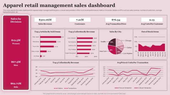
Apparel Retail Management Sales Dashboard




Try Before you Buy Download Free Sample Product
 Impress Your
 Audience
 100%
100% Editable
 Save Hours
 of Time


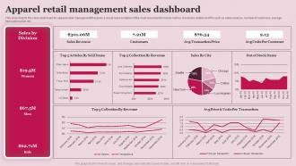
This slide depicts the sales dashboard for apparel retail management that gives a visual representation of the most recent performance metrics. It includes details on KPIs such as sales revenue, number of customers, average transaction price, etc.
People who downloaded this PowerPoint presentation also viewed the following :
Apparel Retail Management Sales Dashboard with all 7 slides:
Use our Apparel Retail Management Sales Dashboard to effectively help you save your valuable time. They are readymade to fit into any presentation structure.





FAQs for Apparel Retail
Start with the obvious stuff - total revenue, units sold, average transaction value. Those are non-negotiable. Inventory turnover is huge too because dead stock will absolutely murder your margins. Track sell-through rates by category and days of inventory sitting around. Customer-wise, you need conversion rates, return rates, and acquisition costs. Foot traffic if you've got physical stores. Oh, and seasonal comparisons are clutch since fashion changes so fast. Honestly, gross margin by product line might be the most telling metric of all. Build your dashboard with these basics first, then you can get fancy with other stuff later.
Dude, real-time sales data is a game changer. You'll catch trends while they're actually happening instead of finding out weeks later when you can't do anything about it. Flying off the shelves? Reorder fast before you're stuck with empty racks. Slow movers get spotted early too - honestly nothing's worse than sitting on dead inventory for months (been there). You can tweak pricing instantly, move marketing budget to stuff that's working, and figure out staffing based on when people actually show up. Just make sure you set up alerts so the data actually makes you DO something, not just stare at charts.
Hey! So for clothing retail, conversion rates by category are huge - like how many people actually buy jeans vs just browse them. Track cart abandonment too because honestly, fashion has the worst rates since everyone freaks out about sizing online. Average items per transaction matters, plus return rates by specific products. That'll show you if certain items have fit problems or just suck quality-wise. Oh, and watch repeat purchases - how often customers come back tells you everything about loyalty. Start there, then you can dig into seasonal stuff and demographics once you get the hang of it.
Make a heatmap that shows turnover rates by product and time - slow inventory basically screams at you in red while green highlights your winners. Honestly, the color coding thing works way better than staring at spreadsheets all day. Throw in some trend lines to catch seasonal stuff (saves you from ordering beach towels in December, you know?). I'd also add stock level bars right next to the turnover data. That way you can instantly spot where you've got too much dead weight or not enough of the good stuff. Focus on your worst 20% first - that's where the real money is hiding.
Oh man, seasonal analysis is everything for clothing forecasting. People's buying habits are crazy predictable once you map them out. Look at your historical data first - when did winter coats fly off shelves last year vs swimwear? Don't forget holiday rushes and back-to-school madness too. Your dashboard needs year-over-year trends, peak periods, and inventory cycles so you can actually plan purchases and staffing. I'd honestly start small though - find your top 3 seasonal patterns and build from there. Trust me, without this you're just guessing and that never ends well.
Pie charts work great for this - just break down your customers by age, spending habits, or how often they buy. Bar graphs are solid too. Honestly, I'm obsessed with color-coding because it makes everything so much easier to read at a glance. Heat maps are clutch if location matters for your business. You could also do comparison tables showing different segments and their average order values. Oh, and don't go crazy with like 10 different categories - stick to 3-4 segments that actually matter for making decisions. Focus on whatever drives the most revenue first, then expand from there. Way less overwhelming that way.
So for your dashboard, I'd start with Google Analytics or Adobe Analytics for web stuff. Customer data? Salesforce and HubSpot are solid choices. NetSuite totally changed my mind about inventory management - used to hate dealing with that mess. Social media tracking through Hootsuite gives you the engagement numbers you need. Your POS system probably has way more useful data than you realize, and don't sleep on email platforms like Mailchimp. Honestly though, just pick whatever's causing you the biggest headaches right now and work from there.
Honestly, charts are a game-changer for spotting trends. Way better than staring at endless rows of numbers. Line charts show you which colors or styles are taking off over time. Heat maps? Perfect for seeing what sells where and when - like how boots spike in the northeast come fall. I love using bar charts to compare how different age groups buy stuff. Oh, and make sure your dashboards update automatically or you'll be working with old info (learned that the hard way). Pick maybe 3-4 metrics that actually impact your buying choices and focus on those.
Your online data is like having a crystal ball for your physical store. People browse tons of stuff online without buying - use that intel to figure out what to display prominently in-store. Cart abandonment patterns? Gold for training staff on what customers hesitate about. Also check your top online searches weekly and make sure those products are front and center when people walk in. Regional trends pop up online way before you'd notice them just from store sales. I swear, sometimes the data reveals stuff that'll totally surprise you about what people actually want in your area.
So you can grab social media data straight through APIs - Instagram, Facebook, TikTok all have them. Tableau and Power BI already have connectors built in that'll pull engagement rates and follower stuff automatically. Honestly though, focus on metrics that actually matter for sales. Like click-through rates from posts to your product pages, or how well posts with specific items perform. Instagram Shopping insights are seriously useful for this. Oh, and set up auto-refresh so you're seeing live data next to your sales numbers. Makes way more sense than checking everything separately.
Dude, mobile dashboards are clutch. You can literally check sales numbers while you're getting your morning coffee or walking around the store. Real-time inventory, what's selling fast - it's all right there on your phone. Your whole team can see the same stuff too, which is super helpful for hitting daily goals. Quick decisions about restocking become way easier. Oh, and definitely set up alerts for the important metrics - trust me, you don't want to be blindsided by weird sales drops or inventory issues. Honestly beats being chained to your computer all day.
Dude, dashboards are literally the only way to stay sane with promo tracking. You can see what's actually working instead of guessing for weeks. Conversion rates, revenue per campaign, which products are moving - it's all right there. Plus you'll catch patterns super fast, like maybe gen Z goes crazy for BOGO deals while millennials want straight discounts or whatever. Set up alerts when campaigns hit certain numbers so you can pump more money into the good ones. Trust me, beats the hell out of waiting for some analyst to email you a spreadsheet two weeks later.
Start with color contrast - your KPI indicators need to work for people with visual impairments. Don't just rely on color for sales trends or inventory alerts. Use colorblind-friendly palettes. Font size matters too - 14pt minimum, though bigger is honestly better when execs are squinting at dashboards on tiny phone screens. Add alt text for your seasonal apparel charts. Your dashboard should work with screen readers and keyboard navigation. Oh, and run it through accessibility testing tools first - they'll tell you exactly what's broken. Way easier than guessing.
Honestly, competitor tracking is pretty straightforward once you get the right tools hooked up. I'd start with SEMrush or SimilarWeb - they're solid for monitoring pricing and product launches. Stock level tracking is clutch during busy seasons if you can get that data. Set up some widgets showing price comparisons for similar products, plus their promo calendars and social engagement stuff. The real game-changer though? Alerts when they slash prices or drop new products in your main categories. Gives you a heads up so you're not scrambling to react later. Worth the setup time for sure.
Bar charts work great for comparing categories like tops vs bottoms. Line graphs show trends over time - super helpful for spotting seasonal dips. Heat maps are clutch for tracking which sizes and colors actually move (I swear by these). Your dashboard needs breathing room, so don't cram everything together. Lead with your top 3 KPIs up front where people will see them first. Year-over-year comparisons are huge since fashion cycles repeat. Oh, and pick colors that make sense - using red for profitable stuff just confuses everyone. Clean layout beats fancy design every time.
-
Delighted to see unique and eye-catching PowerPoint designs that are so easy to customize.
-
It is my first time working with them and that too on a friend's recommendation. I would say, I am not expecting such a worldly service at this low price.