


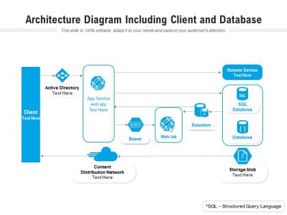
Architecture diagram including client and database




Try Before you Buy Download Free Sample Product
 Impress Your
 Audience
 100%
100% Editable
 Save Hours
 of Time


Our Architecture Diagram Including Client And Database are topically designed to provide an attractive backdrop to any subject. Use them to look like a presentation pro.
People who downloaded this PowerPoint presentation also viewed the following :
Architecture diagram including client and database with all 2 slides:
Use our Architecture Diagram Including Client And Database to effectively help you save your valuable time. They are readymade to fit into any presentation structure.

FAQs for Architecture diagram including
You need clear boundaries between systems, defined components, and data flows connecting them. Skip the implementation details though - nobody wants to get bogged down in that stuff. Think subway map: show how things connect without overwhelming people. Boxes and arrows work great to start, then polish it up. A legend helps if you're using different colors or shapes. Always explain what problem you're solving - context matters way more than you'd think. Test it by having someone else walk through your diagram. If they look confused, simplify it.
So basically, architecture diagrams are like having a translator for all the different teams at work. Developers speak code, PMs speak features, executives speak money - but everyone gets pictures. They show how systems connect and where data flows without needing a computer science degree to understand. Way better than those email chains where someone's trying to explain databases over text (ugh). The trick is matching detail to your audience. Executives want the bird's-eye view, engineers need all the components and connections. Honestly, I've seen more projects saved by a good diagram than killed by a bad one.
Honestly, I'd just start with Draw.io (they call it diagrams.net now but whatever). It's free, runs in your browser, and has a bunch of templates already built in. Lucidchart's pretty solid too, and if you're stuck in Microsoft-land, Visio does the job. For fancier architecture stuff, there's Archimate or you can grab AWS icons and drop them into Draw.io. Miro works if your team's already using it for other design things - might as well stick with what everyone knows, right? Seriously though, try the free option first. You can always upgrade later if you need bells and whistles.
So basically each industry tweaks their diagrams to show what they actually care about. Healthcare ones are all about data privacy and HIPAA stuff. Finance diagrams? Total overkill honestly - security boundaries and audit trails everywhere you look. Manufacturing focuses more on connecting factory floor data and real-time flows. They also use symbols their teams already know. Best bet is checking out existing diagrams in your field first to see what's normal, then just modify standard templates to fit your industry's language and priorities. Way easier than starting from scratch.
Start with the big picture first - show your major components, then drill down into details for each piece. Stick to consistent colors and shapes (trust me, rainbow diagrams are just confusing). Group related stuff together and try not to have lines crossing everywhere. Label things clearly - none of those weird abbreviations only you get. If your legend's longer than the actual diagram, you've gone way too deep. Better to split complex systems across multiple connected diagrams than cram everything into one monster visual. Makes it way easier when you're presenting to people later.
Colors totally make or break your diagrams. Red and warm colors grab attention for critical stuff, while blues fade to the background. Shapes matter too - circles are processes, rectangles are systems, diamonds show decisions. I've literally watched people get completely lost because someone used terrible color choices. People read these visual cues before they even look at your labels, which is kinda wild when you think about it. Just stay consistent with your color coding and only go bold on the parts that actually need it.
Think of architecture diagrams as your project's blueprint. They show you system components, data flow, and how everything connects before you dive into coding. Super helpful for spotting bottlenecks early and getting your team on the same page. Honestly, they beat reading through dense technical docs any day - way easier to grasp what's happening visually. New developers love them too since they can understand the system without asking a million questions. Just start sketching something rough, even on a napkin. You can clean it up later once things get clearer.
Totally depends who you're showing it to. Executives? Keep it high-level - just major components and how data flows between them. But if developers need to actually build this thing, you've gotta include APIs, databases, all those integration details. Here's my trick: I always think "what's the dumbest question someone might ask after seeing this?" Usually tells me what I'm missing. Start broad, then layer in more detail where needed. Honestly, your diagram should just answer whatever specific questions your audience has. Don't overthink it.
Honestly, the worst thing you can do is cram everything into one giant diagram. I've made this mistake so many times - it just becomes a mess nobody can follow. Keep your high-level stuff separate from the nitty-gritty details. Short diagrams work better than complex ones. Also throw in a legend because trust me, you'll forget what those symbols mean later. Consistent naming helps too. Oh, and maybe this is obvious but start broad then zoom into specific sections. Way easier for people to actually understand what you're showing them.
Honestly, think of architecture diagrams as X-rays for your security setup. They show you exactly how data flows between components and where trust boundaries exist. Super useful for spotting weak points. I always look for unencrypted connections, components without proper access controls, and obvious single points of failure. The visual aspect makes attack surfaces way more obvious than just reading documentation (which nobody does anyway). Try flipping your perspective - pretend you're the attacker and see where you'd try to break in first. That exercise alone will reveal gaps you totally missed before.
Honestly, architecture diagrams work great with agile - way better than people think. Just sketch the big picture during sprint planning, then tweak it as you learn stuff. Perfect documentation is overrated anyway. They help spot dependencies early and make onboarding new devs so much easier mid-sprint. Plus stakeholders actually get what you're building when there's a visual. Keep them simple though - like a basic service map you update as you go. I've seen teams skip this and regret it later when everything gets messy.
Your diagrams basically become useless lies if you don't keep them current. I've watched entire teams build stuff for weeks based on outdated architecture docs - honestly such a waste. New people get confused, everyone makes bad decisions. Update them with every major change or sprint. Treat them like living docs, not something you create once and forget. Oh, and definitely assign someone to actually own this - otherwise it just won't happen. Make it part of your definition of done. Trust me, future you will thank you.
Set up regular review sessions where your team can mark up diagrams directly - Miro and Lucidchart are solid for this. During these sessions, people can point out what's missing or suggest better flows. Honestly, developers will spot things you totally missed as an architect. Actually update the diagrams based on their feedback though, don't just collect comments and ignore them. Make it collaborative from day one instead of dropping a "final" version on everyone. I'd do weekly iterations - keeps people engaged and your architecture won't drift into fantasy land.
So for cloud stuff, you'll want three main diagram types. Logical architecture diagrams are clutch - they show your services and data flow, plus how everything connects. Network diagrams map out VPCs, subnets, security groups. Trust me on this one, future you will be grateful when something breaks at 2am. Deployment diagrams show your actual resources across regions and zones. Honestly? Skip the super detailed technical ones unless you're troubleshooting something specific. Start high-level, then go deeper into network topology. Oh and keep them updated in your docs - stale diagrams are actually worse than having none.
Honestly, architecture diagrams are like having a translator between your tech team and the business folks. Instead of boring everyone with technical jargon, you can actually point at boxes and say "this piece right here is what makes your fancy multi-channel experience work." Way better than another PowerPoint nightmare! They help you catch problems before they blow up your budget. Plus leadership gets it when you show them exactly where their money's going. I'd start small though - just pick one business thing and map it out first.
No Reviews