


Before Vs After Ppt Professional Designs Download Before Implementation




Try Before you Buy Download Free Sample Product
 Impress Your
 Audience
 100%
100% Editable
 Save Hours
 of Time


Contribute to eco friendly efforts with our Before Vs After Ppt Professional Designs Download Before Implementation. Advocate going for great alternatives.
People who downloaded this PowerPoint presentation also viewed the following :
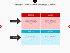
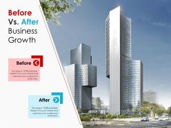
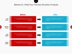
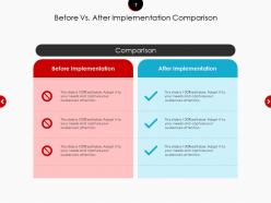
Before Vs After Ppt Professional Designs Download Before Implementation with all 14 slides:
Use our Before Vs After Ppt Professional Designs Download Before Implementation to cut down the burden. Don't allow it to get too heavy.
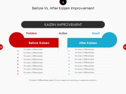

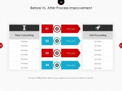
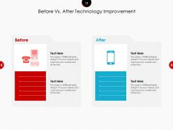
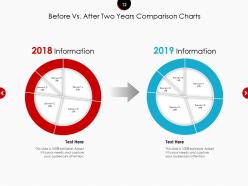
FAQs for Before Vs After Ppt Professional Designs
Start with one clean font and stick with it - seriously, font mixing is where most people go wrong. Pick 3-4 colors max with good contrast so people can actually read your stuff. Don't cram everything together like you're trying to fit a novel on each slide. Use consistent headers and bullet points so it's easy to scan. Make your text big enough that the person in the back row isn't squinting at tiny fonts (I learned this the hard way). Oh, and create a master template with spots for titles, content, and images - you'll thank yourself later when you're not rebuilding every slide from scratch.
Colors basically set expectations before you even open your mouth. Blues and greens make people think "trustworthy," while reds scream urgency. I've watched solid presentations completely bomb because someone chose neon yellow backgrounds - honestly painful to sit through. When your palette doesn't match your message, audiences get confused and can't focus on what you're saying. My old boss used to say mismatched colors are like wearing a tux to a beach party. Short version: pick colors that help your message, don't sabotage it.
Dude, your font choices can seriously make or break the whole thing. I learned this the hard way when I used like 5 different fonts in one deck - looked terrible. Keep it simple with maybe 2-3 fonts max. Make sure people in the back can actually read your text without glasses. Comic Sans is obviously a no, but you'd be surprised how often people mess this up. Good typography helps your audience follow along naturally instead of getting distracted by weird formatting. Oh, and consistent sizing throughout! Creates that professional look without trying too hard.
Okay so here's what works - structure your templates like a story with problem, tension, then resolution. Before/after layouts are honestly my favorite because they show transformation instantly. Set up consistent visual metaphors throughout (journey maps work great, or building blocks that literally stack as you make points). Make sure there's dedicated spots for hero images, data viz, and customer quotes that back up your story beats. Oh and create what I call a "story spine" template - it forces people to follow narrative flow instead of just word-vomiting information everywhere. Short sentences mixed with longer flowing ones keep people engaged. Trust me, templates should guide the story, not fight it.
Your brain literally stops working when slides look all over the place - I swear this happens every time. People get distracted trying to decode what each new icon means instead of listening to you. Same fonts, same visual style, same hierarchy = they actually hear your message. Think of it like learning a new language, except this one takes 30 seconds. I sat through this one presentation where every slide was completely different and honestly? Exhausting. My mind kept wandering. Stick to consistent visuals and people will remember what you said later instead of just feeling confused.
Oh man, the worst thing is when presentations look like a hot mess - you know, random fonts everywhere and colors that make your eyes hurt. I swear some decks look like they were made by a committee who never talked to each other. Good templates fix this though! They give you colors that actually work together and fonts that don't suck. Plus they stop you from cramming a novel onto one slide. Honestly, just pick one solid template and stick with it - then you can focus on what you're actually saying instead of wrestling with design stuff.
Honestly, knowing your audience is everything when picking templates. Executives want sleek, minimal stuff while college kids can handle more creative designs. Font size matters way more than you'd think - older people need bigger text and better contrast or they'll just give up. Tech people love complicated charts and infographics, but if you're presenting to doctors, keep it clean and straightforward. I learned this the hard way once! Academics expect tons of detail and text, but regular folks prefer visuals over walls of words. Always ask who's going to see this before you start designing.
Stick to the 6x6 rule - no more than 6 bullet points, 6 words max each. Let your visuals carry the weight here. I learned this the hard way after watching people's eyes glaze over during my presentations! They literally can't read and listen at once. Put your key text close to related images and don't be afraid of white space. Icons beat paragraphs every time. Here's a quick test: cover all your text and see if someone could still grasp like 70% of what you're saying from just the visuals. If yes, you've nailed it.
Okay so white space is like magic for presentations - seriously. Your slides look so much better when stuff isn't crammed together. People get overwhelmed when there's no breathing room, you know? I used to make this mistake all the time actually. Now I just double the spacing around my text and images and boom, instant upgrade. It's wild how much more professional everything looks. Your main points actually pop instead of getting lost in the chaos. Even just spacing out your bullet points makes a huge difference. Try it next time!
Yeah, don't go crazy with animations or you'll look like you just figured out PowerPoint exists. Those swooshing bullet points with sound effects? Hard pass. But honestly, subtle stuff actually helps - like gentle fades between slides or simple reveals for important points. Just avoid anything that spins or makes people motion sick lol. The trick is using them to guide attention, not show off. I learned this the hard way when my text did some weird glitch thing during a presentation once. Test everything first! Less is definitely more here.
Okay so basically you gotta match your template to what you're actually trying to do. Teaching something? Go clean and structured - headings, bullet points, lots of white space. Makes it way easier to follow. But if you're trying to persuade people, that's when you bring out the big fonts and bold visuals. I swear, half the presentations I see fail because someone used their "safe" template for everything. Short answer: teaching = organized and calm, selling = dramatic and punchy. Oh and don't overthink it - just pick one goal first, then design around that.
Honestly, just get a good template. I used to waste hours trying to make slides look decent and they'd still come out looking like garbage. Templates give you fonts and colors that actually match instead of that random mishmash we've all seen too many times. They're built so your important stuff pops out naturally too. The best part? You can focus on what you're actually saying instead of moving text boxes around forever. Seriously though, buy one decent template and use it for everything – total game changer.
Honestly, good templates are game-changers because they force interaction instead of letting people check out mentally. I always build in Q&A spots and polling breaks - when it's built into the structure, people actually know when to jump in. Clean slides help too since nobody wants to participate when they can't even read what's on screen (been there, done that). The whole visual thing should feel natural and guide conversations without being weird about it. Try dropping 2-3 interaction moments into your next template and you'll see the difference right away.
Pick 2-3 metrics that actually matter for your goals first. Watch how engaged people are - questions they ask, participation levels, whether they're secretly scrolling Instagram. Pre/post surveys work great for checking if they actually absorbed anything. If you're trying to sell something, track conversion rates. Follow-up actions are telling too - did anyone actually do what you asked them to? Feedback scores are obvious but useful. Here's the thing though - you need baseline data before changing your design. Otherwise you're just guessing if it worked better.
Dude, feedback from old presentations is like a cheat sheet for your next one. Look for patterns - if three different groups couldn't read your tiny fonts or got lost during your data slides, fix that stuff in your template. I totally used to blow off feedback until I caught myself bombing the same way repeatedly. Comments about pacing and visual layout are gold. Also weird tangent but I swear audiences are way more honest in their feedback forms than to your face. Anyway, write down 2-3 specific notes right after presenting and update your template that week while you remember.
No Reviews