


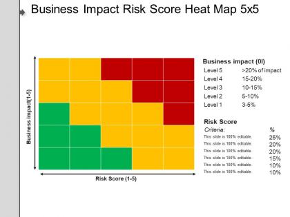
Business impact risk score heat map 5x5 example of ppt




Try Before you Buy Download Free Sample Product
 Impress Your
 Audience
 100%
100% Editable
 Save Hours
 of Time


One of the efficient ways to perform and document a risk analysis as well as assessment by using the risk matrix PowerPoint slide. This simple visualization heat map 5x5 matrix template is useful to illustrate different management methods that help an individual to represent possible risks, as well as define the risk levels. A user can also describe that they must support management decision making as well as plan activities to mitigate those risks. When you insert the 5x5 risk matrix analysis PPT template, your presentation looks more creative. You can go for a consistent and clear risk matrix diagram slide for visualization new company’s competitors or even changes in the government policy. A presenter can illustrate the purpose of risk management which is to anticipate as well as control risks to minimize their threats or maximize their potential by using the risk management model PPT template. The risk matrix diagram slide will help you in creating a memorable presentation on business risks or threats. By using the heat map template, a presenter can illustrate that it becomes easy to visualize with colors all risk categories and then focus attention on the main subject. Aesthetically crafted by artistic young minds. Our Business Impact Risk Score Heat Map 5x5 Example Of Ppt are designed to display your dexterity.
People who downloaded this PowerPoint presentation also viewed the following :
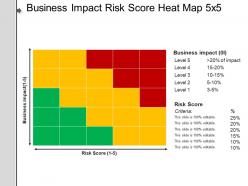
Business impact risk score heat map 5x5 example of ppt with all 5 slides:
Your thoughts will fly quick and fast. Lay the base for them with our Business Impact Risk Score Heat Map 5x5 Example Of Ppt.


FAQs for Business impact risk score heat map 5x5
A Business Impact Risk Score Heat Map is a visual risk assessment tool that plots potential business risks against their probability and impact severity using color-coded matrices. It's constructed by identifying key risks, assessing their likelihood and business consequences, then mapping them onto a grid where red indicates high-priority risks requiring immediate attention, with many organizations finding this approach streamlines risk prioritization and resource allocation decisions.
Organizations effectively prioritize risks using heat maps by plotting probability against impact severity, creating visual risk rankings through color-coded matrices that immediately highlight critical threats requiring urgent attention. This approach enables leadership teams to allocate resources strategically, with many financial institutions and healthcare organizations finding that heat maps streamline decision-making processes, enhance stakeholder communication, and ultimately deliver faster risk mitigation responses.
Key metrics should include financial impact magnitude, operational disruption duration, regulatory compliance exposure, customer satisfaction effects, and recovery time objectives. These metrics enable organizations to prioritize risk mitigation resources strategically, with many financial services and healthcare institutions finding that comprehensive heat maps streamline crisis response planning and enhance stakeholder confidence.
A heat map facilitates interdepartmental risk communication by providing a standardized visual language that translates complex risk data into immediately understandable color-coded insights, enabling finance, operations, IT, and compliance teams to quickly identify shared priorities. This visual approach streamlines cross-functional discussions by eliminating technical jargon barriers, with many organizations finding that departments collaborate more effectively when risk severity levels are universally comprehensible, ultimately accelerating coordinated response strategies.
Excel, Tableau, Power BI, GRC platforms like ServiceNow, and specialized risk management software such as LogicGate and MetricStream are best suited for creating Business Impact Risk Score Heat Maps. These tools streamline risk visualization through automated data integration, real-time updates, and customizable heat map interfaces, with many organizations finding that cloud-based platforms like Tableau and Power BI deliver enhanced collaboration and scalability.
Organizations should update their Business Impact Risk Score Heat Maps quarterly at minimum, with many finding that monthly updates better capture dynamic business environments, regulatory changes, and emerging threats. Through regular reviews, companies can adjust risk priorities, reallocate resources strategically, and maintain accurate threat assessments, ultimately delivering enhanced operational resilience and competitive advantage.
Stakeholder input ensures heat maps reflect diverse perspectives on risk probability, impact severity, and organizational priorities across different departments and expertise areas. Through collaborative workshops and structured interviews, stakeholders provide critical insights on operational vulnerabilities, regulatory concerns, and strategic exposures, ultimately delivering more comprehensive risk assessments and stronger organizational buy-in.
A Business Impact Risk Score Heat Map enhances decision-making by providing visual clarity on risk priorities, enabling rapid assessment of threat levels, and facilitating resource allocation based on impact severity. This strategic visualization tool streamlines executive discussions, accelerates response planning, and improves stakeholder communication, with many organizations finding that heat maps reduce decision-making time while increasing accuracy in risk management strategies.
Common pitfalls include oversimplifying complex risks into basic color categories, failing to regularly update data inputs, relying on subjective assessments without quantitative backing, and neglecting stakeholder input during risk evaluation. These visualization challenges can mislead decision-makers in financial services, healthcare, and manufacturing sectors, with many organizations finding that combining heat maps with detailed risk registers and regular cross-functional reviews ultimately delivers more accurate assessments and stronger strategic outcomes.
Risk tolerance significantly influences heat map design by determining threshold levels, color coding intensity, and escalation triggers that align with organizational appetite for various risk categories. Companies with lower risk tolerance typically implement more sensitive scoring systems and granular categorization, while risk-accepting organizations may consolidate moderate risks, ultimately enabling strategic resource allocation that matches their specific operational philosophy and regulatory requirements.
Heat map best practices include using intuitive color gradients, maintaining consistent scales, providing clear legends, ensuring adequate cell sizing, and grouping related data logically. Effective heat maps leverage sequential color schemes for quantitative data, diverging palettes for variance analysis, and strategic white space for readability, with many organizations finding that proper labeling and interactive tooltips significantly enhance stakeholder comprehension and decision-making speed.
Businesses integrate heat maps with existing risk management frameworks by embedding them into enterprise risk management systems, compliance monitoring platforms, and strategic planning processes. This integration enables organizations to create comprehensive risk dashboards, automate threat escalation procedures, and align risk appetite with operational decisions, ultimately delivering enhanced visibility across departments while streamlining regulatory reporting and strategic risk oversight.
Financial institutions like JPMorgan Chase use heat maps to visualize credit risk across loan portfolios, enabling rapid identification of high-risk segments and geographic concentrations. Manufacturing companies leverage operational risk heat maps to prioritize safety investments and reduce workplace incidents, while healthcare systems use them to identify patient safety vulnerabilities, ultimately delivering faster risk response, improved resource allocation, and measurable reduction in operational losses.
Heat maps forecast emerging risk impacts by visualizing probability-likelihood intersections across time horizons, enabling organizations to identify patterns, anticipate cascading effects, and prioritize resource allocation. Through predictive modeling and scenario analysis, companies in sectors like financial services and manufacturing can simulate potential disruptions, assess cross-functional vulnerabilities, and develop proactive mitigation strategies, ultimately delivering enhanced preparedness and competitive advantage.
Teams implementing risk management heat maps benefit from training in risk assessment methodologies, data visualization techniques, statistical analysis, and heat map software platforms like Tableau or Power BI. Financial services and manufacturing organizations find that combining workshops on risk categorization with hands-on software training enables teams to create accurate, actionable heat maps that streamline decision-making and enhance strategic risk oversight.
-
Design layout is very impressive.
-
Easily Editable.
-
Commendable slides with attractive designs. Extremely pleased with the fact that they are easy to modify. Great work!
-
Awesome presentation, really professional and easy to edit.